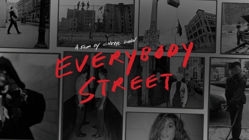
Street Photography
|
A street photograph has to be a real, unposed moment. It is a genre of photography that records everyday life in a public place and often allows photographers to take photos of strangers. they may not have a social purpose in mind, but prefer to isolate and capture moments that might go unnoticed.
|
|
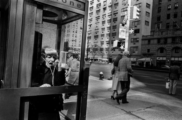
How do street photographers behave?
Bruce Gilden is very aggressive and intrusive of your personal space when taking his photos. and says he has no ethics. However, a photographer like Boogie asks to take photos of people.
What kind of equipment do they use?
Lots of the photographers used different digital cameras but, Joel Meyerowitz used a film camera.
What kinds of subjects interest them?
Gangs, the public, busy streets, up close portraits.
Why do they like photographing on the street?
To capture things that may be interesting in the future - Martha Cooper.
What are the risks involved in street photography?
Boogie was offered drugs and said taking the photos became 'depressing' as he was taking photos of guns and people taking drugs.
What makes a successful street photograph?
'If you can smell the street by looking at the photo, its a street photograph' - Bill Gilden.
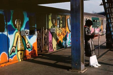
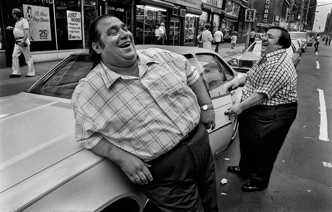
Martha Cooper
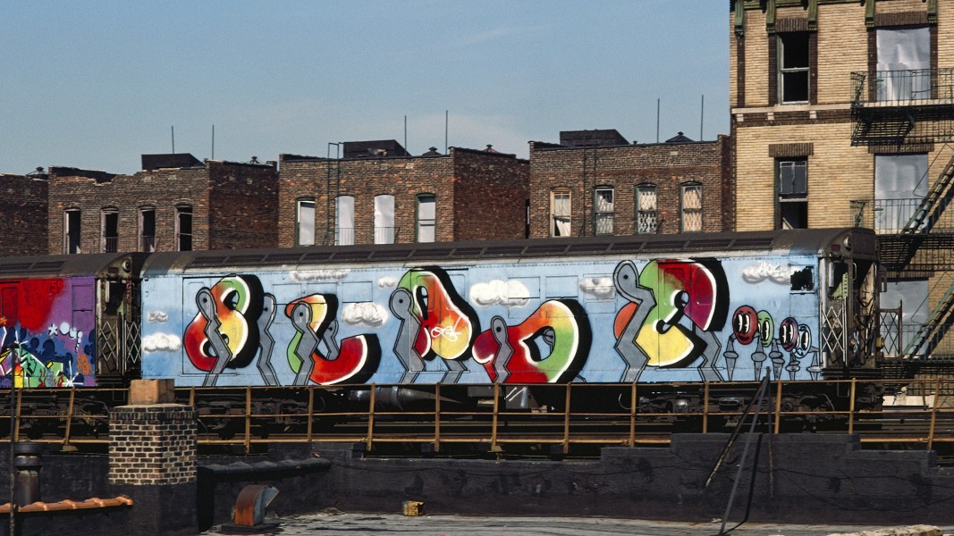
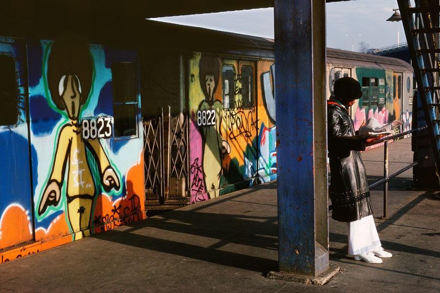
Martha Cooper is an American photographer born in the 1940s in Baltimore, Maryland. She worked as a staff photographer for the New York Post during the 1970s. She is best known as for documenting the New York graffiti scene of the 1970s and 1980s. In 1984, Cooper published her photographs of New York city graffiti in the book Subway Art, which has been called the graffiti bible, and by 2009 had sold half a million copies.
|
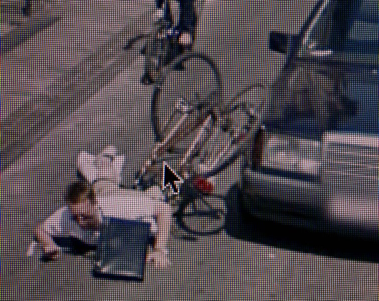
This piece is 180th Street Station Platform, the Bronx by Martha Cooper created in 1980. It is an example of street photography, the composition shows a lady leaning against a railing at at train station. There is a train in the background with colourful graffiti that almost looks like the women standing in front of it. The focal point of the photo I would say is the graffiti as it catches your eye. The technique used here are natural lighting and shadows. The colours in these photos are quite dark in the foreground as gets lighter in the background. The lines in the image are from the train, the pillar, the railing and the stairs to the right of the image. The image makes me feel happy because of the bright colours and the women's bright white trousers.
|
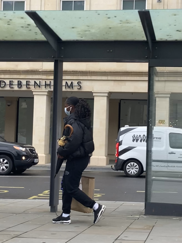
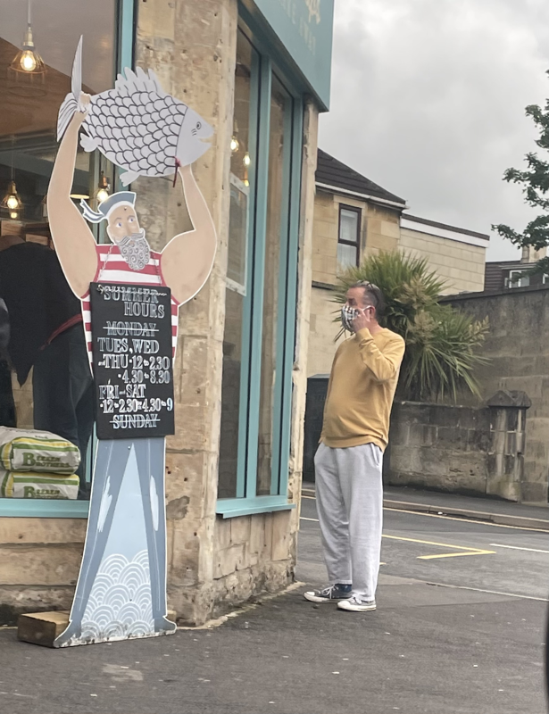
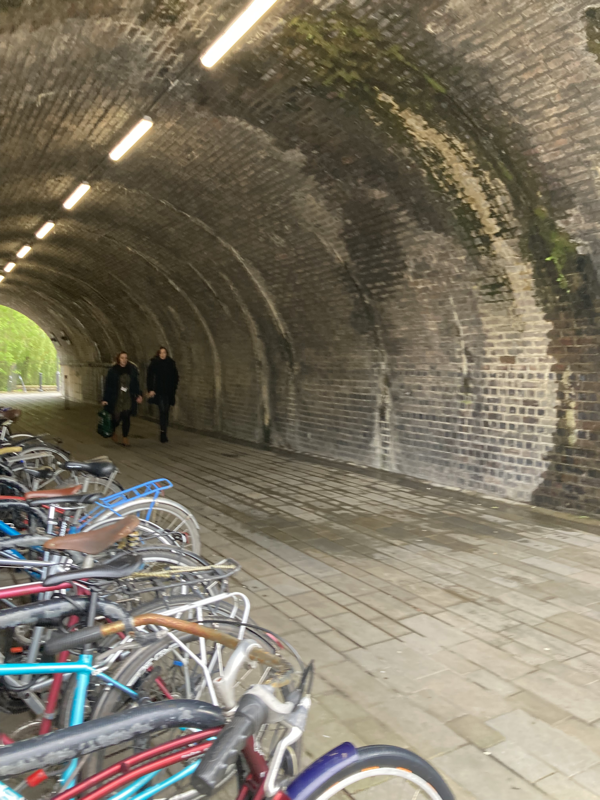
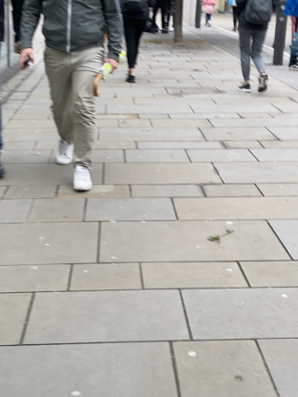
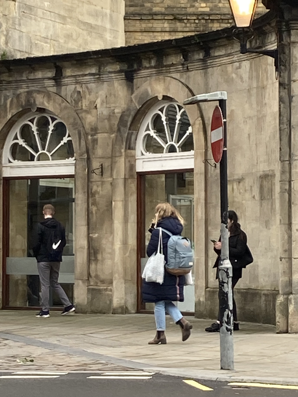
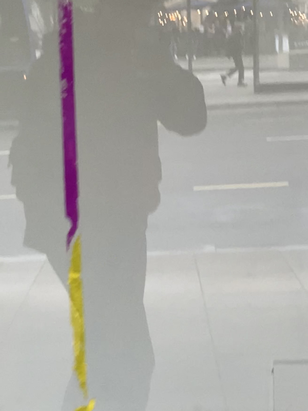
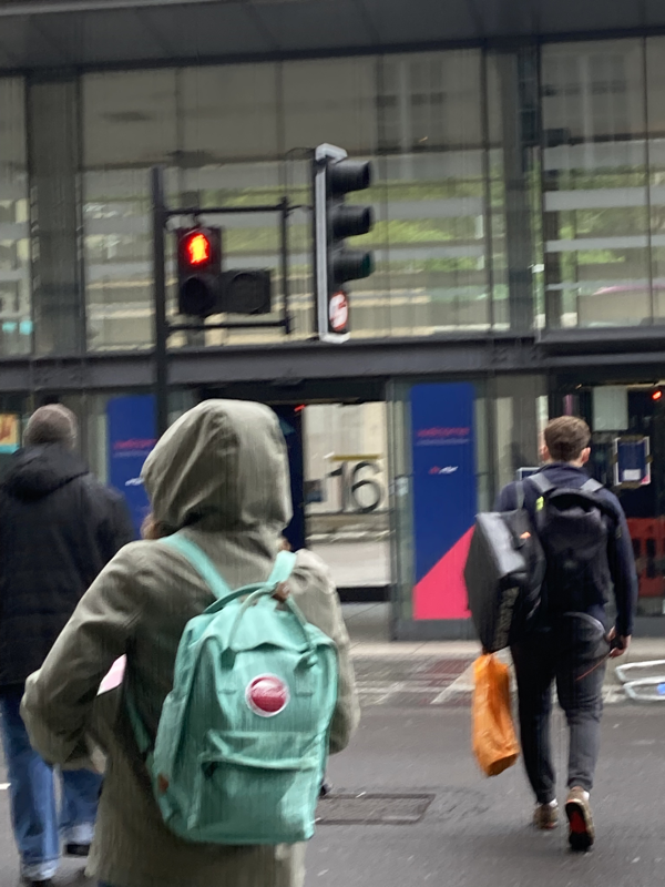
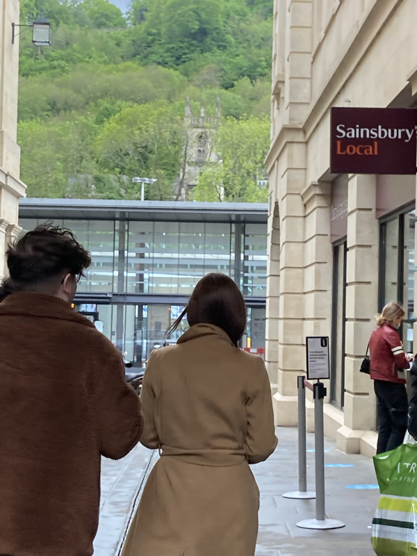
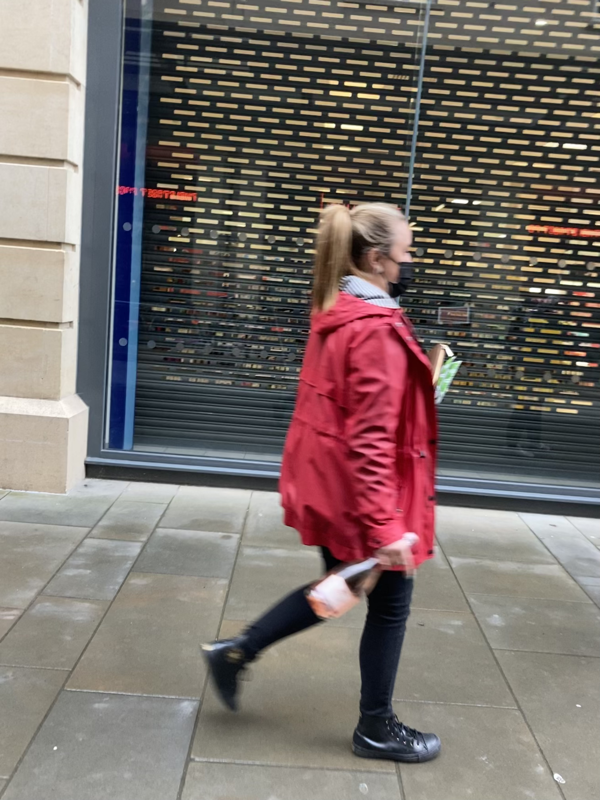
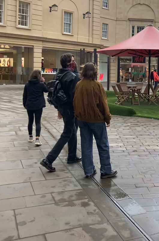
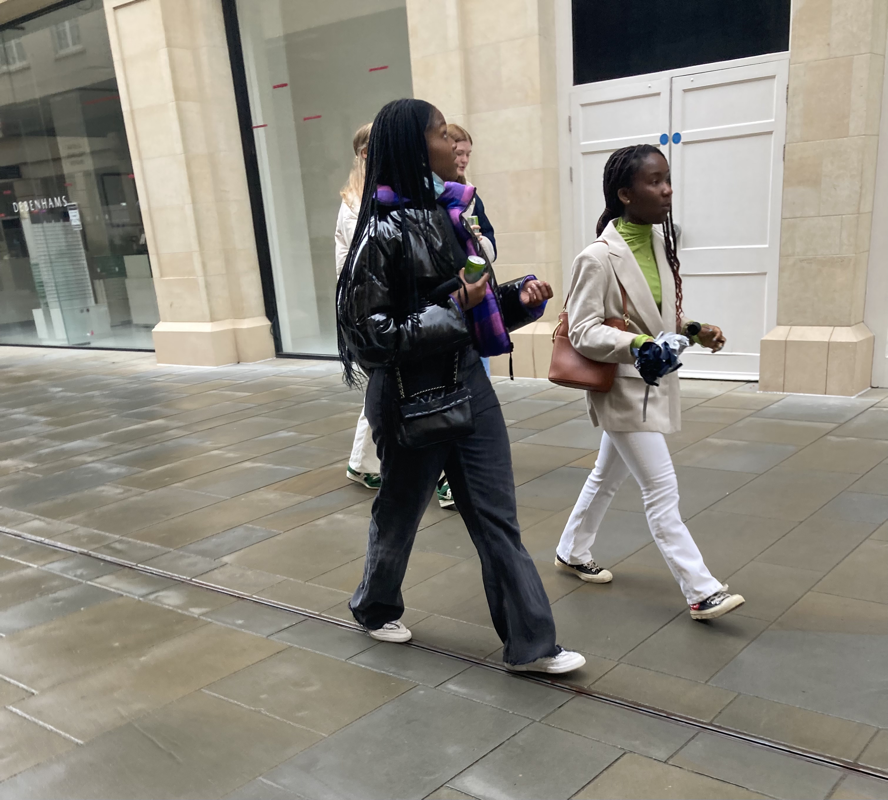
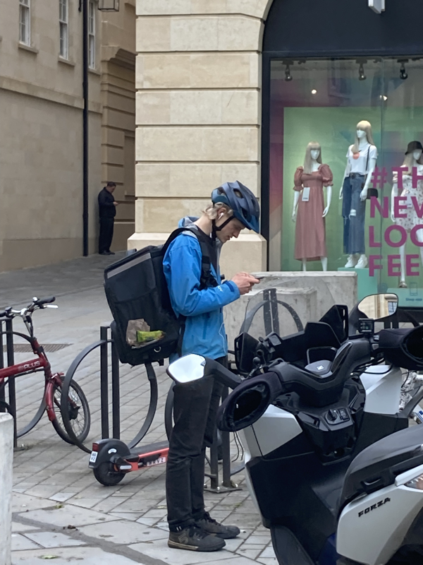
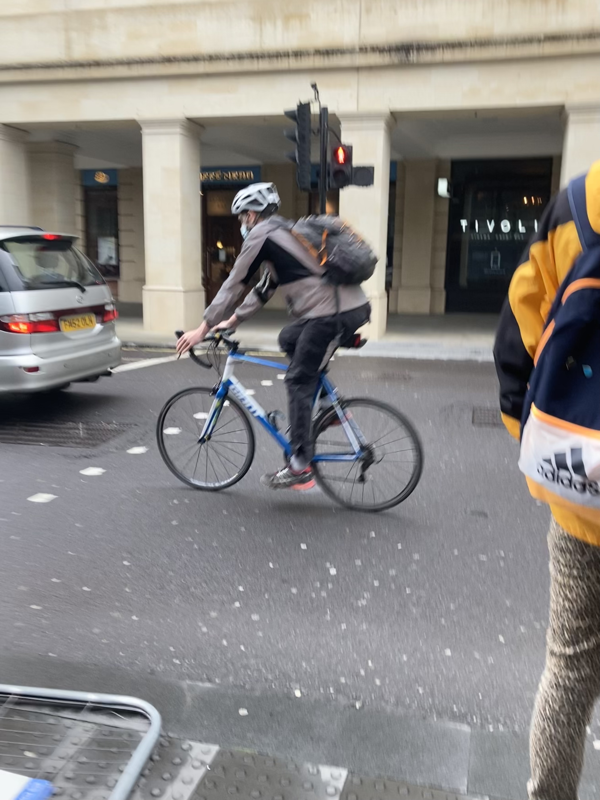
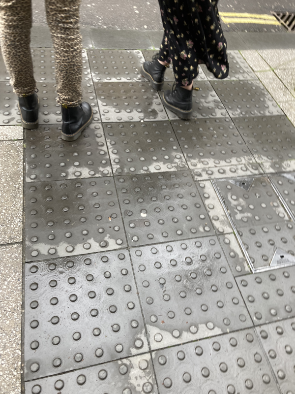
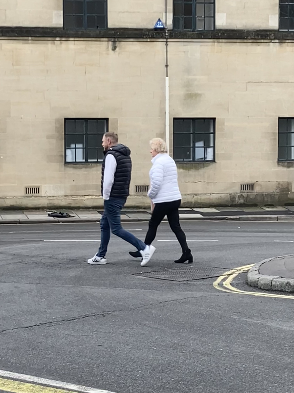
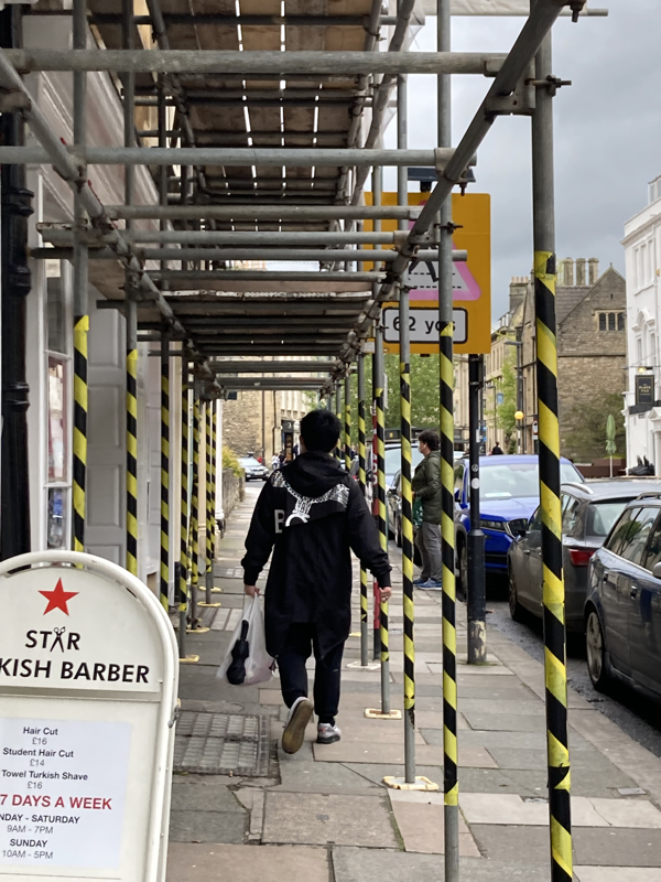
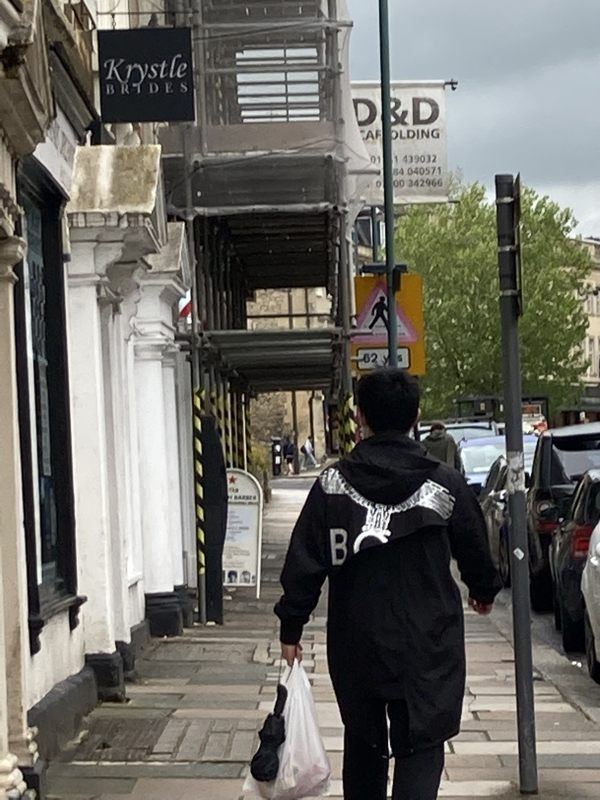
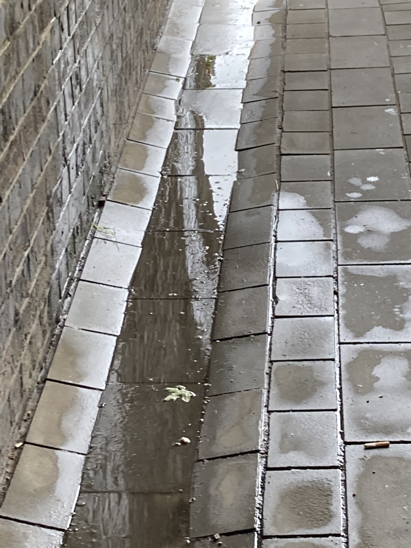
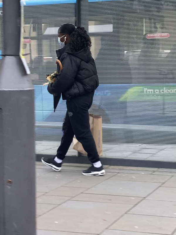
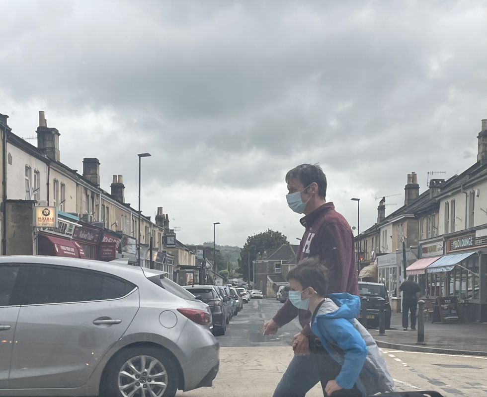
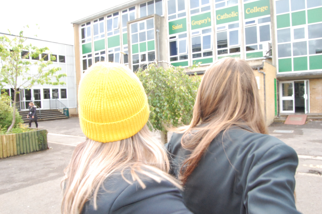
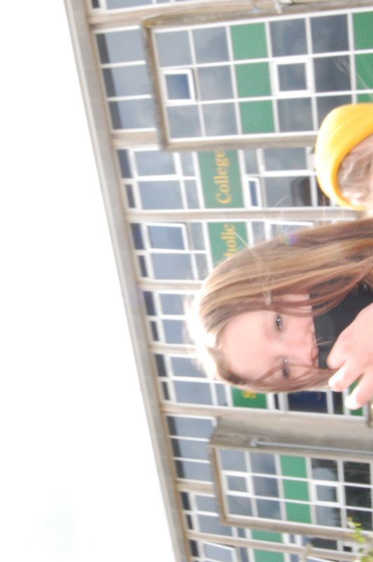
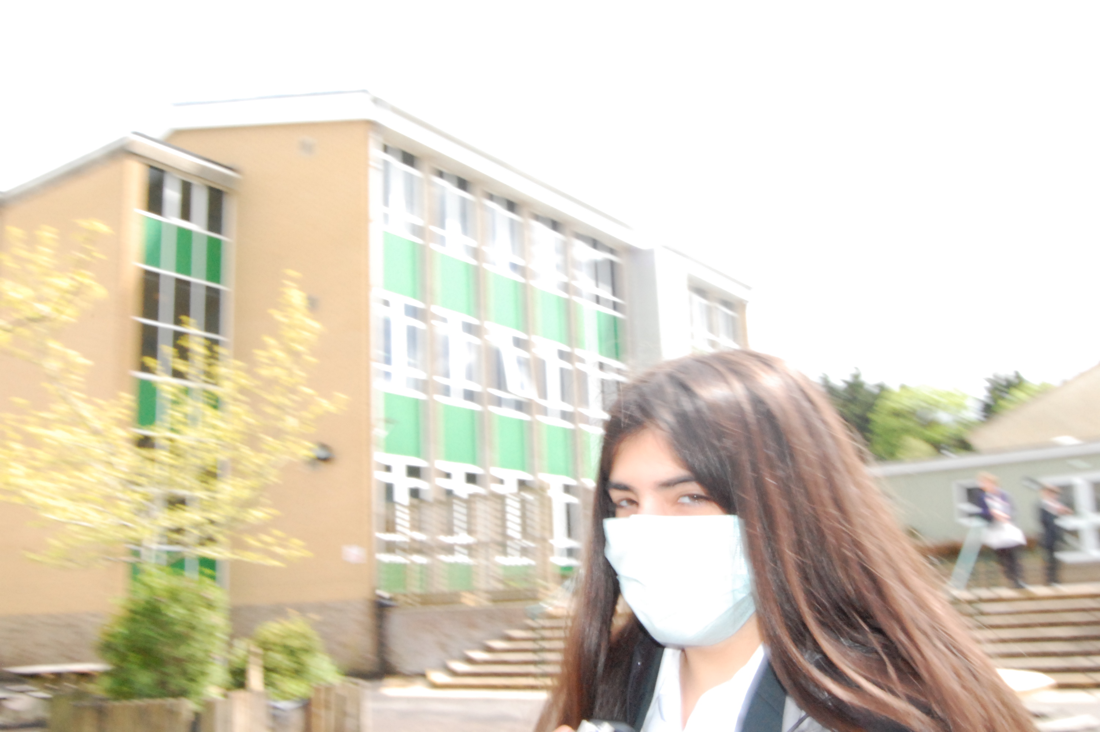
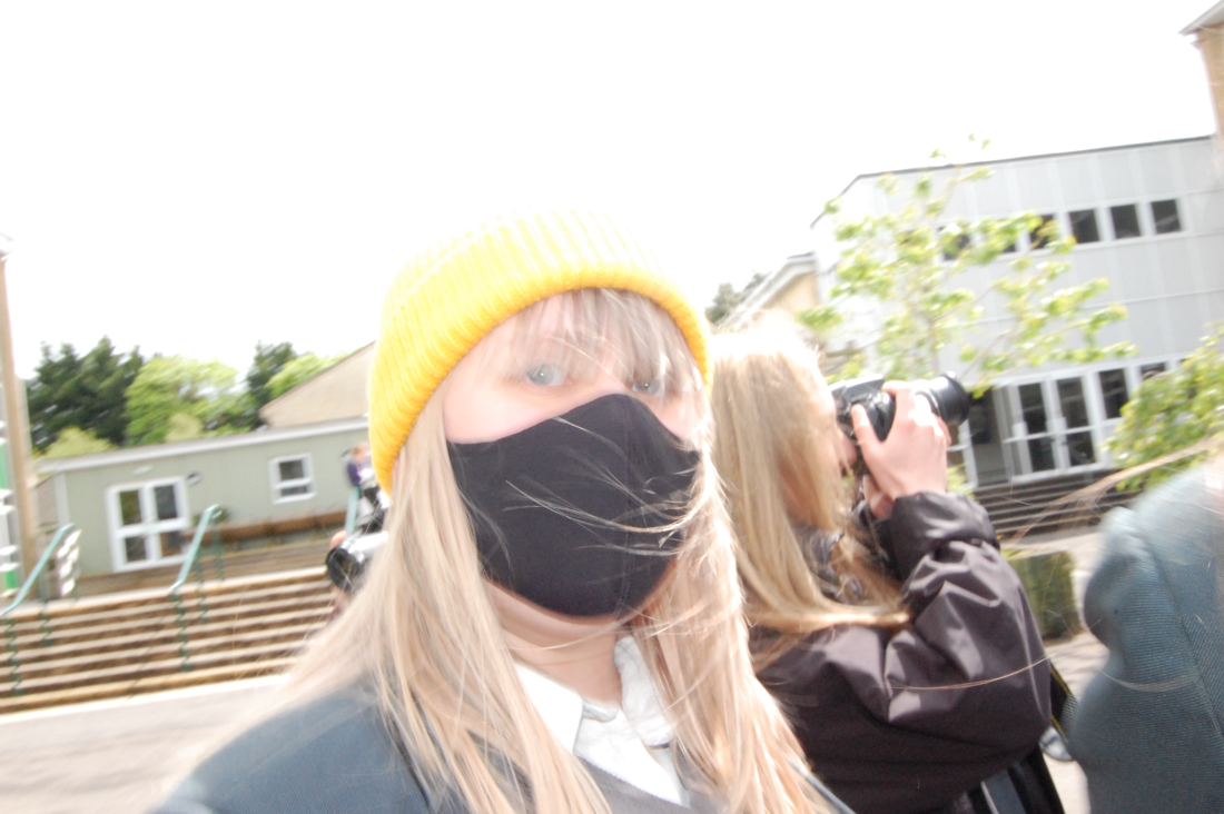
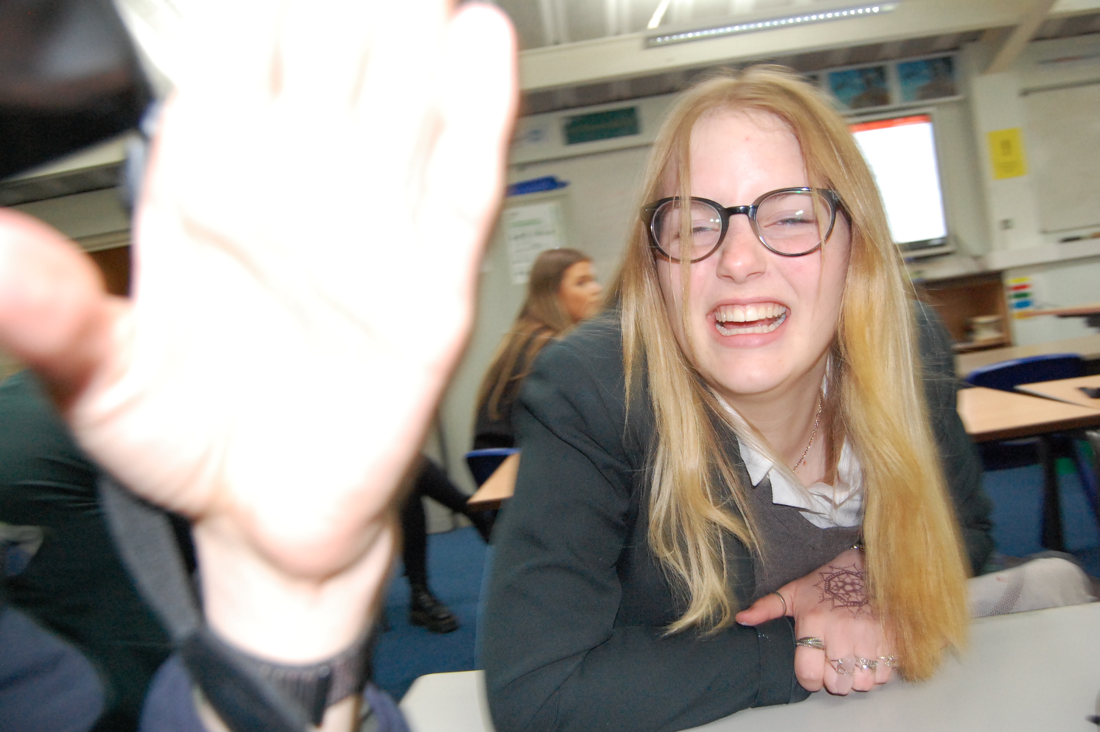
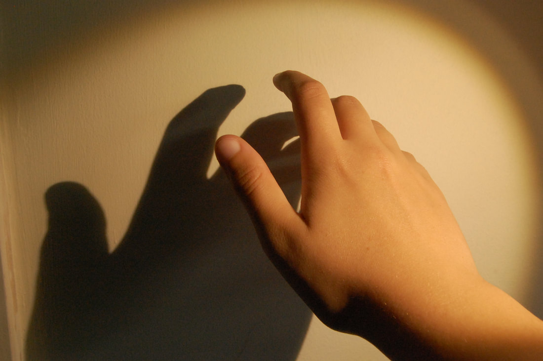
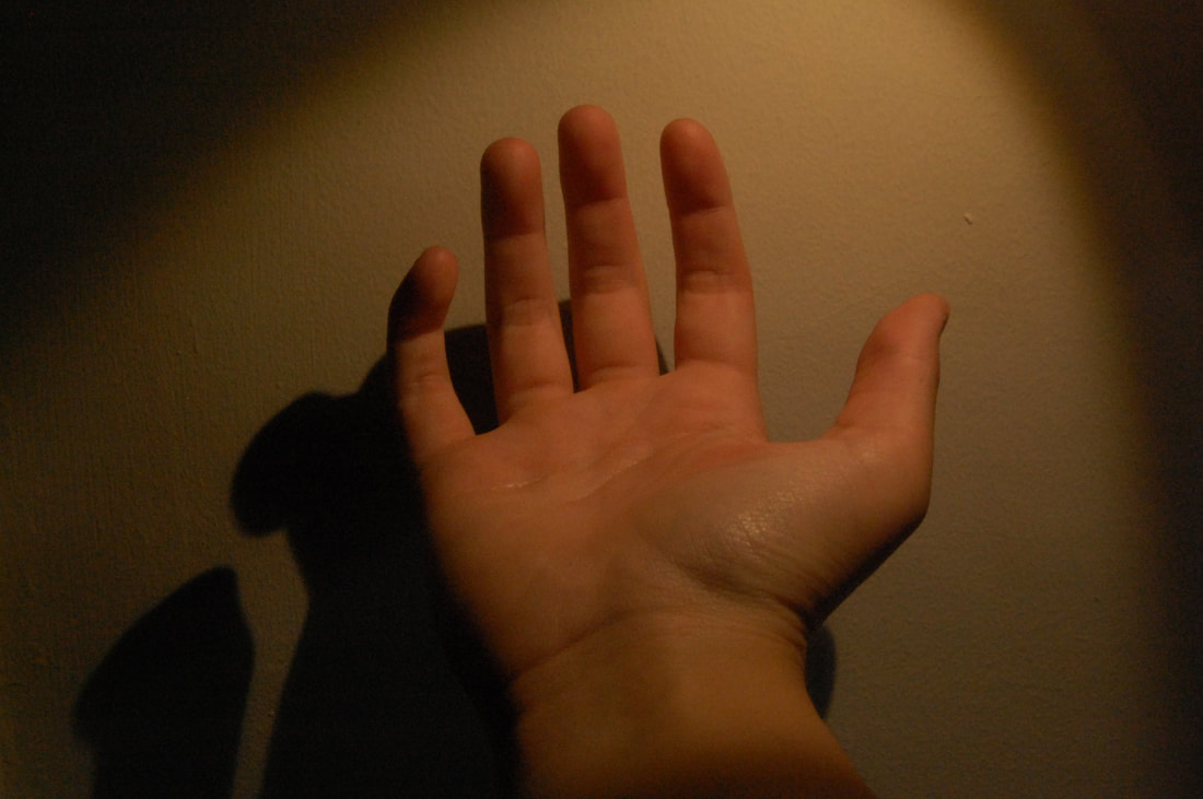
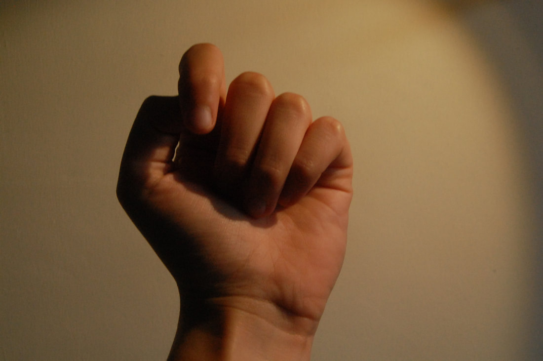
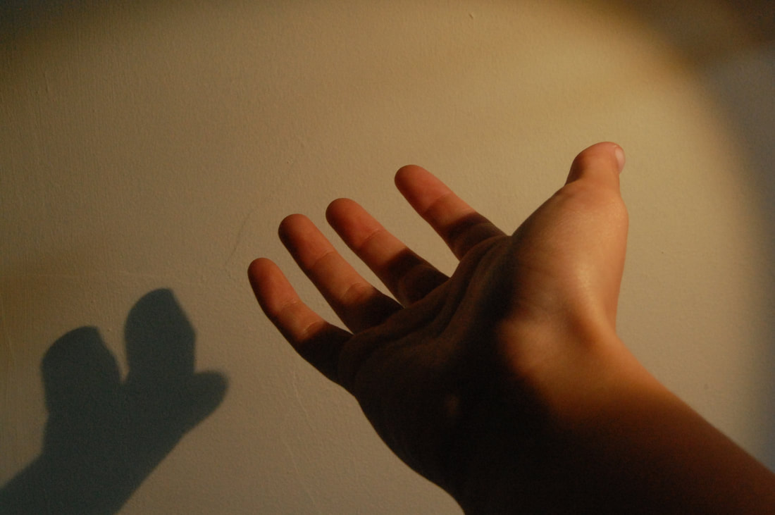
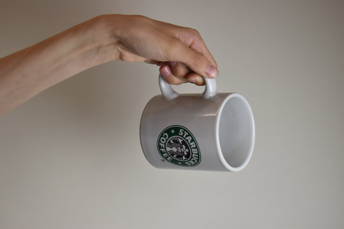
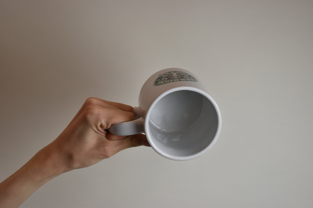
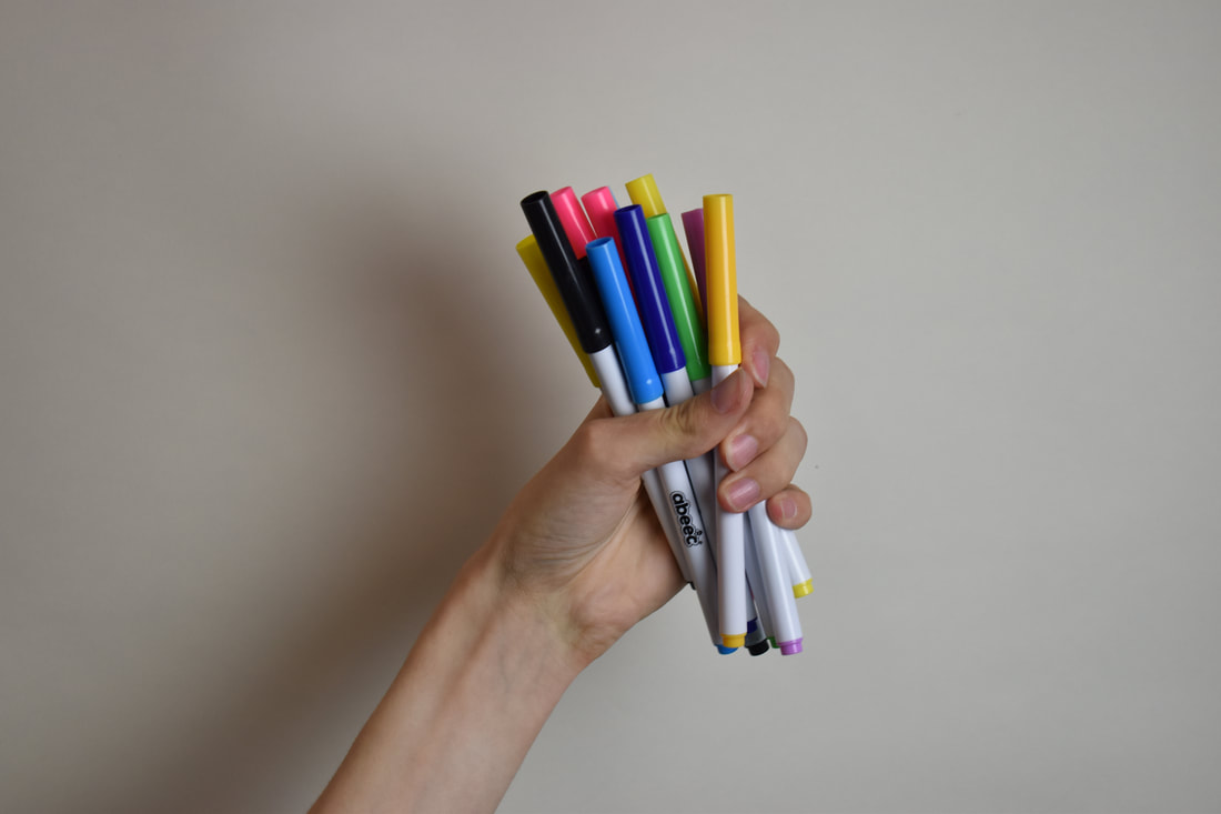
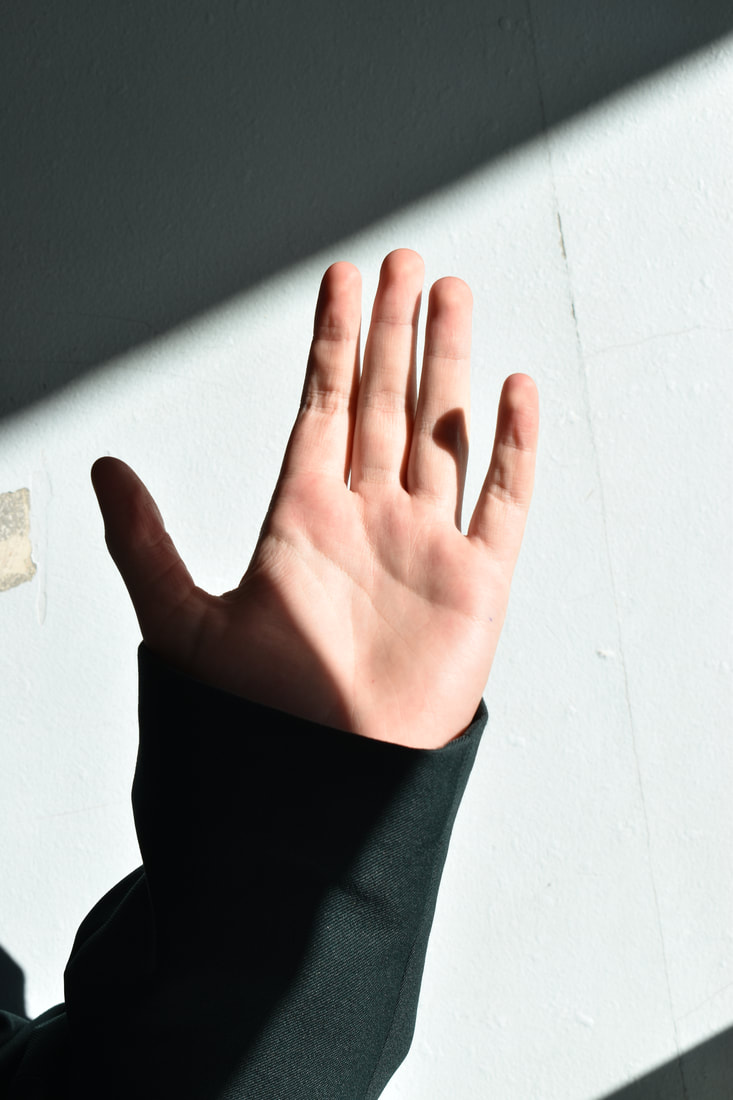
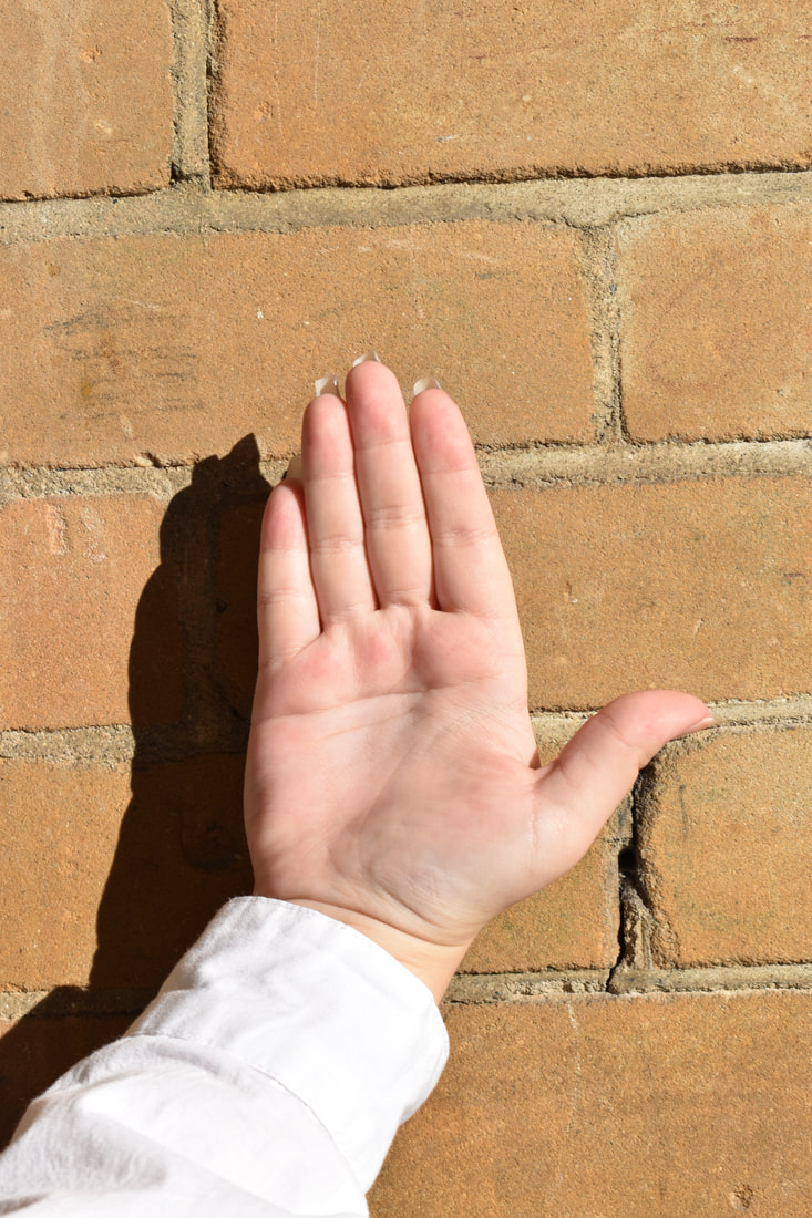
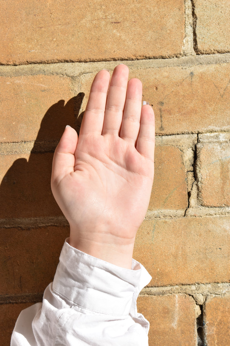
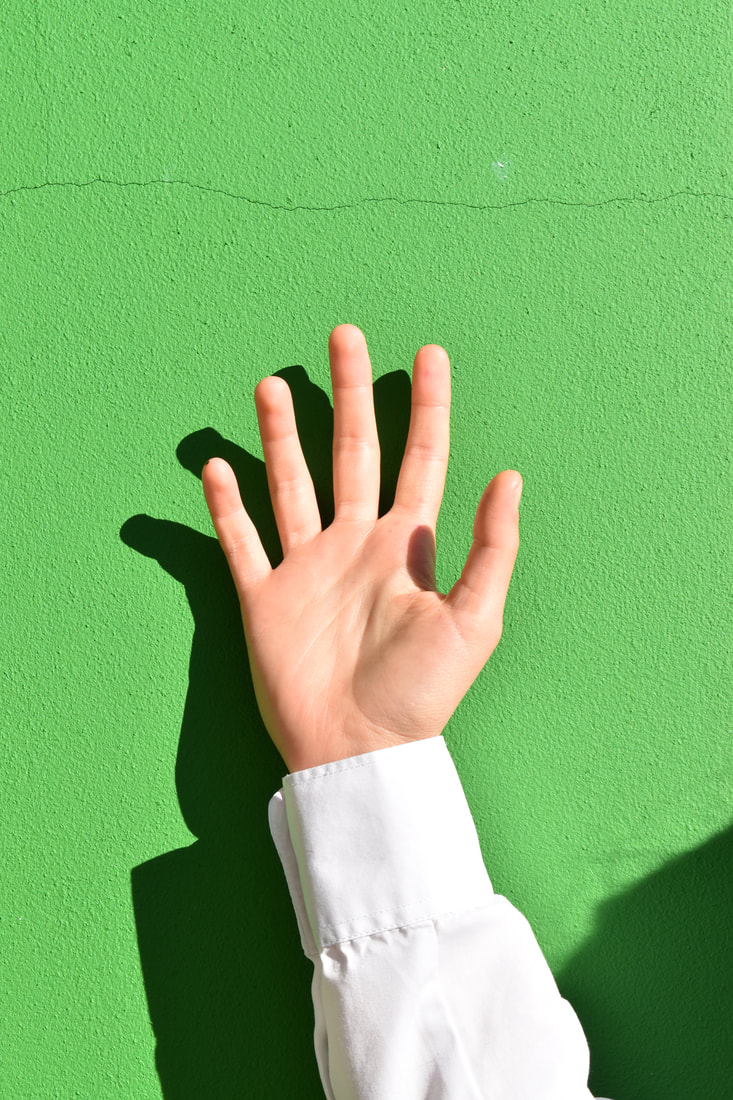
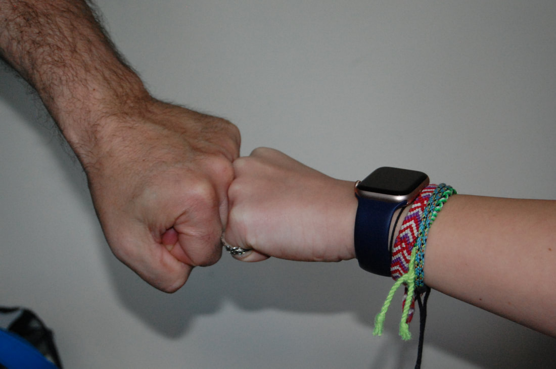
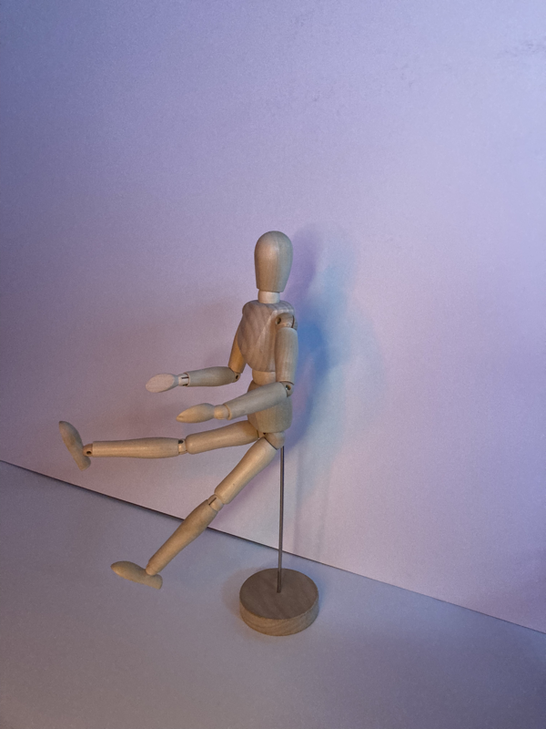
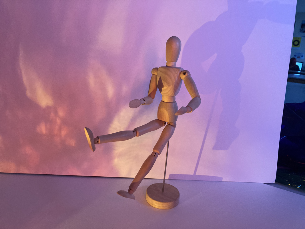
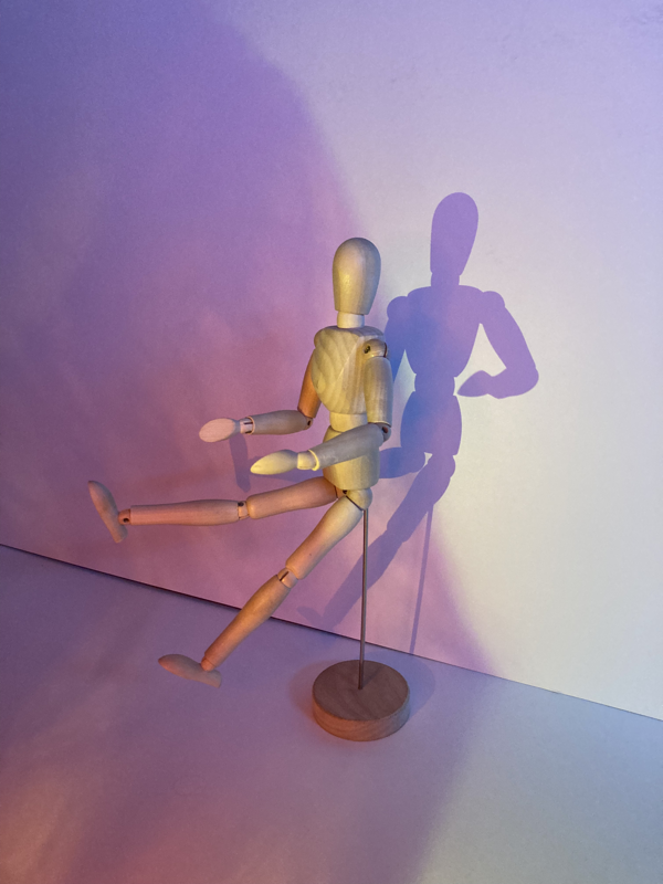
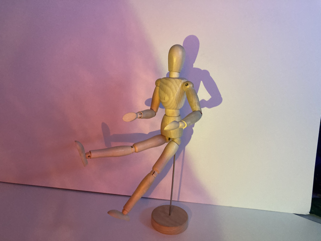
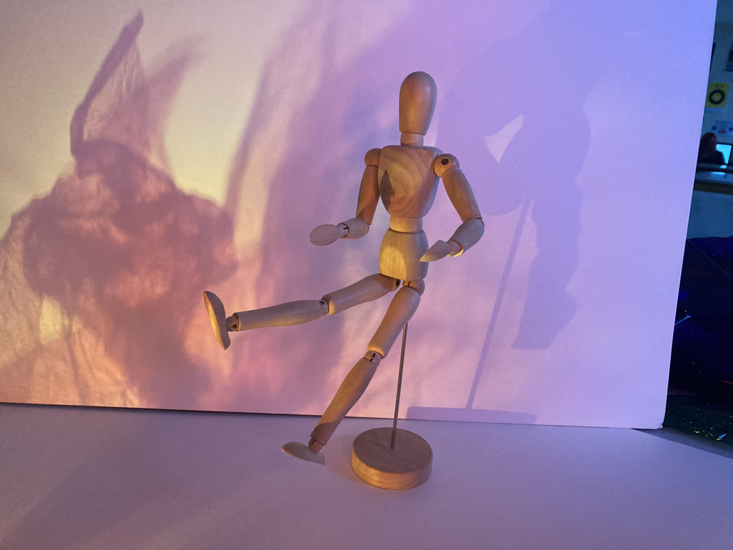
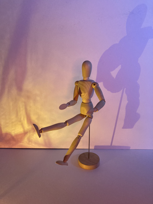
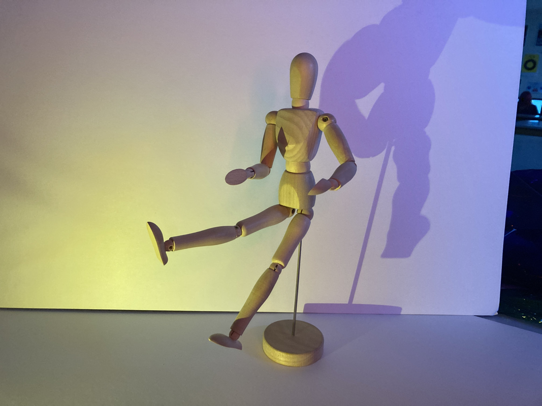
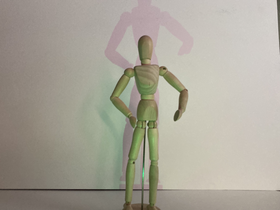
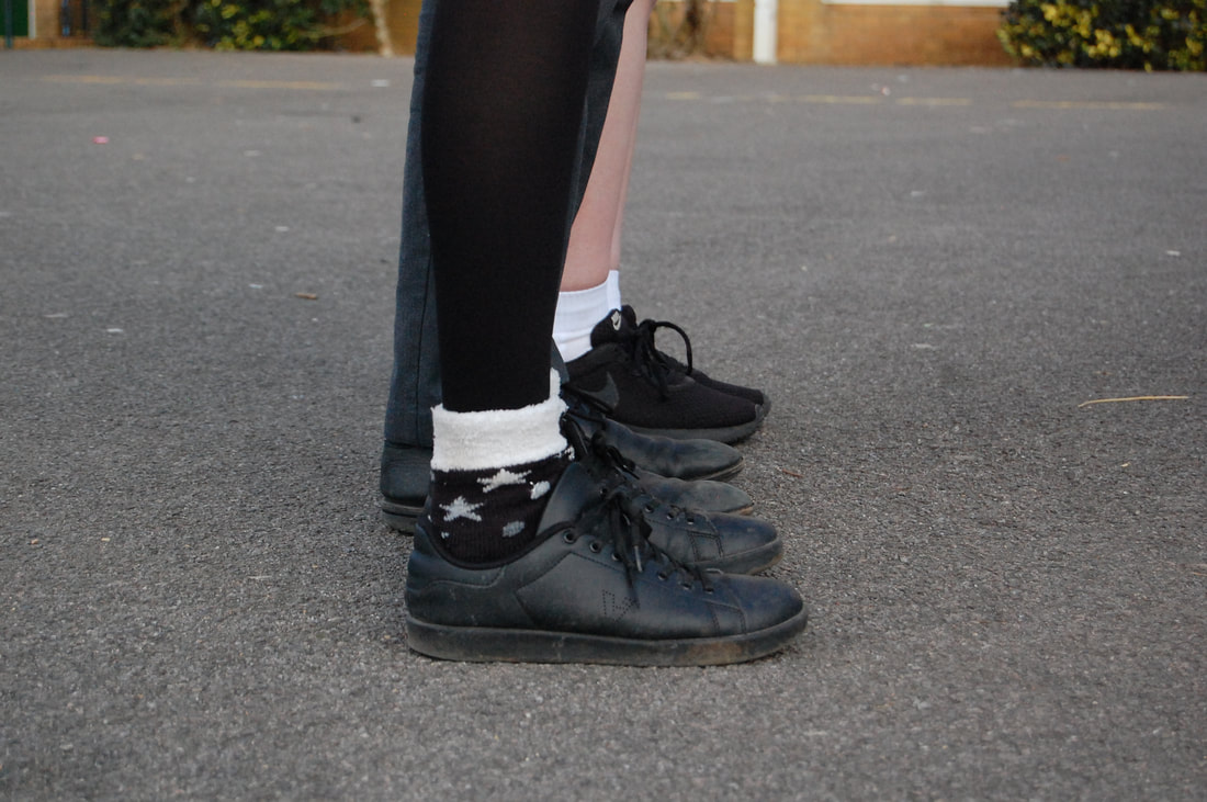
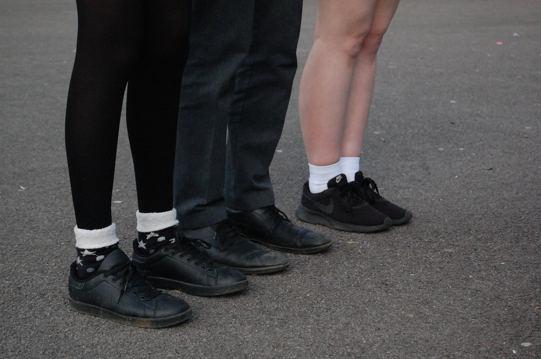
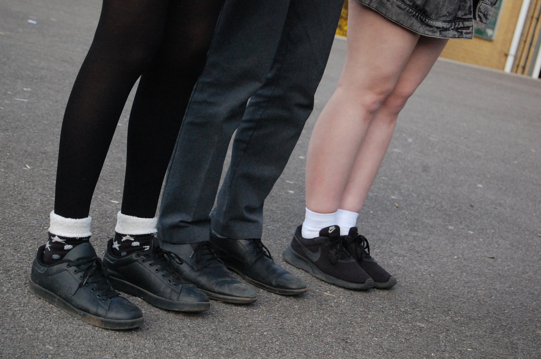
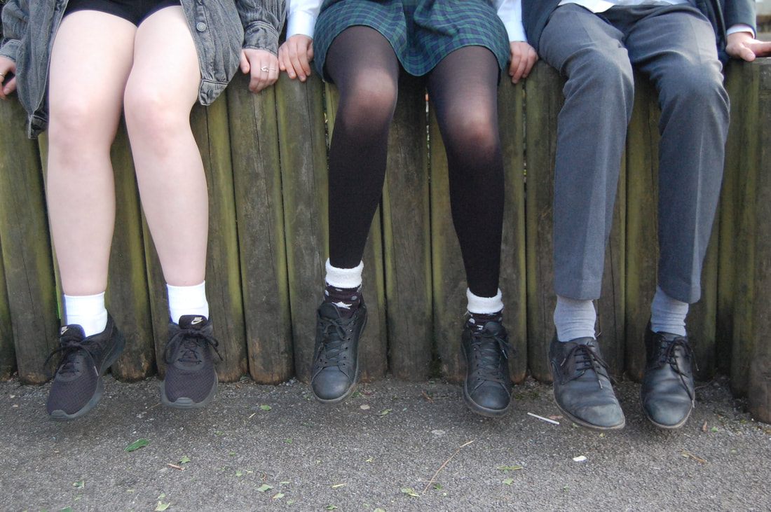
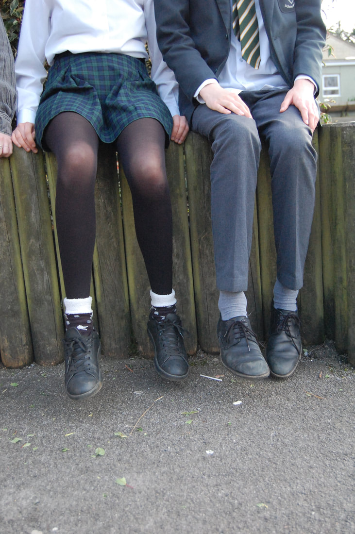
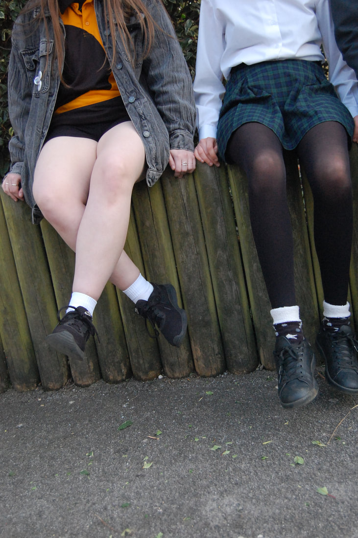
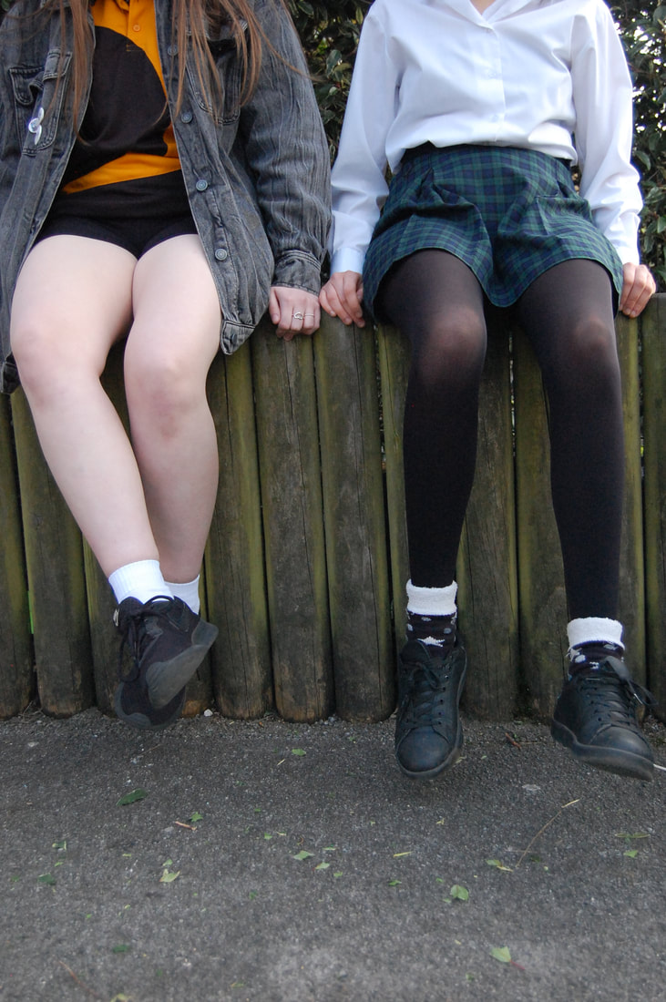
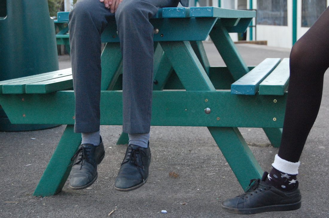
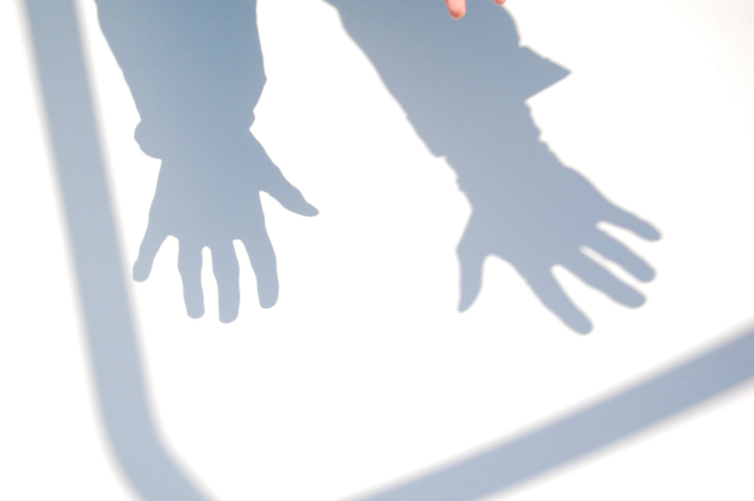
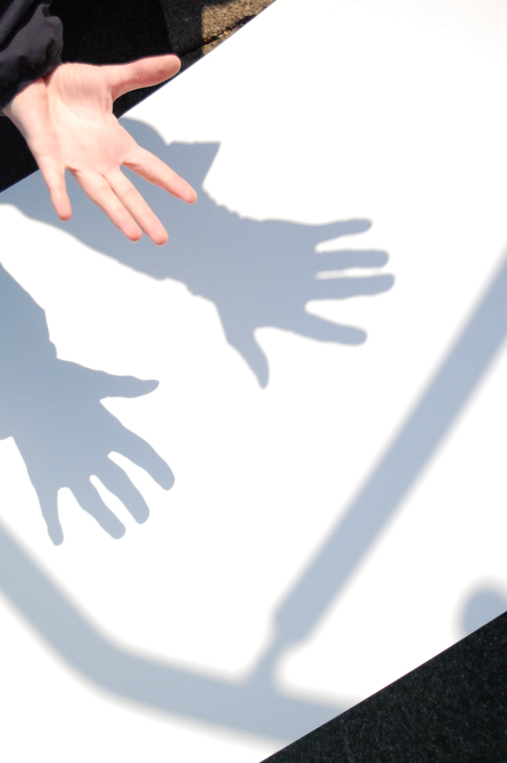
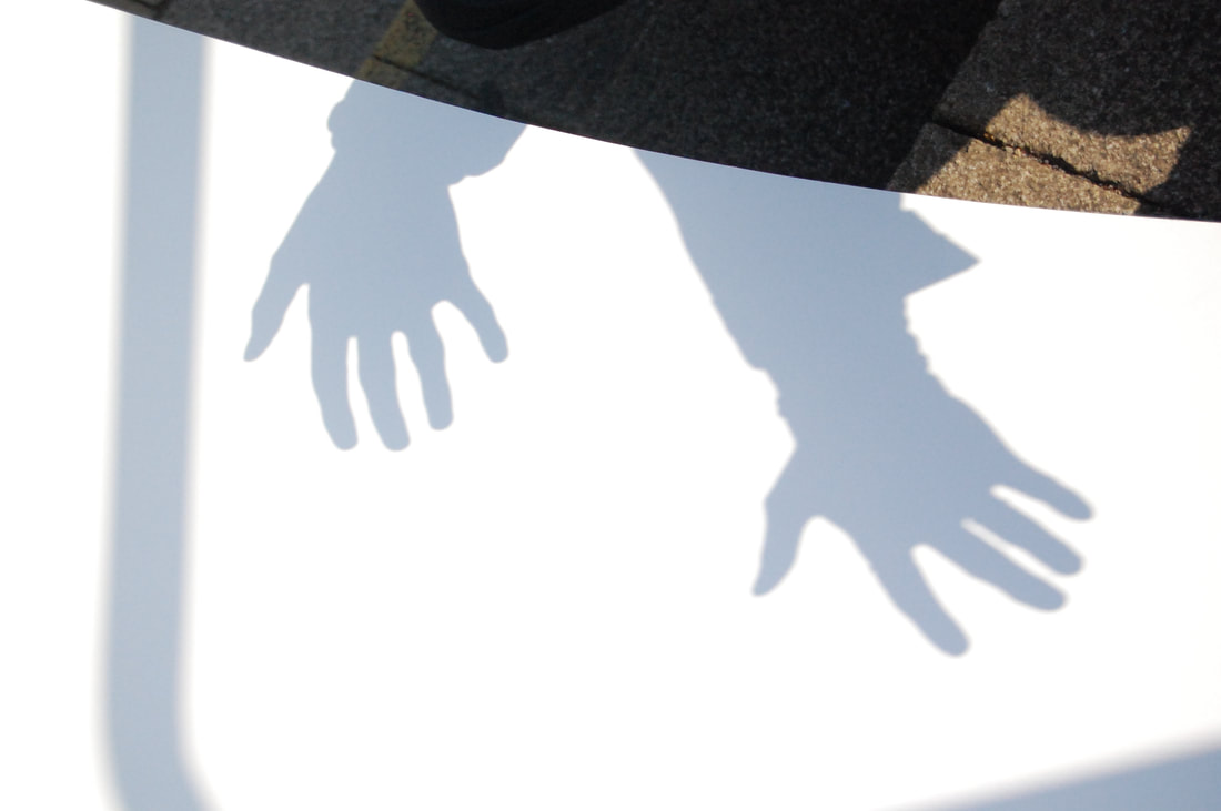
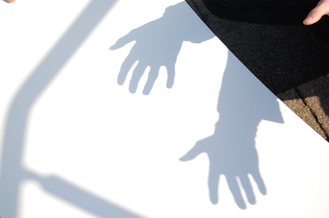
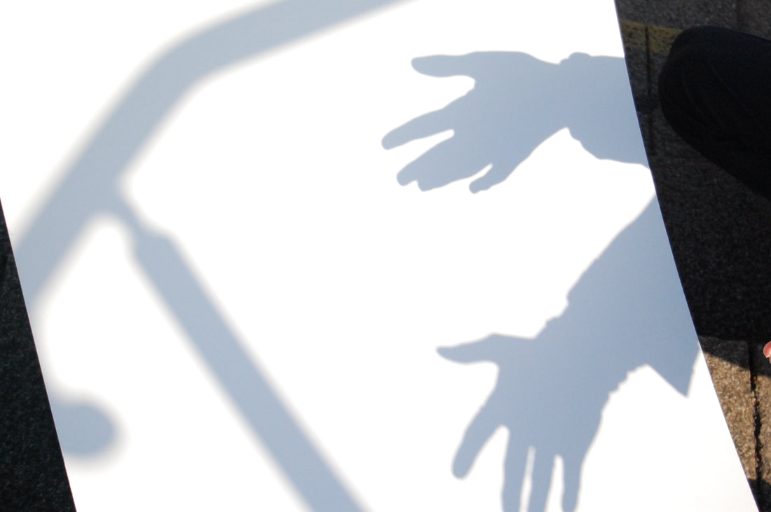
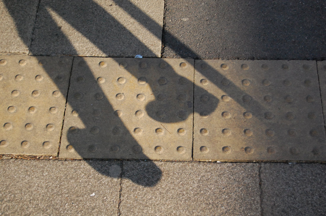
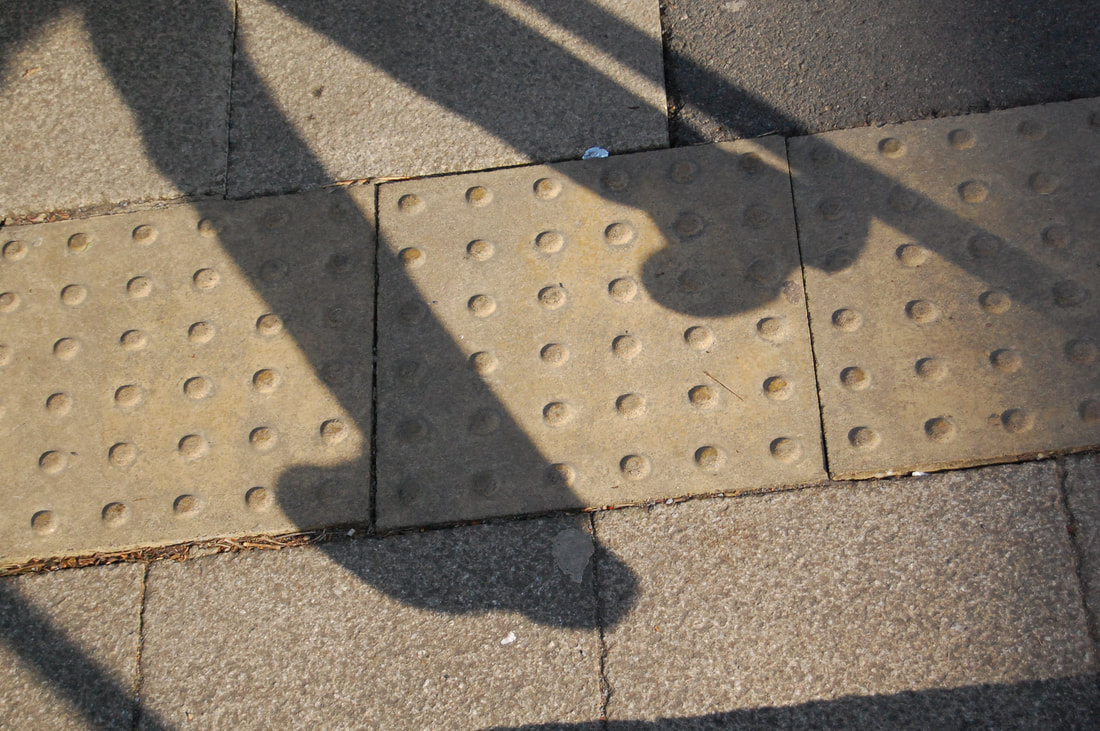
My photos
For this shoot, we have to take photos at different viewpoints including:
- Looking Down
- Shadows & Reflections
- Over the Shoulder
- Cropping
- Walk On By
- Surfaces
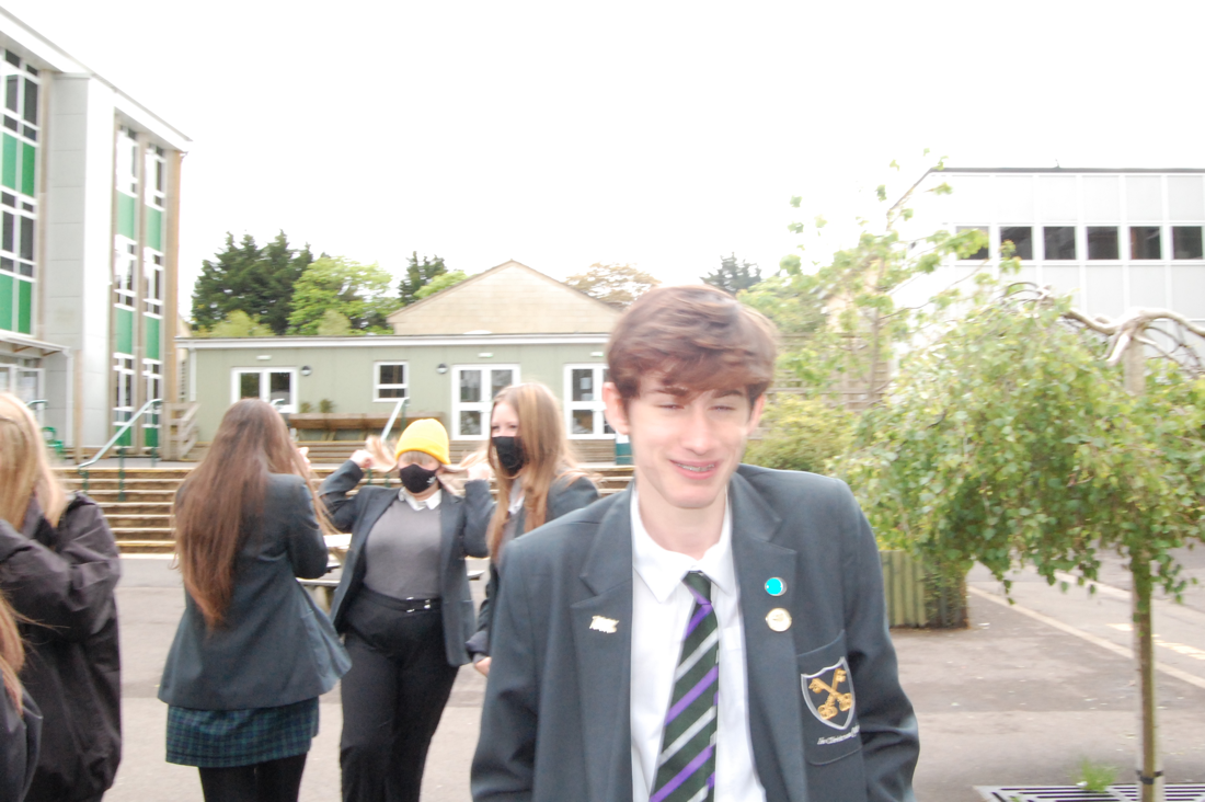
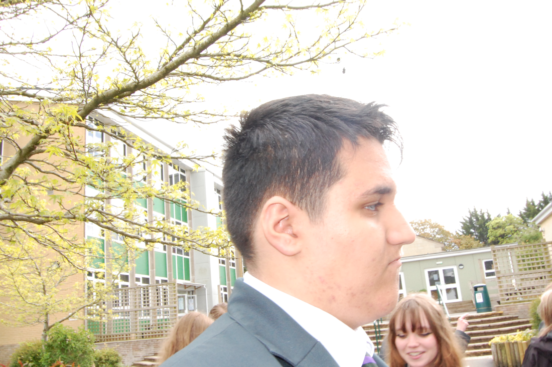
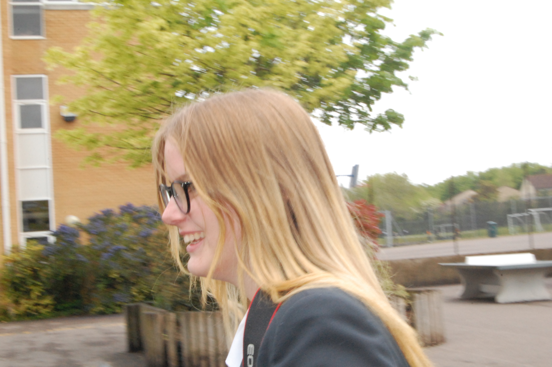
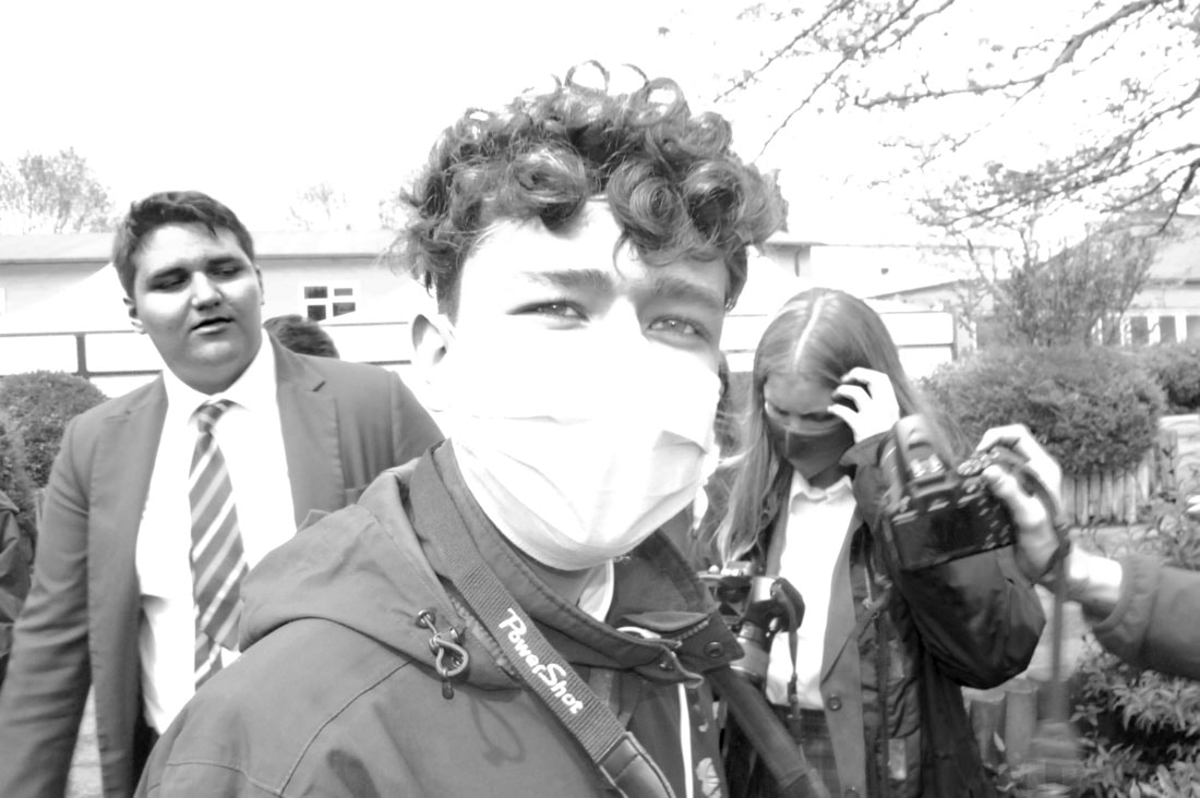
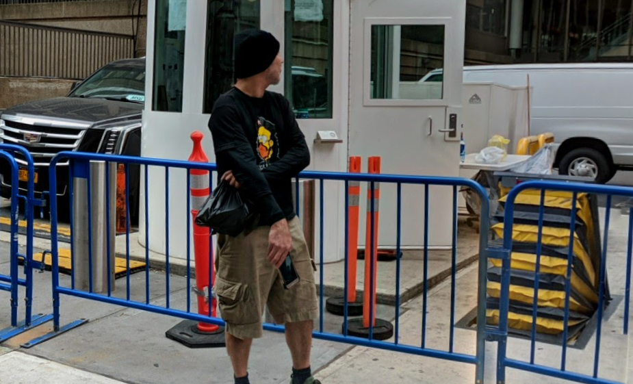
1
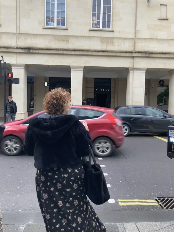
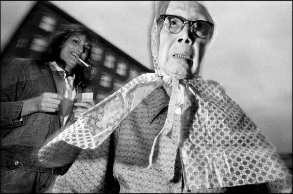
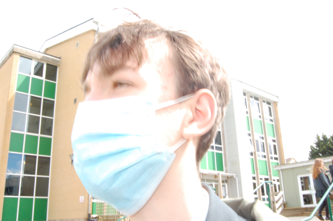
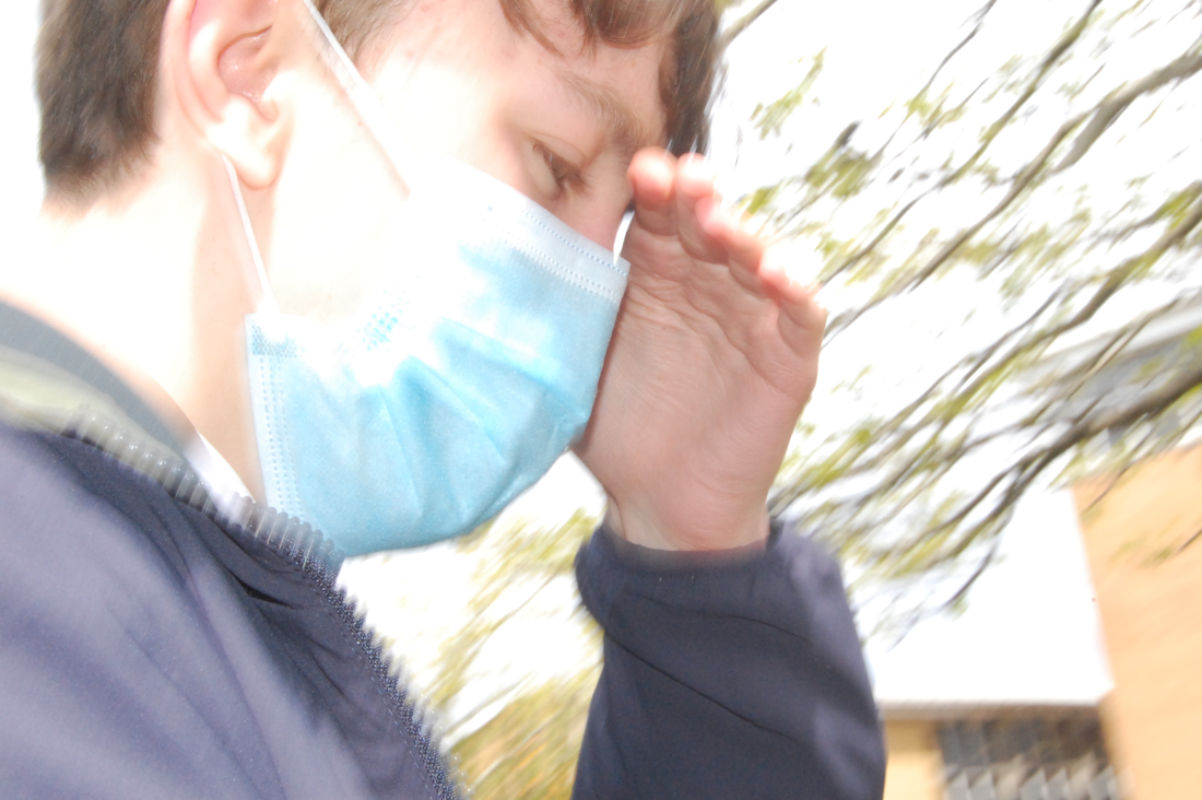
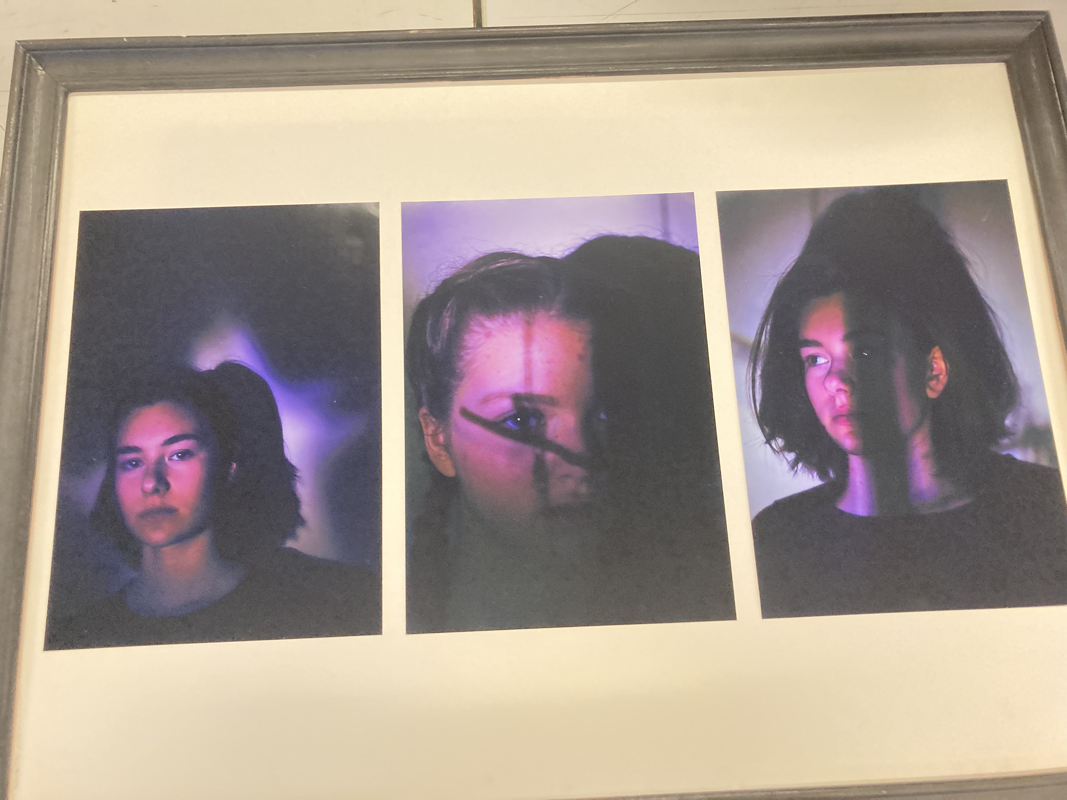
Bruce Gilden
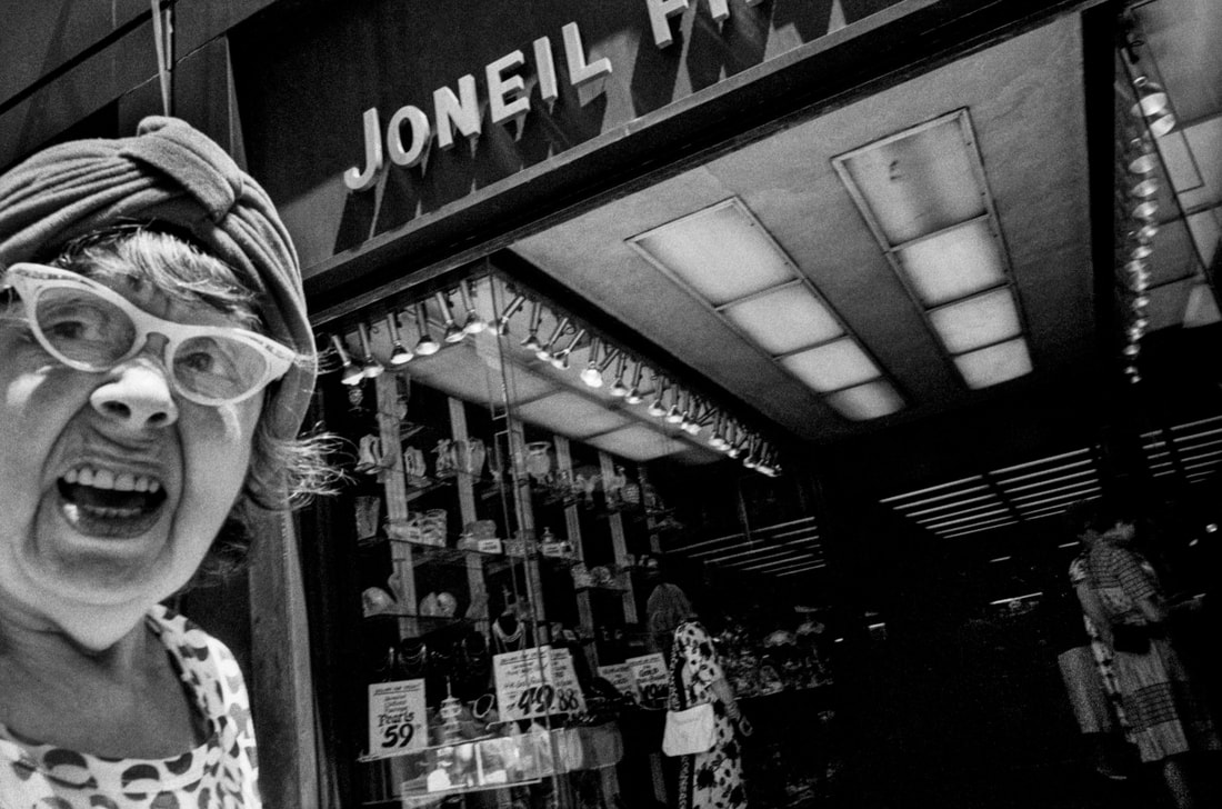
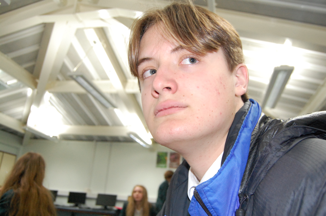
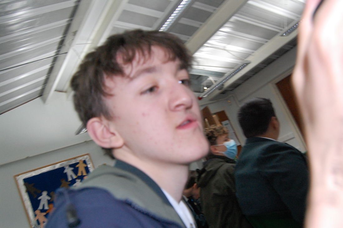
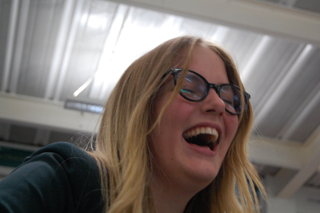
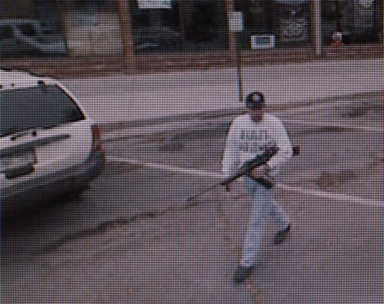
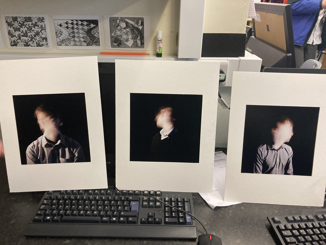
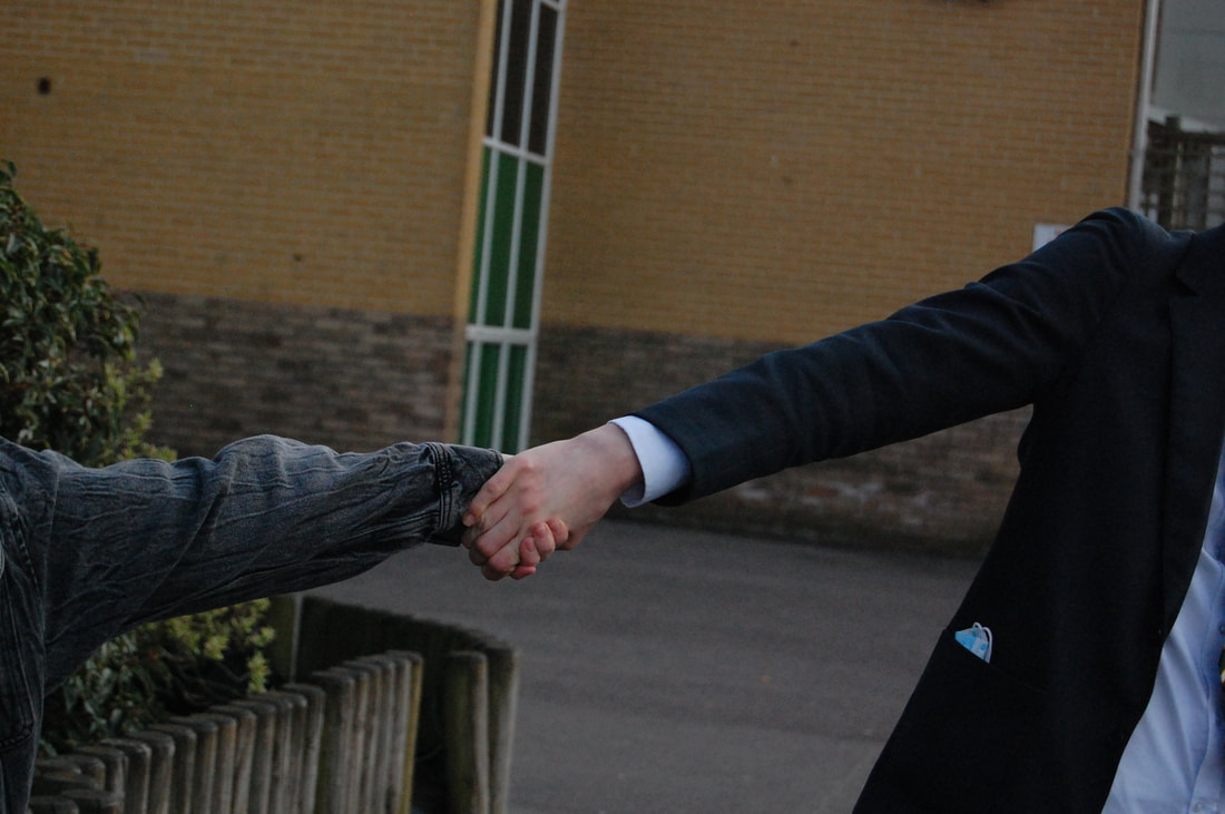
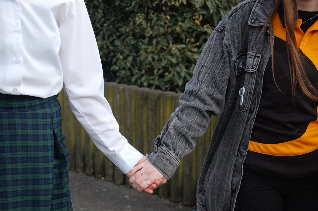
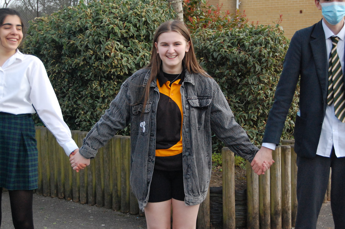
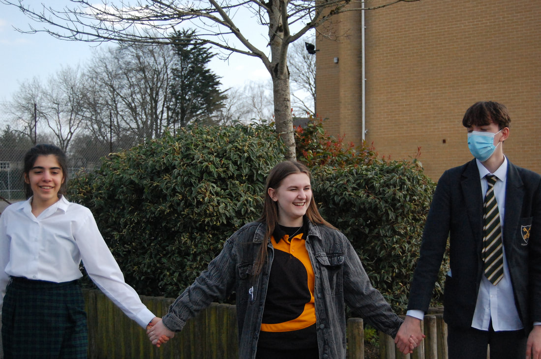
It is interesting how different everyone's reactions were to their photo being taken at so close and unexpected and I think it's an unusual type of way to take street photographs. If I had to take photos like these I think I would feel uncomfortable and awkward because I would be invading their personal space. I don't think some of these people wanted to be in the photos but they weren't really given time to react or say no to Gilden. However, some people were smiling so maybe they didn't mind. Gilden's approach to street photography is an interesting way to capture the streets and is very different to every other street photographer I've looked at.
|
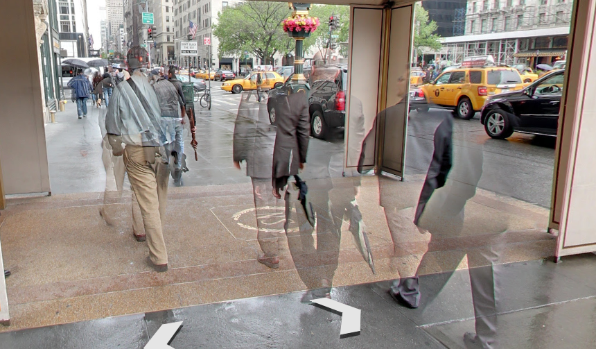
This photo is by Bruce Gilden and he uses a wide camera angle and a flash for lighting. He's used a slightly longer shutter speed to give it a ghosting effect. This means the outlines of the people aren't clear and are blurry. Gilden's photography is often right in peoples faces so he has the camera very close to the subject. You can tell he's taken the photos really quickly because of their expressions on their faces, the old women who is closest to the camera is surprised and the younger women in the back is laughing.
|
|
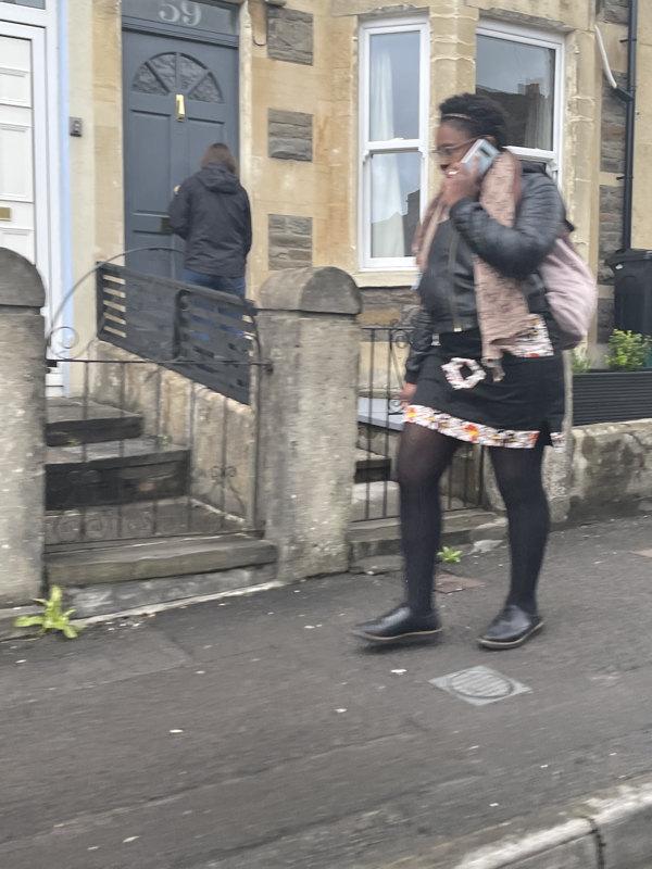
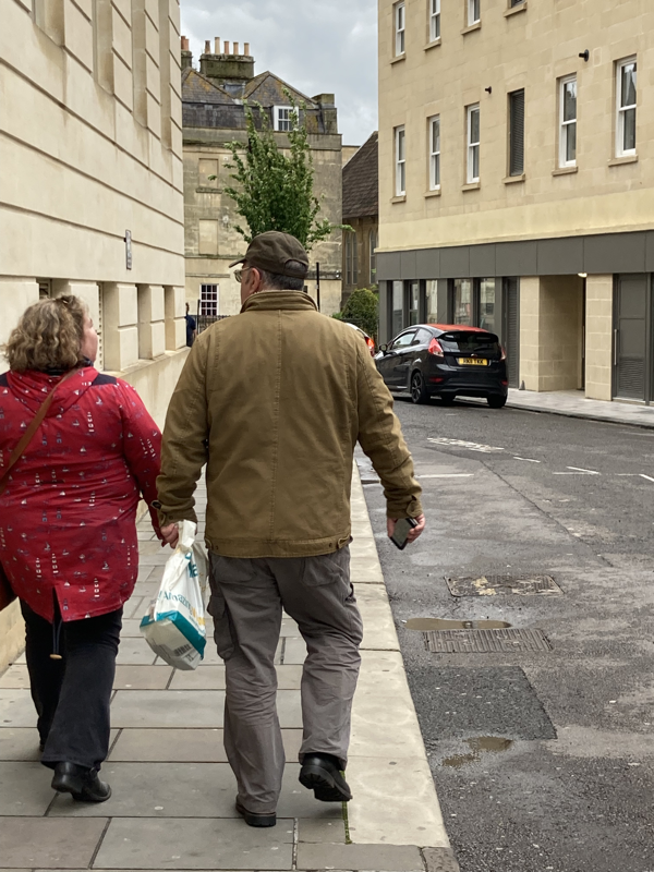
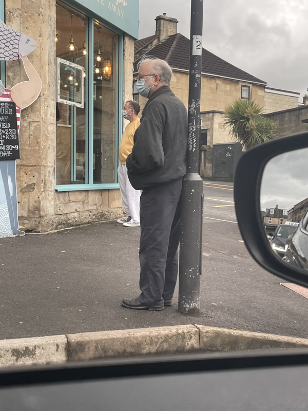
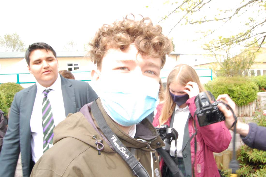
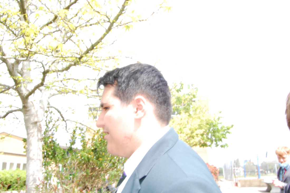
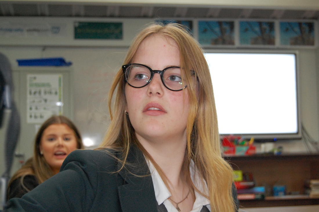
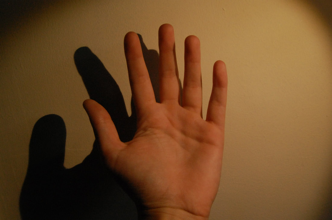
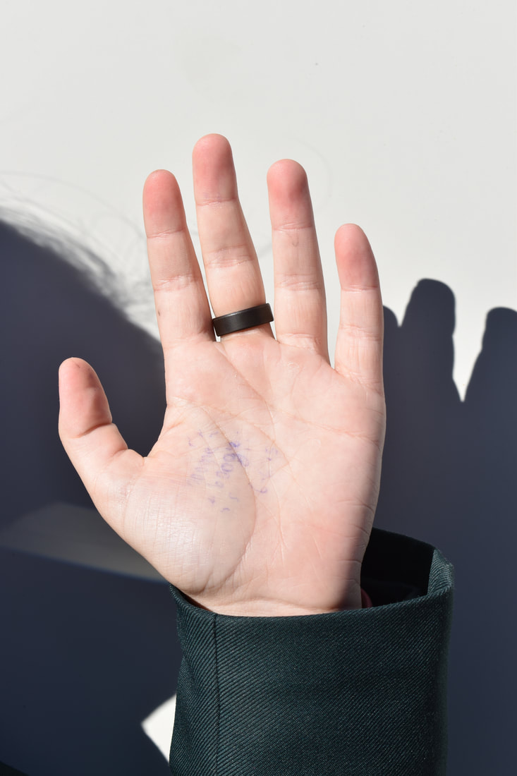
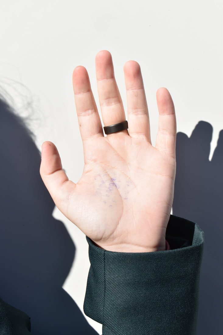
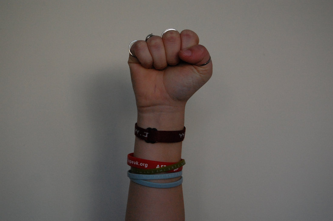
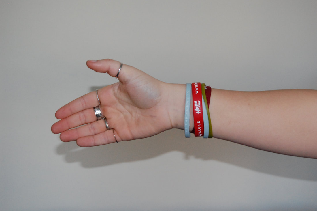
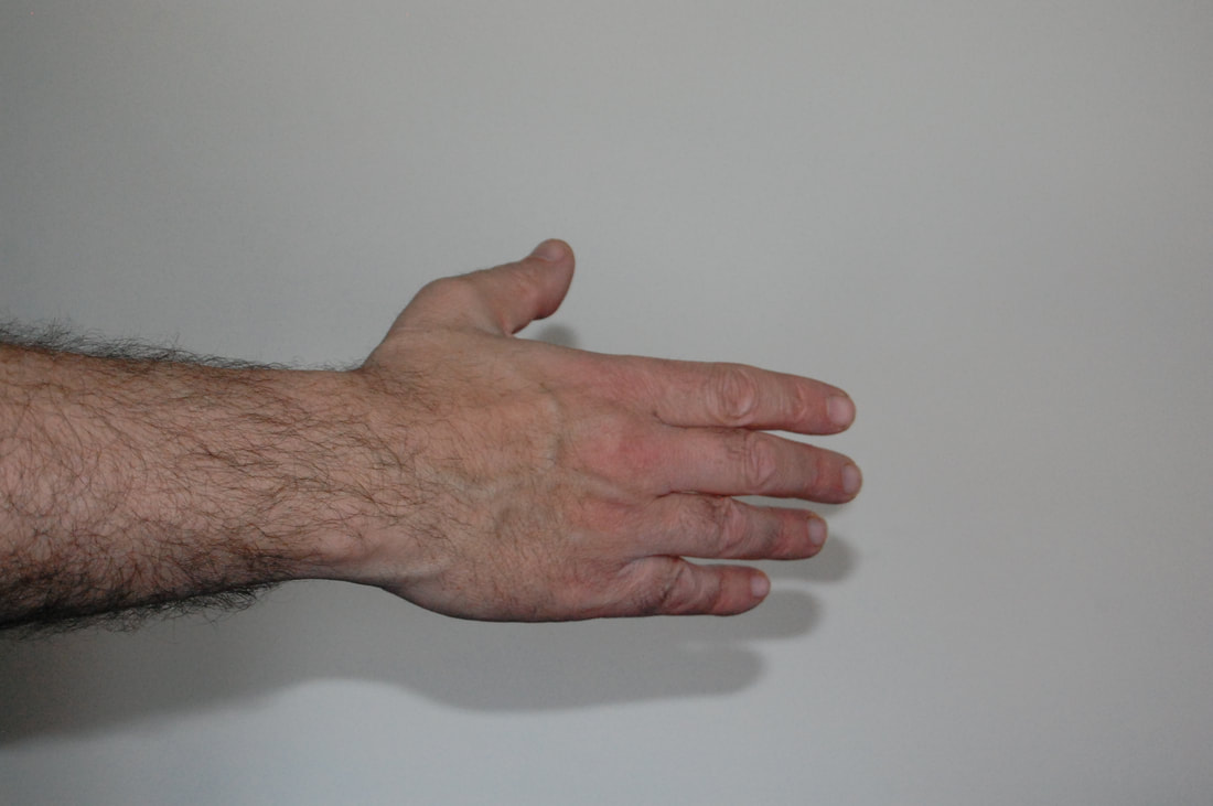
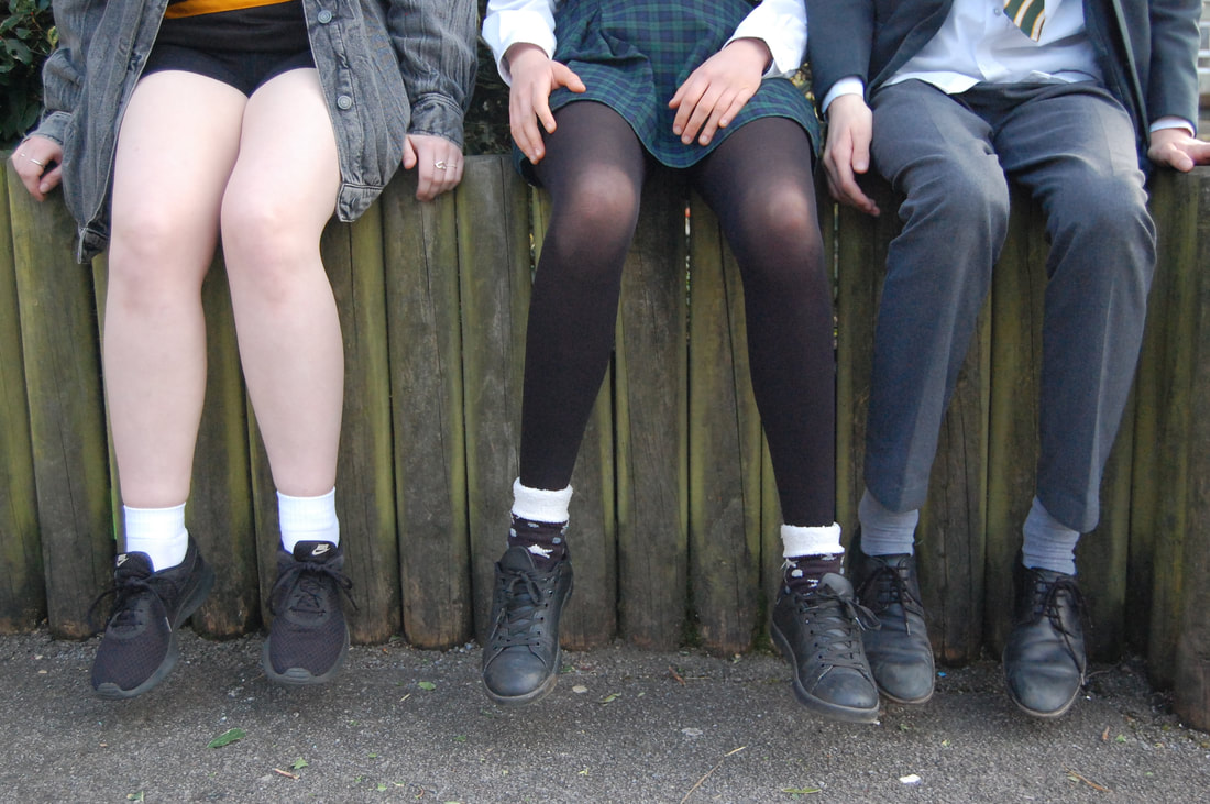
My photos
2
Edits
Shoot review:
WWW: I think I captured people in a similar way to Gilden and tried to capture people's imperfections.
EBI: Not have as many photos of people smiling and try to catch them off guard like he does.
WWW: I think I captured people in a similar way to Gilden and tried to capture people's imperfections.
EBI: Not have as many photos of people smiling and try to catch them off guard like he does.
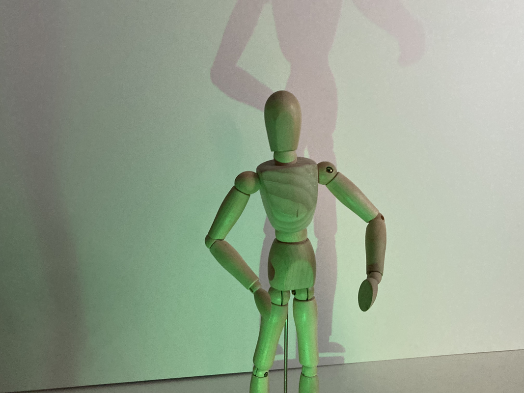
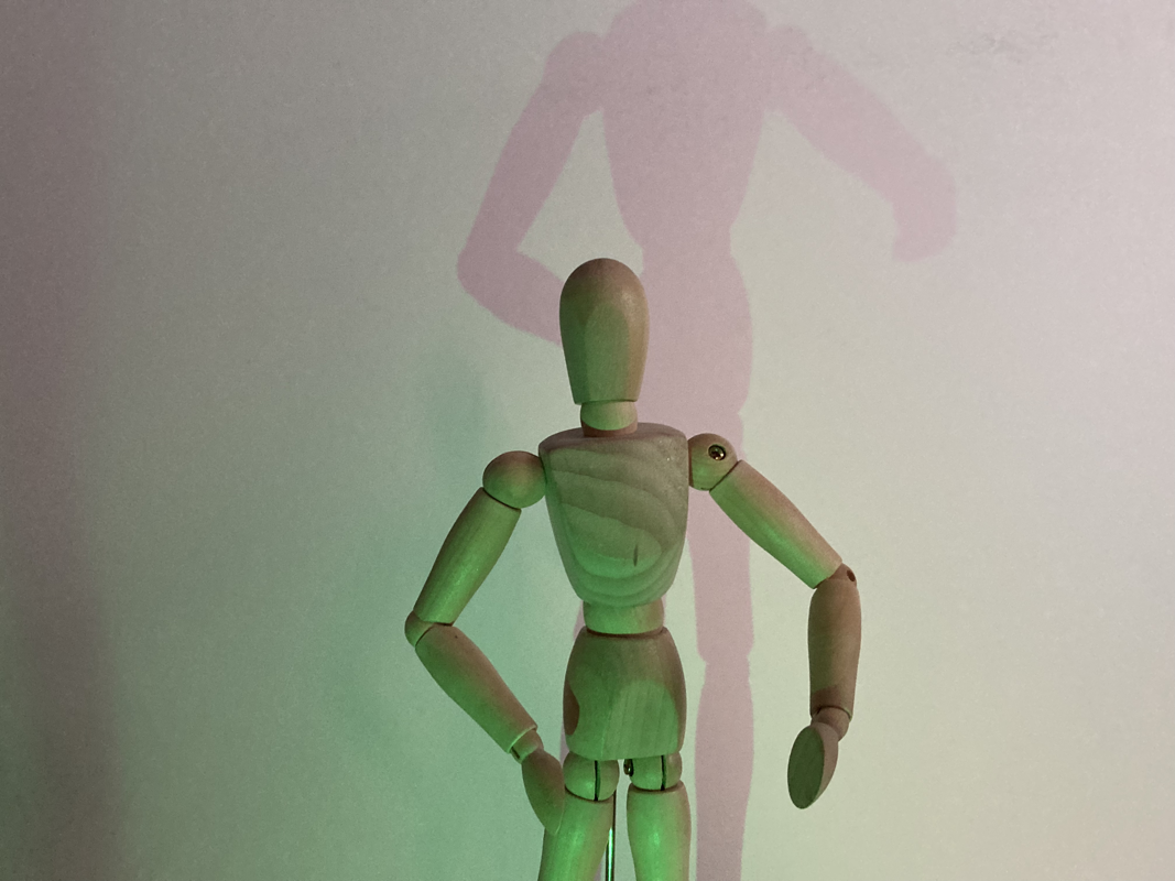
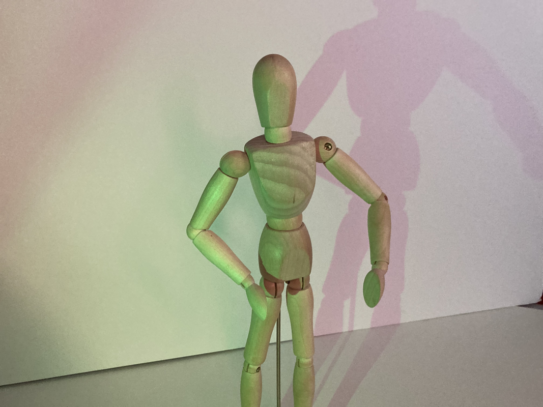
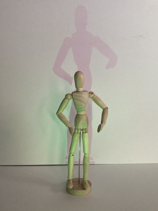
The Human Condition
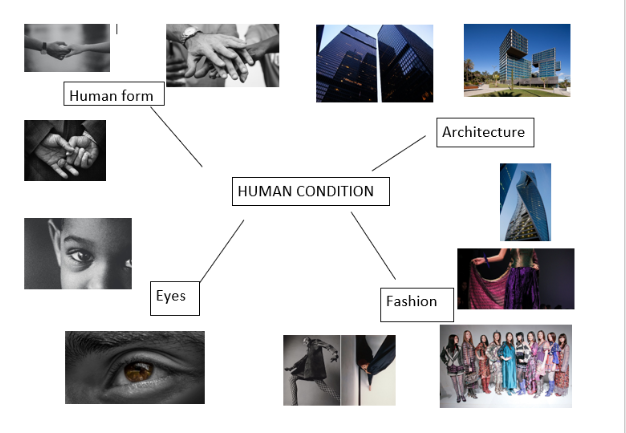
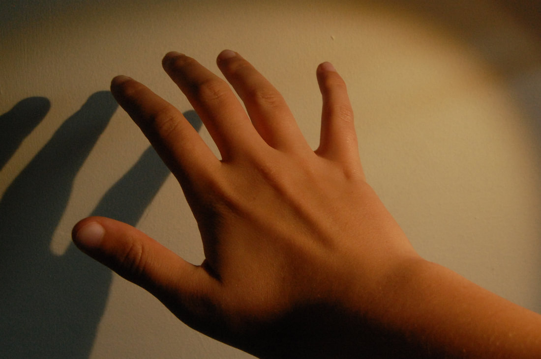
For the Component 1 project 'The Human Condition' I will be investigating the theme of the human form. I chose this theme because I think its interesting how many ways you can capture photos of a human and you can take them is so many different ways. I think John Copeland is a good example of the human form in photography as he highlights every little crease or wrinkle in his photographs. I think its an interesting way to display the human body and my initial thoughts of the theme is that I think it will be fun taking the photos and setting them up. My theme can be explored by using different shutter speeds and apertures with the photo ideas I have in mind and explore different angles and how close I am to the object.
Shoot 1
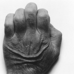
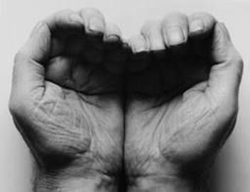
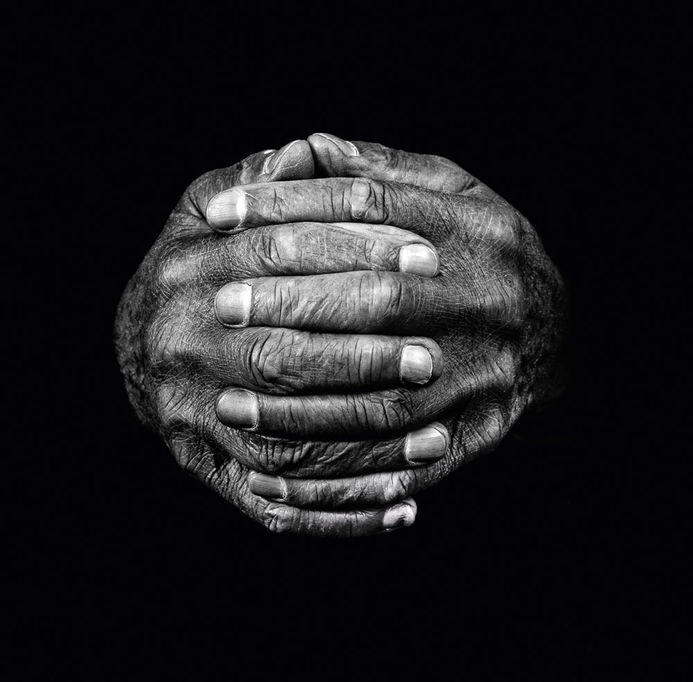
John Copeland

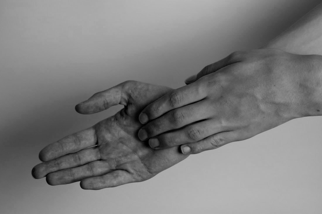
|
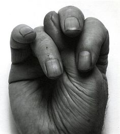
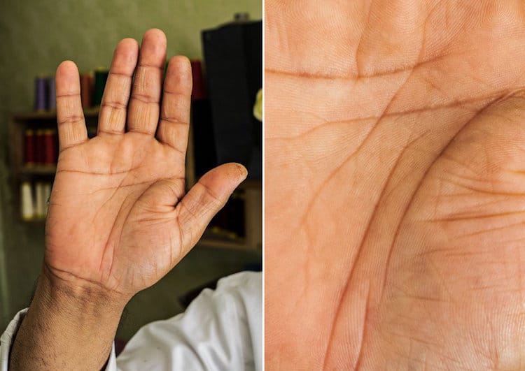
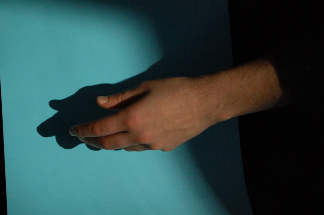
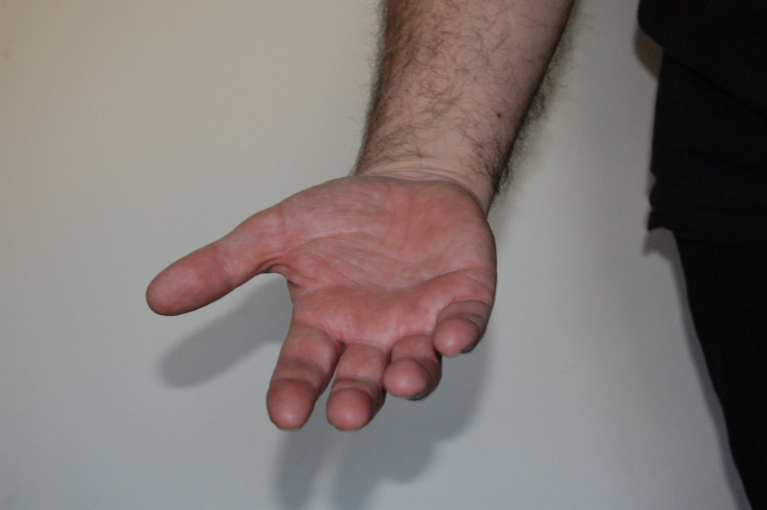
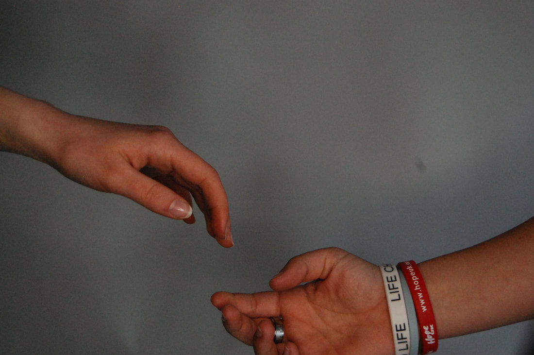
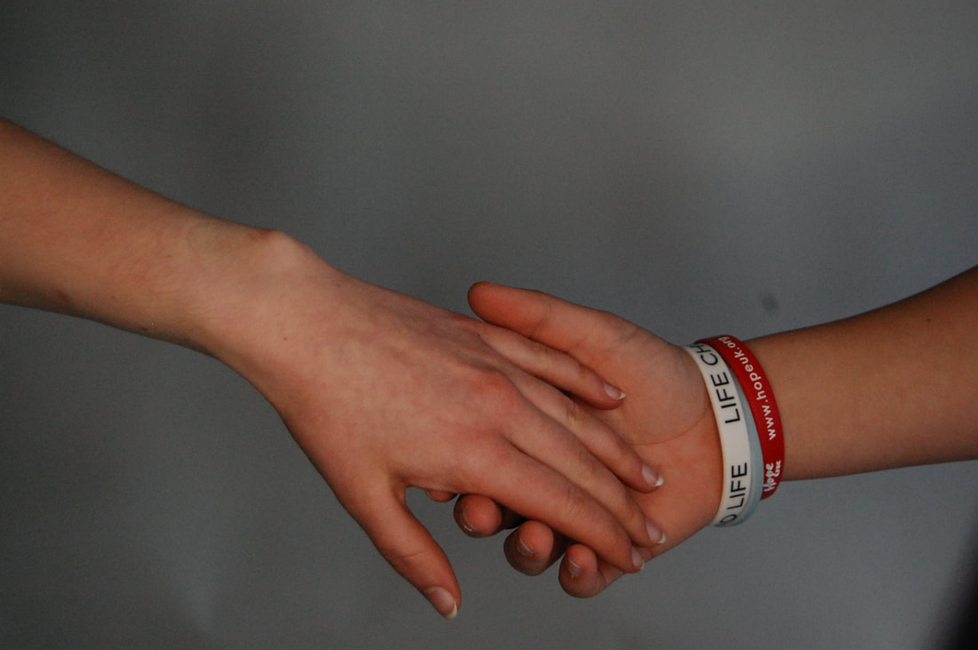
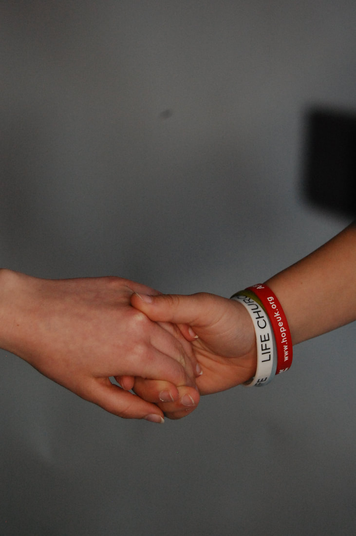
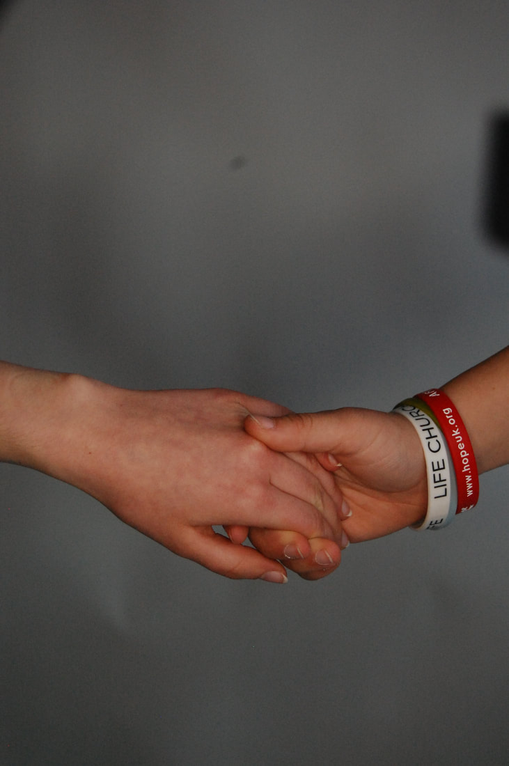
This is a photo by John Copeland. The areas that appear the sharpest to me is the line of the nails from the way the hands are cupped. The lighting is quite dramatic in this shoot because you can see its been placed behind the hands to form the shadows in the palm of the hand. I think it would've been taken in a studio or somewhere with a white backdrop as there isn't any natural light. The lines in this image are the outline of the hands which are straight and curved in some places. The creases and wrinkles in the palm makes lots of straight and jagged lines which make you think the hands belong to a slightly older person. The shape of the nails are repeated several times and are positioned next to each other in a pattern. The subject appears 3D because of shadows on either side which give the appearance of a 3 dimensional object. This image is very focussed so a large aperture was used which means letting more light in the lens giving the image a shallow depth of field. The tones are dark and light in this photography from the way the light is placed but it is all mostly dark greys/ blacks from the editing with the black and white filter.
|
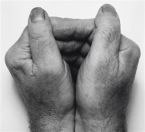
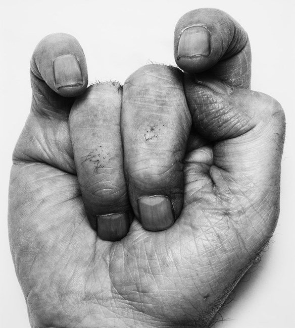
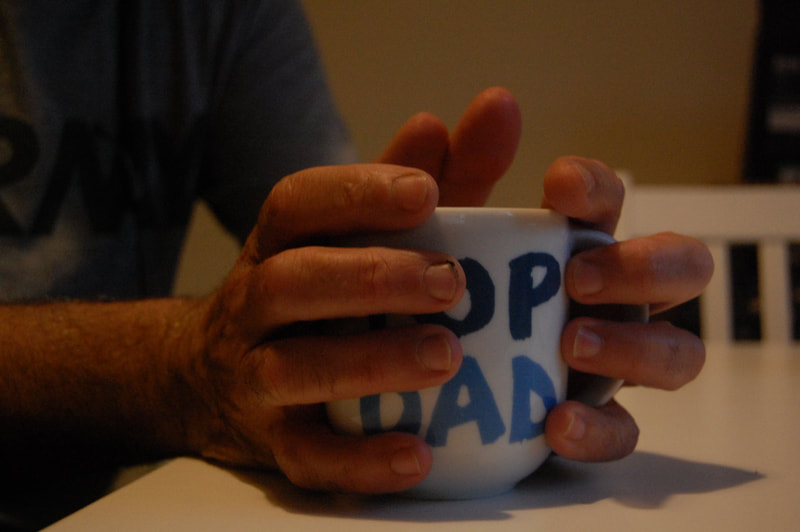
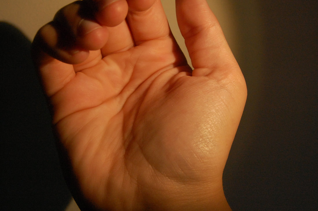
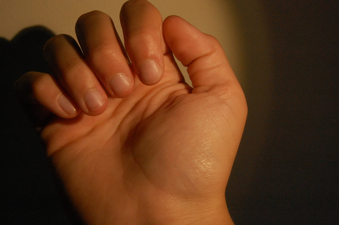
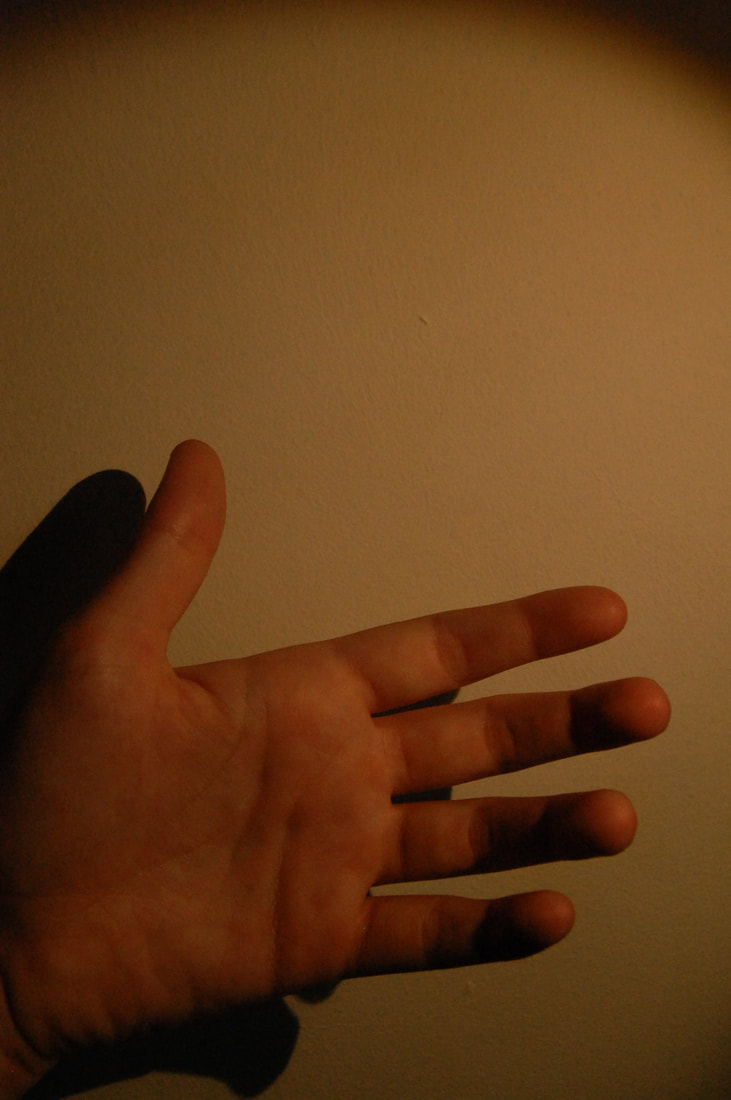
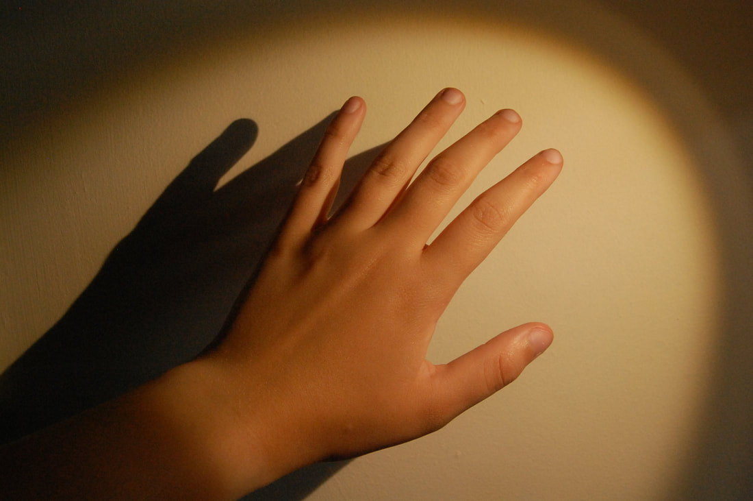
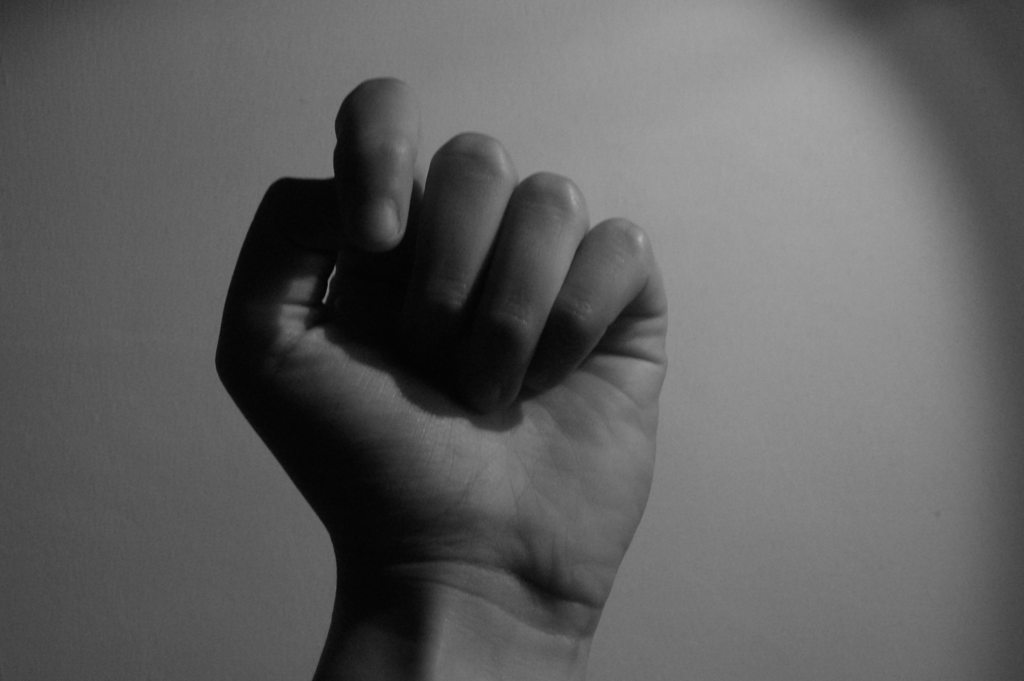
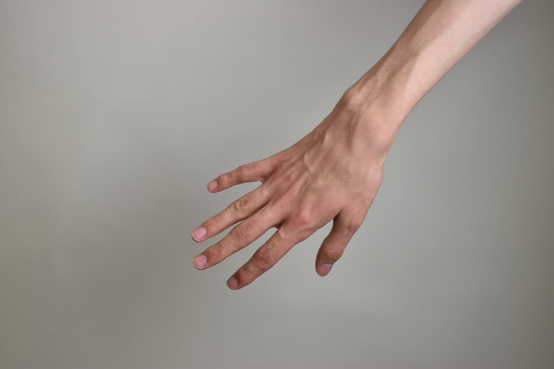
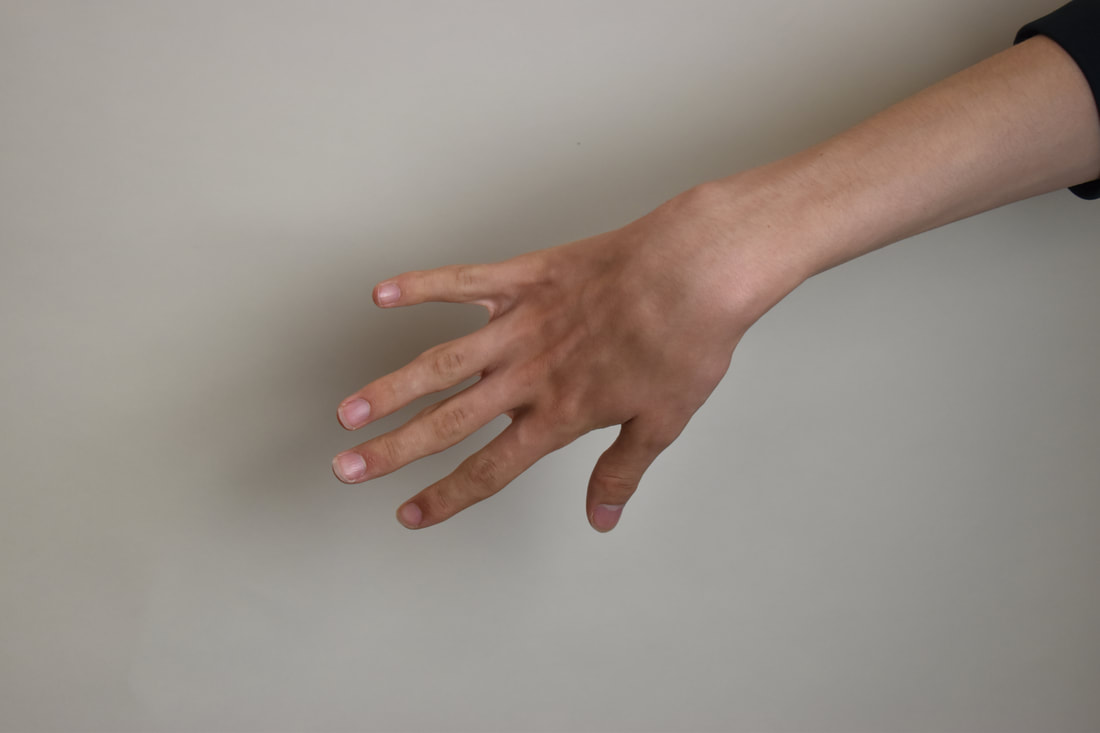
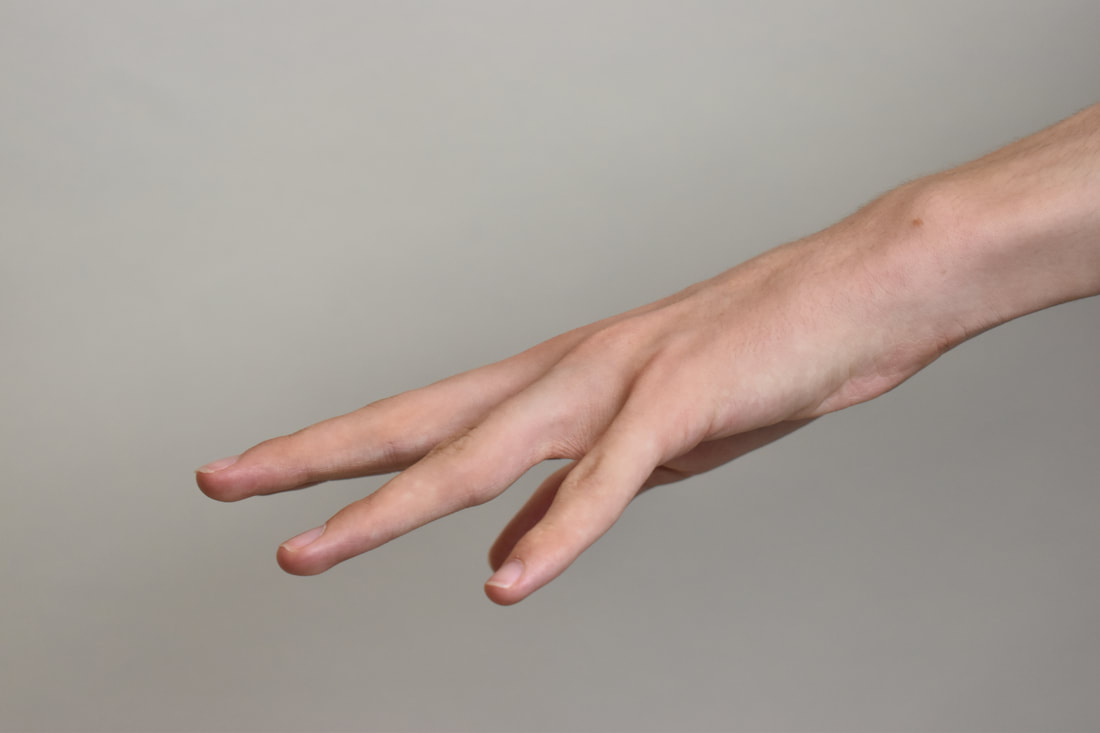
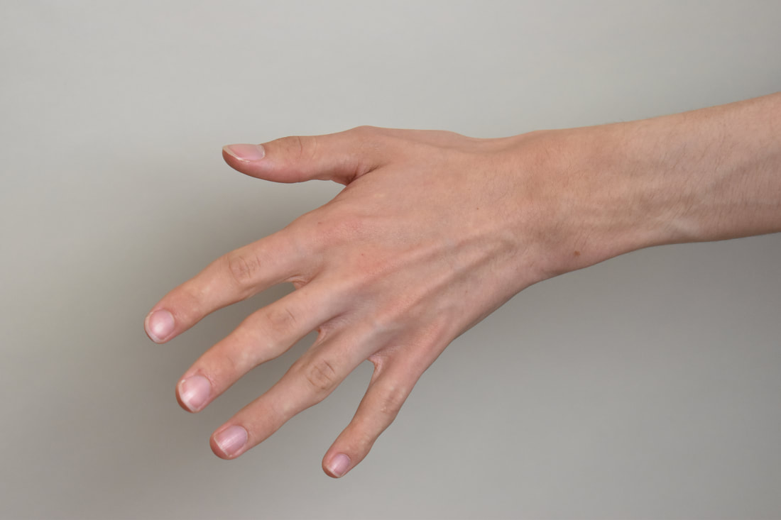
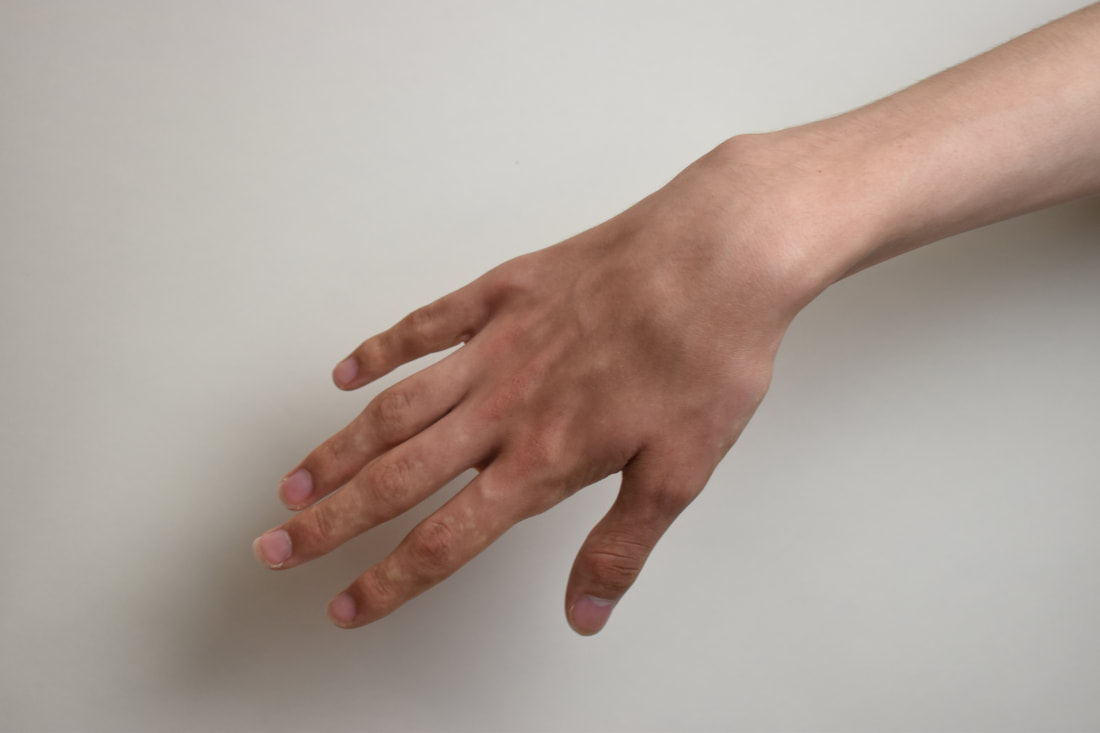
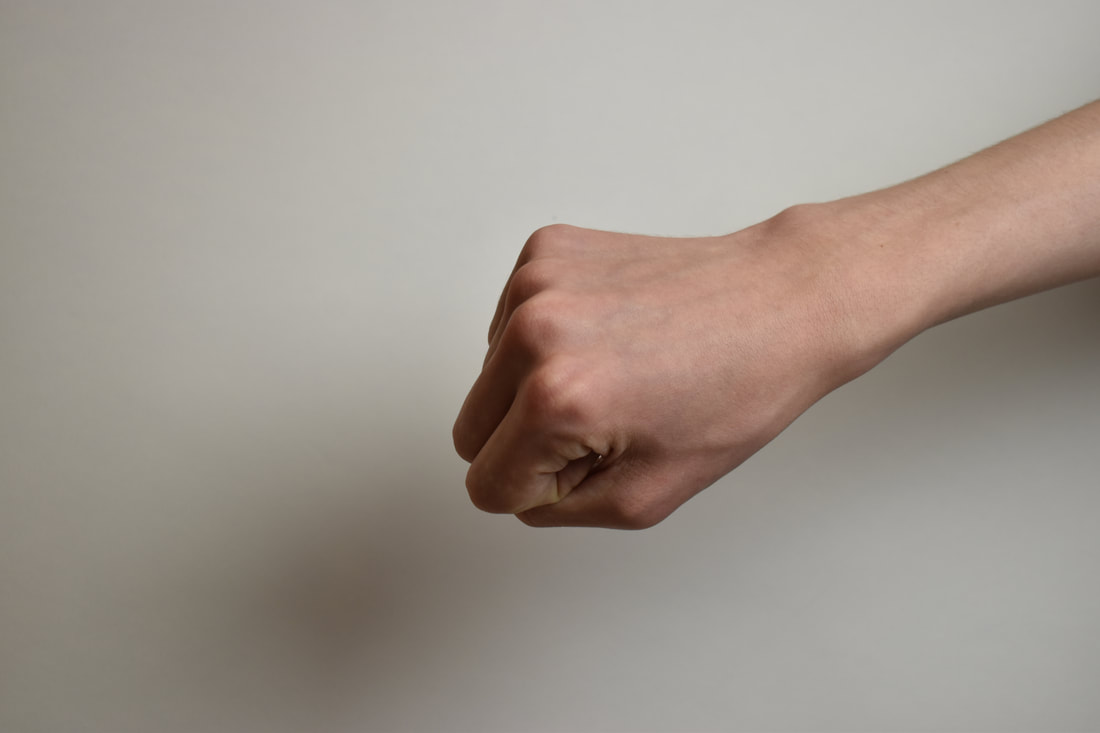
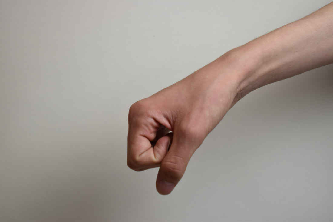
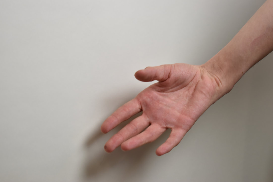
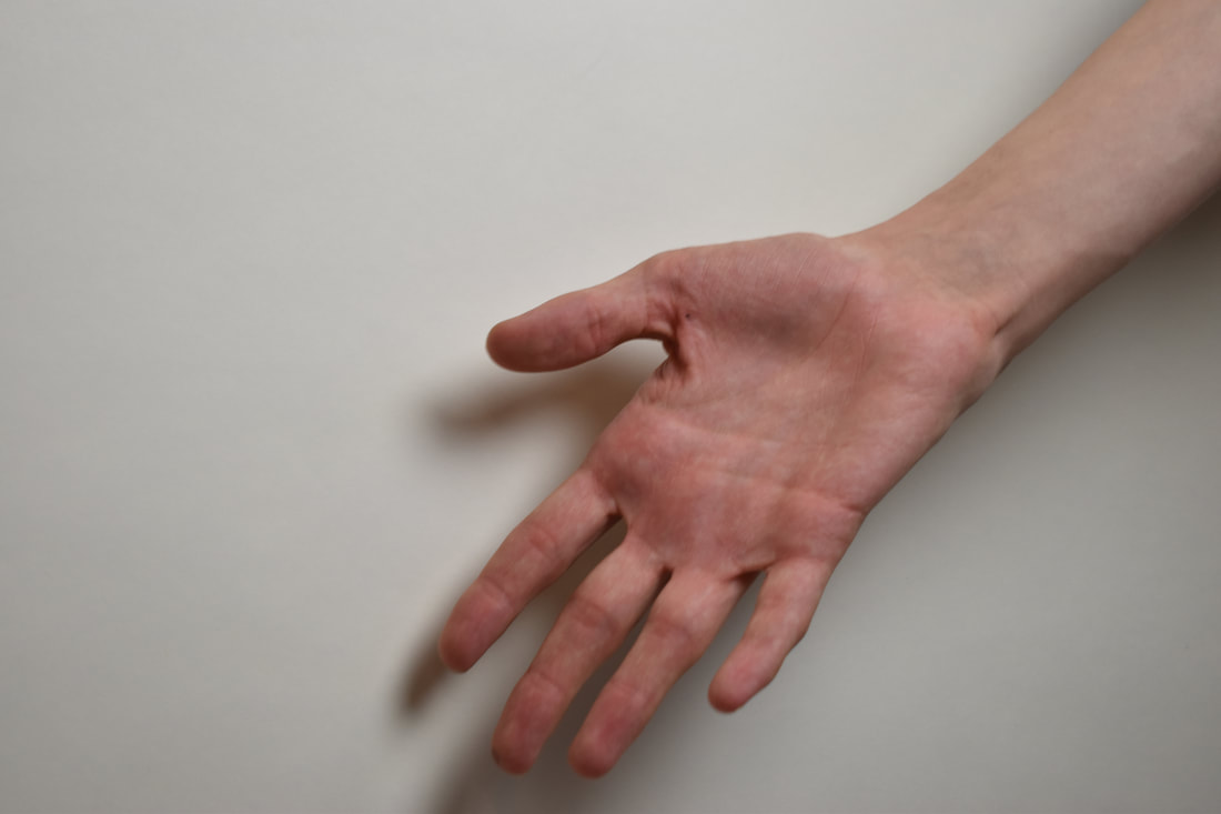
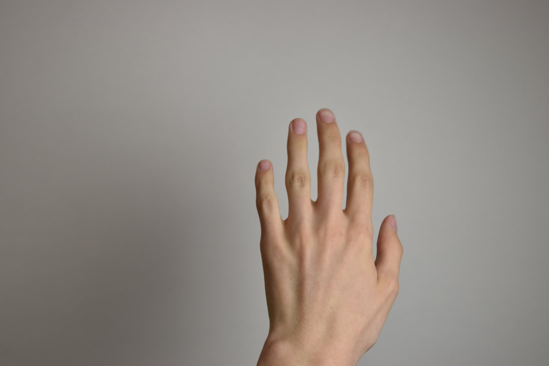
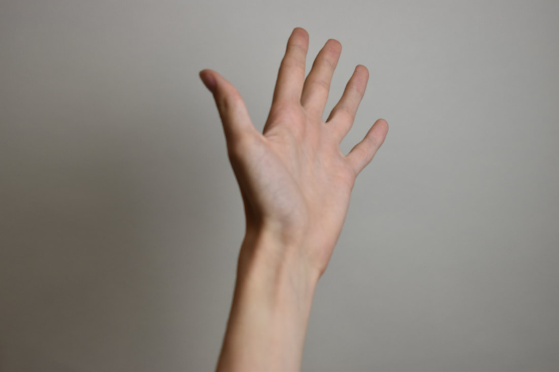
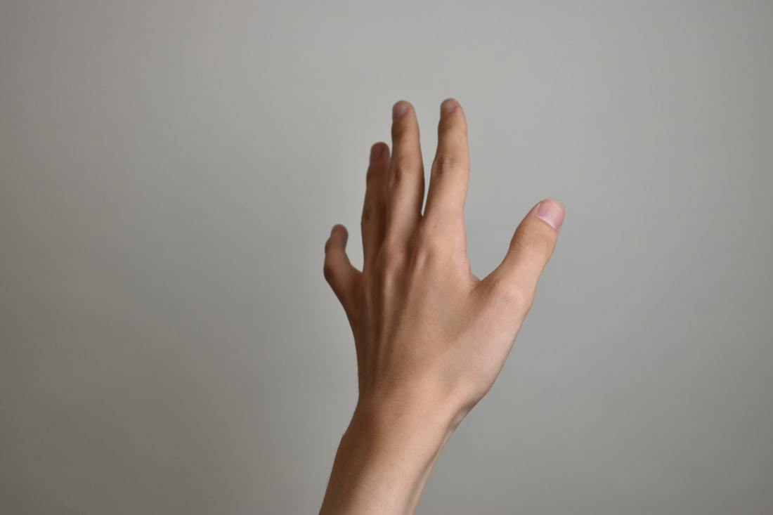
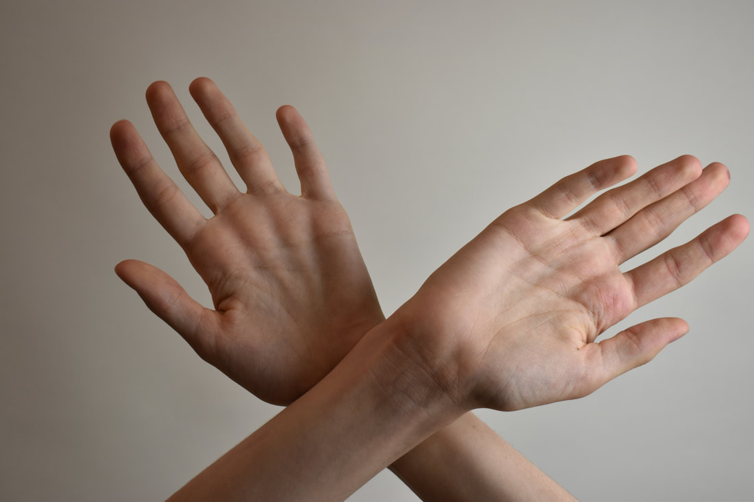
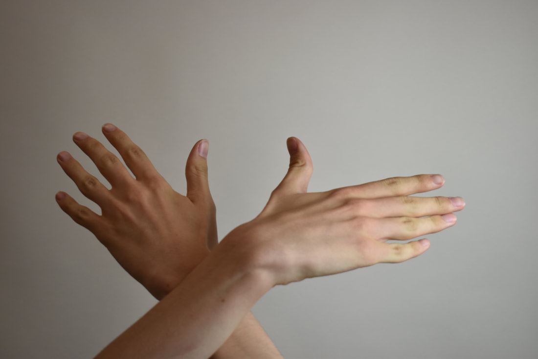
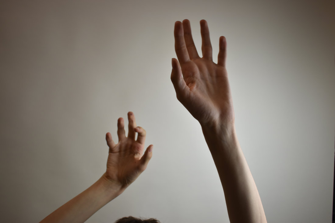
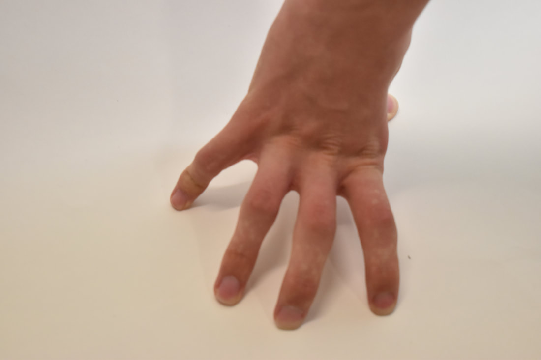
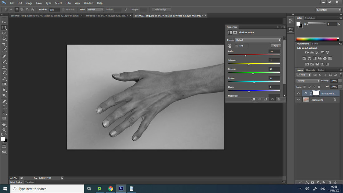
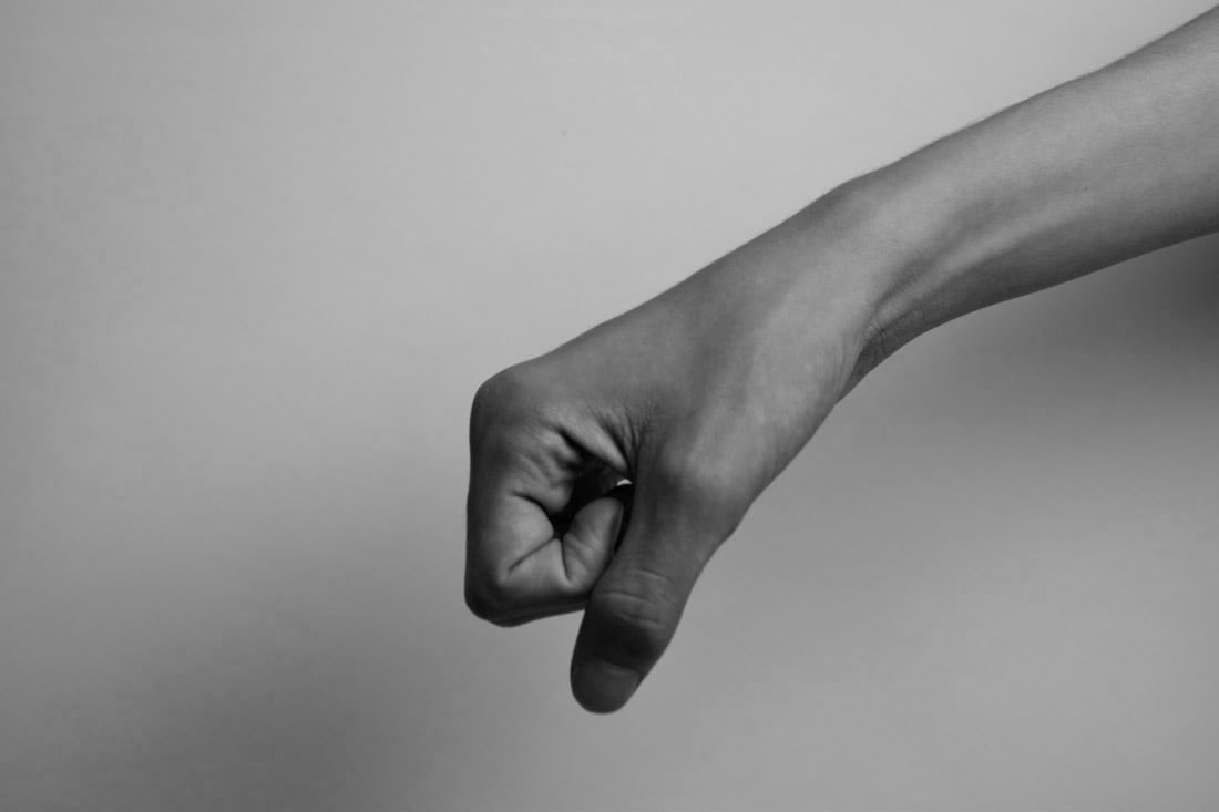
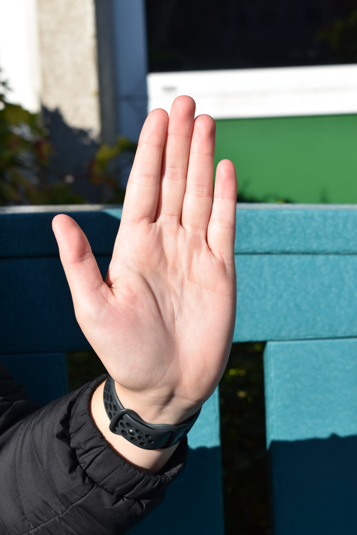
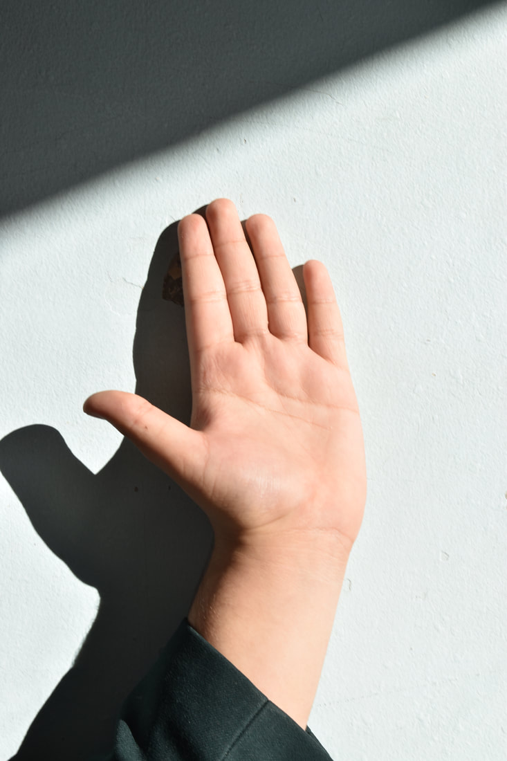
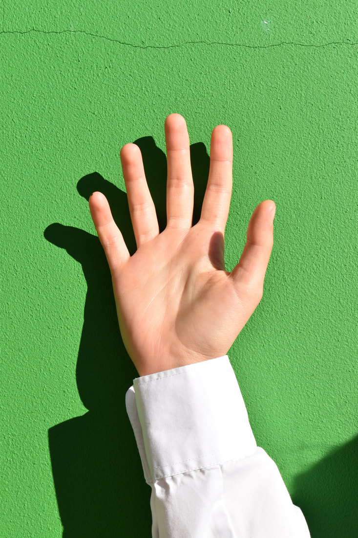
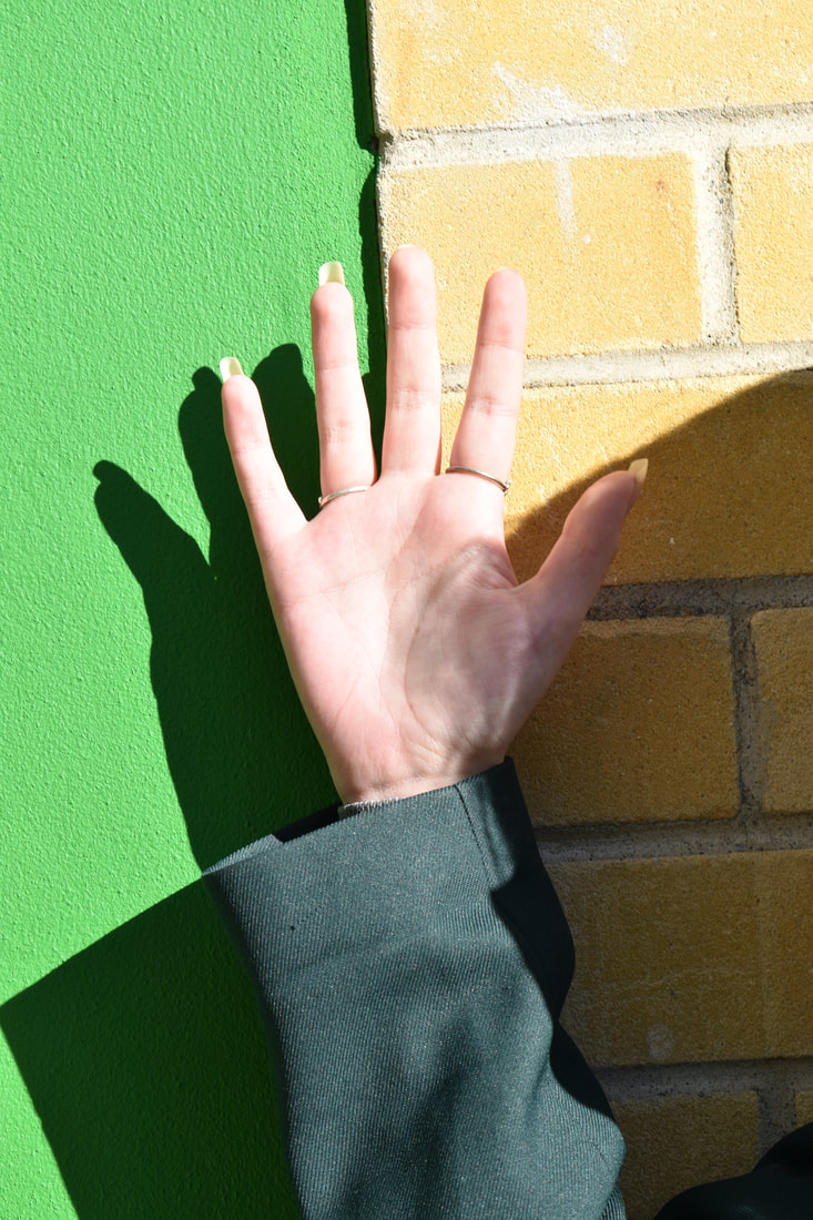
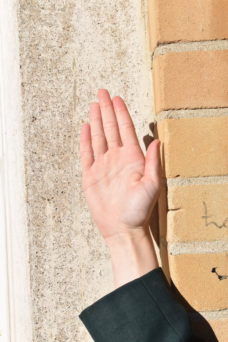
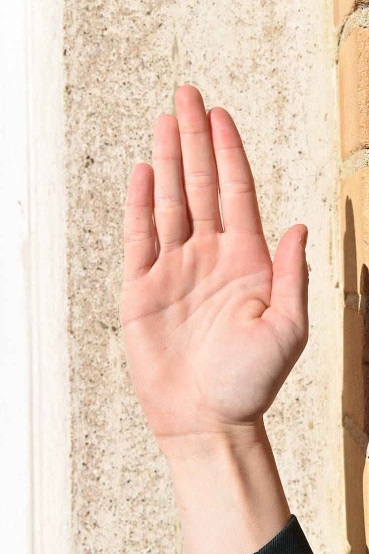
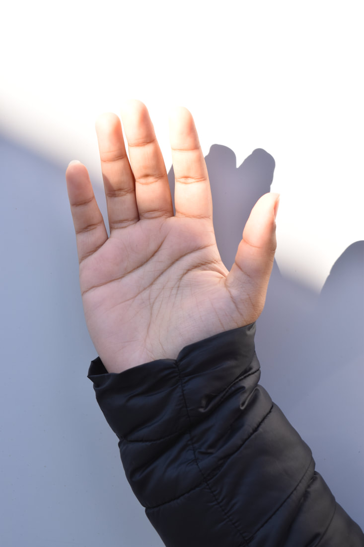
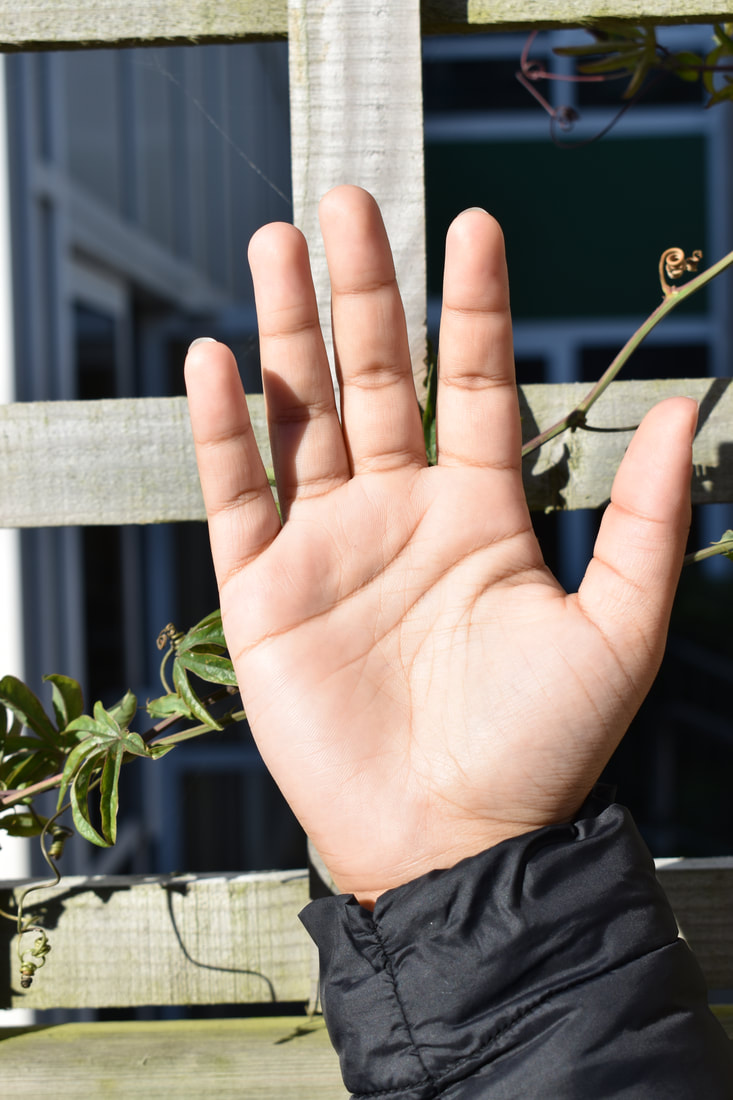
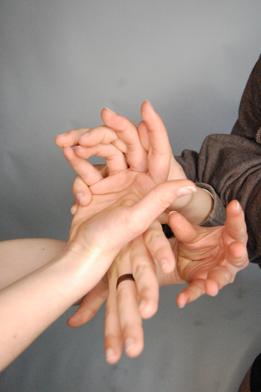
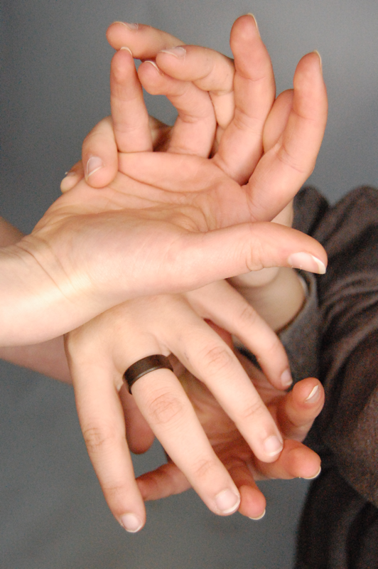
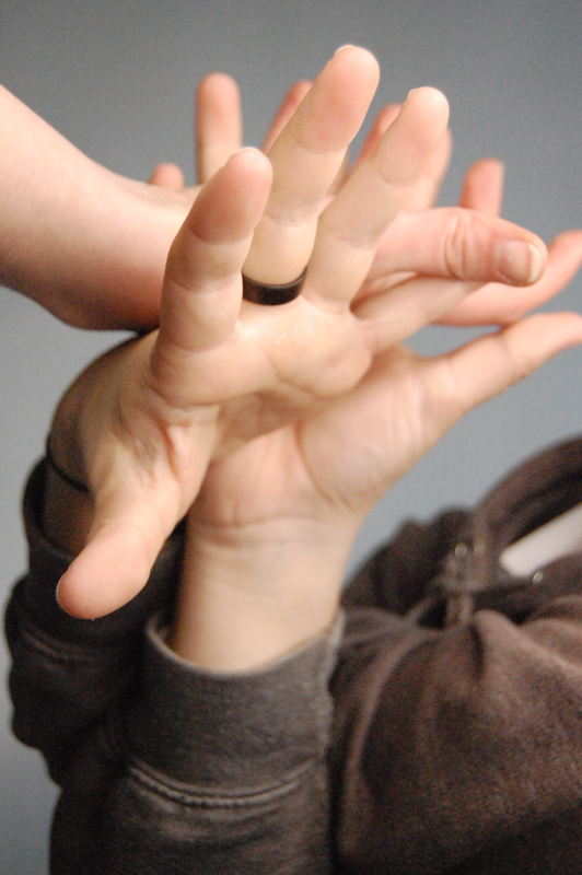
My photos
3

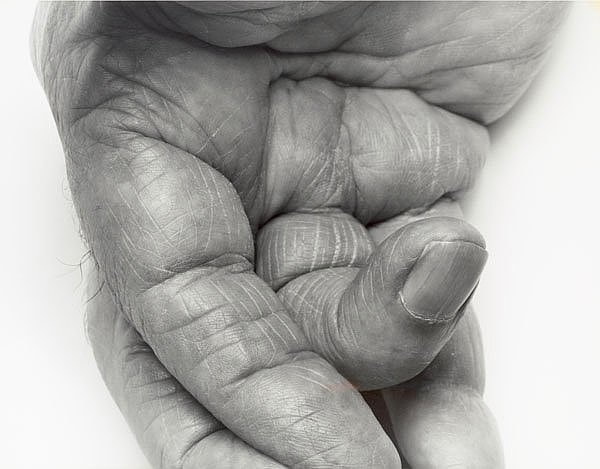
My photo |
John Copeland's photo |
|
|
Shoot review
WWW: I think that my shoot went well as I did two shoots on different aged hands for a variety of photos and i am pleased how they turned out.
EBI: try and edit my photos a bit better to be similar to the photographers.
WWW: I think that my shoot went well as I did two shoots on different aged hands for a variety of photos and i am pleased how they turned out.
EBI: try and edit my photos a bit better to be similar to the photographers.
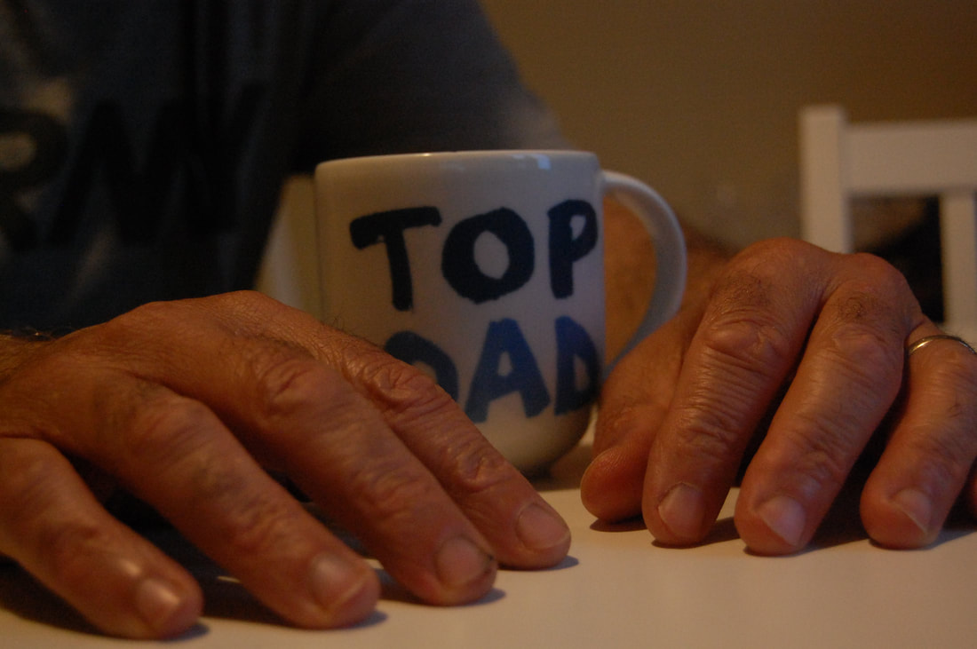
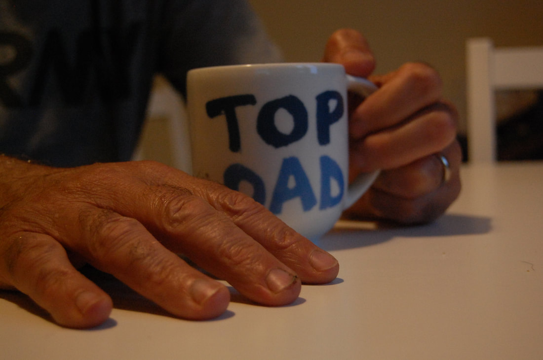
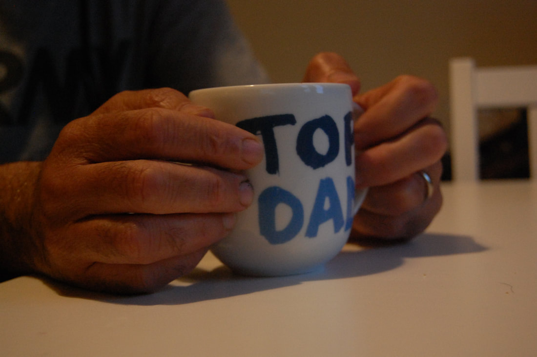
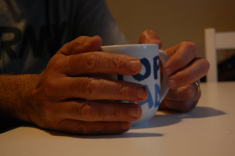
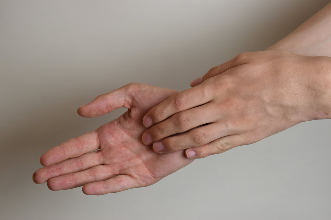
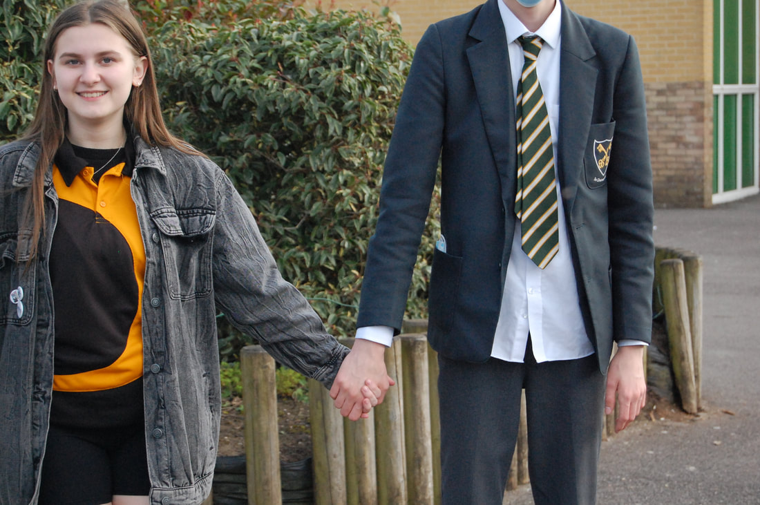
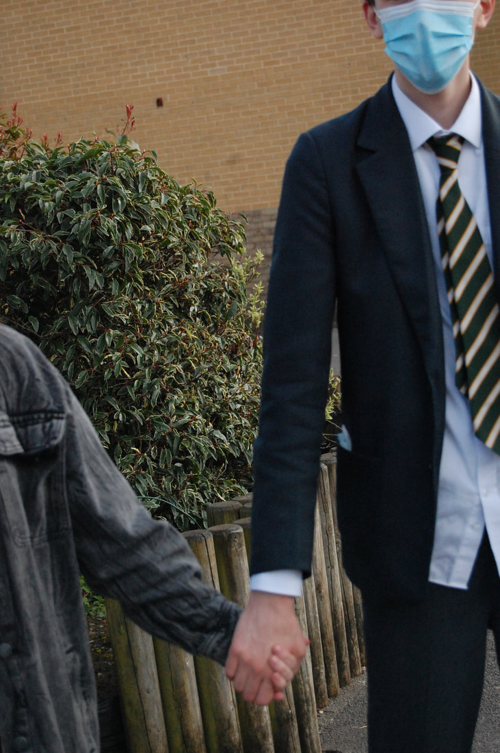
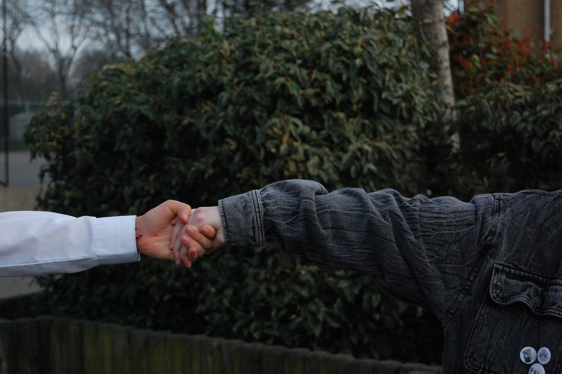
Shoot 2
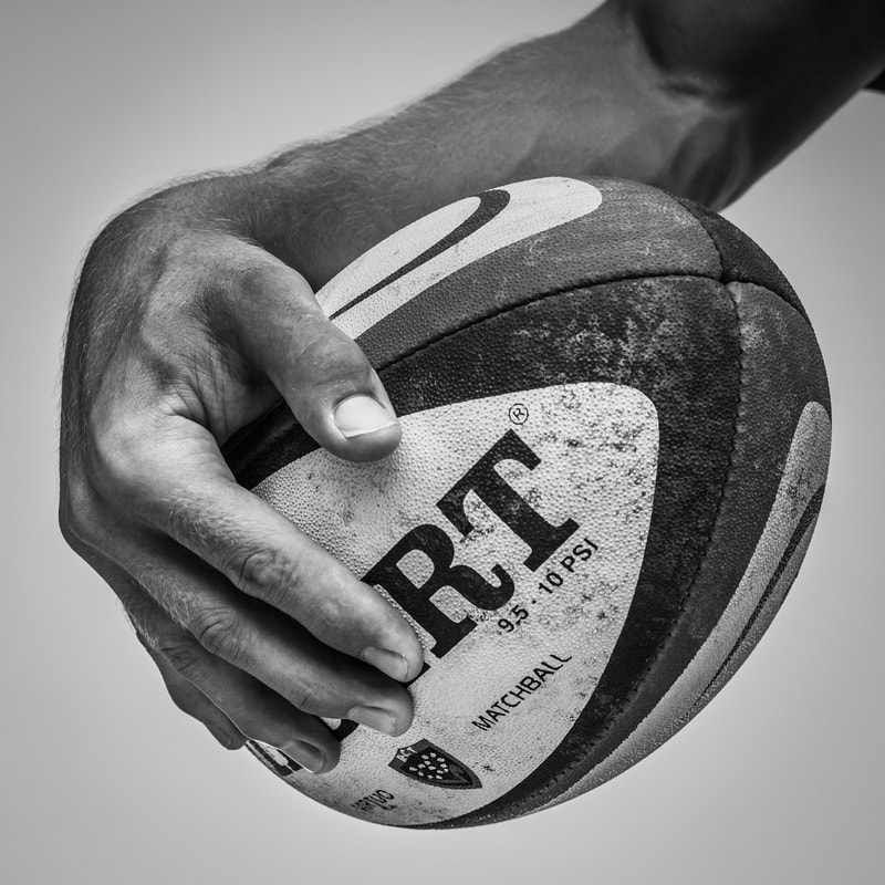
Tim Booth
Tim Booth is a UK photographer who believes that a hand tells a more honest story of what a person has been through than the face. In a extensive photographic study, Booth has turned peoples hands into an alternative form of portraiture. "When you look at just the hands, your mind is free from pre-conceptions and is able to imagine the whole life of a person, their completeness, rather than just the aesthetic of a face" - Tim Booth.
|
|
This is a photo taken by Tim Booth of Jonny Wilkinson a rugby player. "Hands are massively important in rugby, its not just a question of manipulating the ball, my hands play a vital role in communication on the pitch". The photo displays him holding a 'Gilbert' rugby ball and would've been taken with a white back drop and is well lit with a photography light, which looks to be directly on the subject. Booth would've used a black and white filter or used a grey scale to edit this photograph as there is no colour. The depth of this image is deep and there is lots of negative space which makes you focus on the player holding the rugby ball. The dominant lines in the image are the curved seems of the ball which are quite thick as they have a lot of texture. The main focus of this photo would be the ball but the hand in front is also very clear which means it was taken on a good quality camera.
|
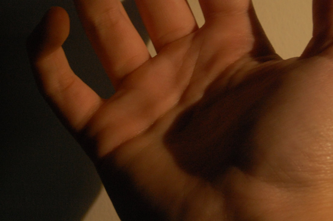
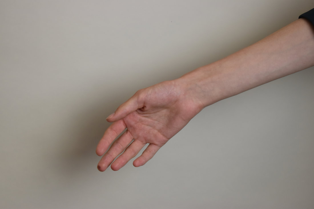
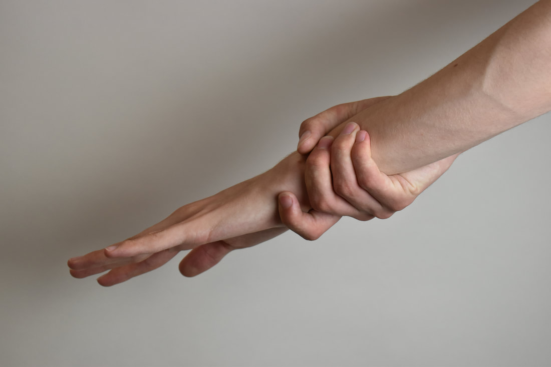
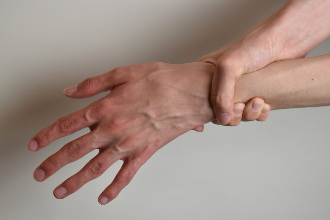
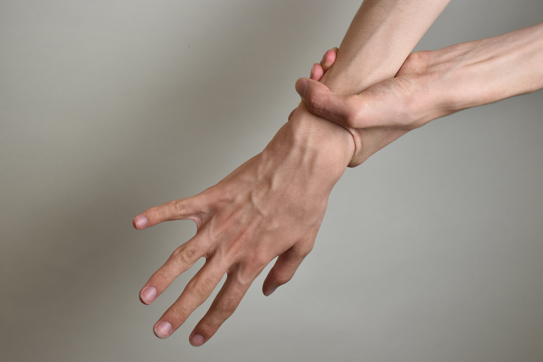
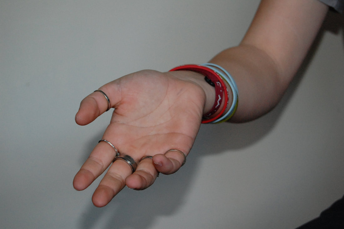
My photos
4
Edited photos and process
Shoot review:
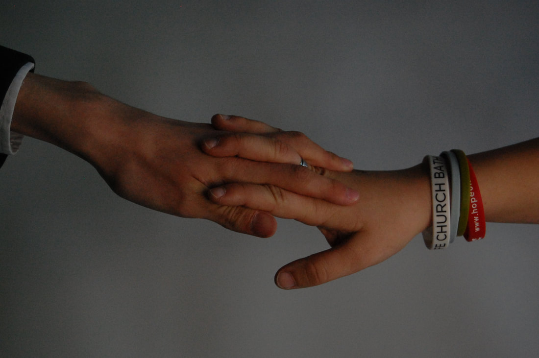
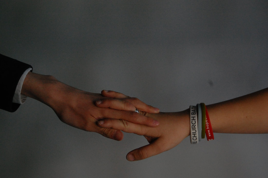
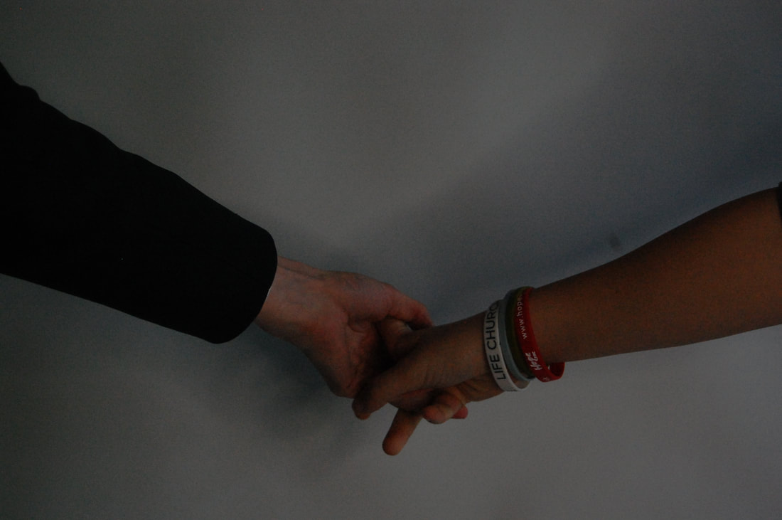
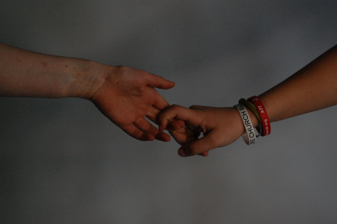
In this shoot have asked my friend to help me take these photos and we used a studio set up with a white back drop and a studio light. I used a 1/250 shutter speed to clearly capture the photos and a f10 aperture allowing more light into the camera and a the lower aperture creates a shallow depth of field, making the background blurry. I think I achieved good quality photos. I think my shoot could have been even better if I had used multiple different hands. My target for my next shoot is to experiment with different editing. This piece of work was influenced by Tim Booth.
In this shoot have asked my friend to help me take these photos and we used a studio set up with a white back drop and a studio light. I used a 1/250 shutter speed to clearly capture the photos and a f10 aperture allowing more light into the camera and a the lower aperture creates a shallow depth of field, making the background blurry. I think I achieved good quality photos. I think my shoot could have been even better if I had used multiple different hands. My target for my next shoot is to experiment with different editing. This piece of work was influenced by Tim Booth.
Shoot 3
Omar Reda
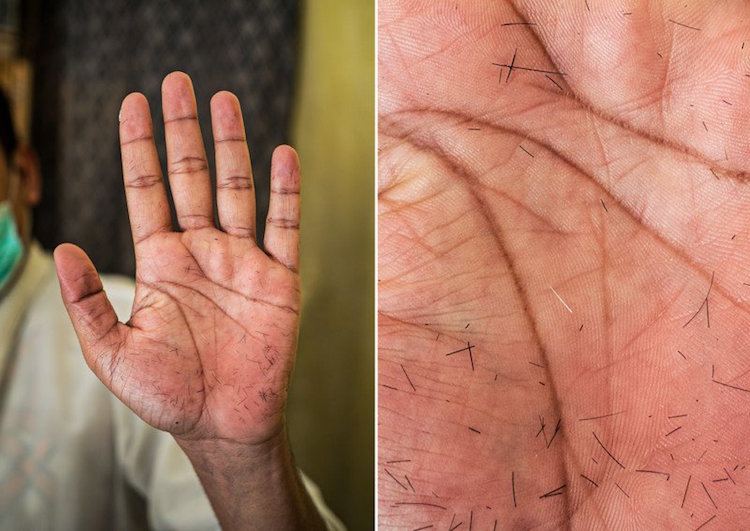
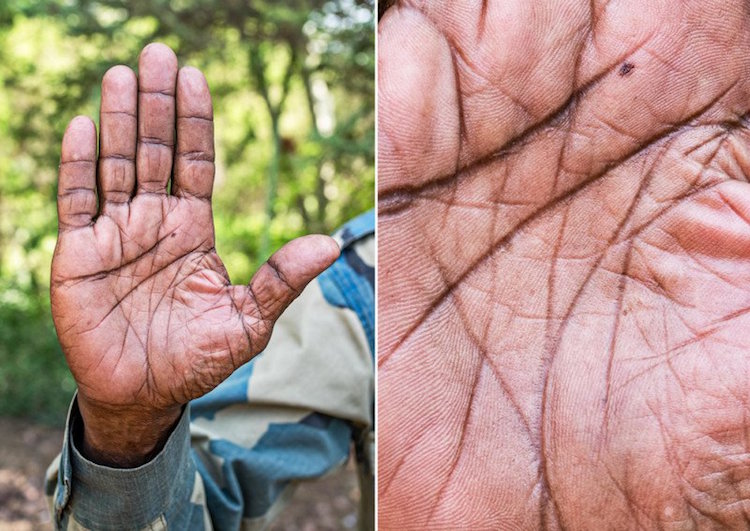
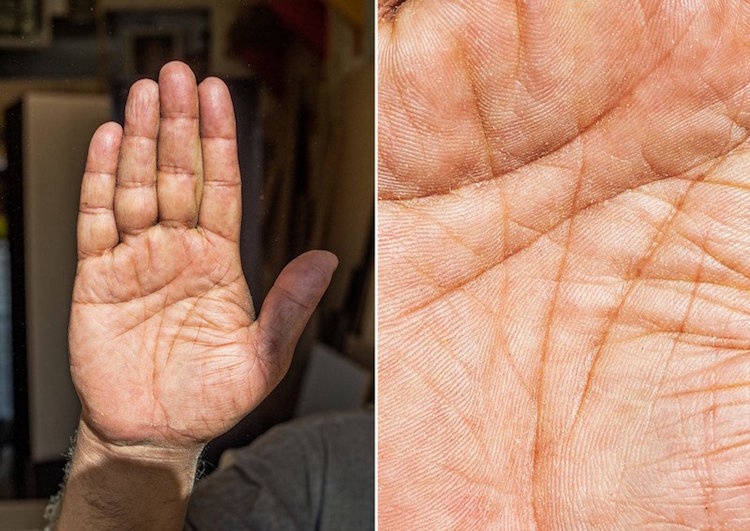
This project: 'The Story of life', Lebanese photographer Omar Reda documents global cultures and traditions with individual points of view. By focusing just on hands on his subjects, rather than their portraits, reflecting on what hands can reveal about a person. He has travelled around Tanzania, Ethiopia, Nepal and Saudi Arabia to capture these hand portraits.
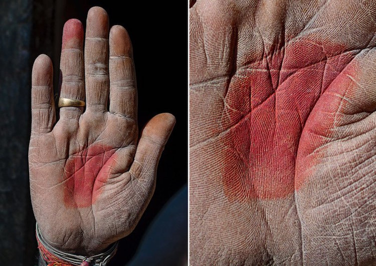
In this image, the subject is the hand, and that is where the image is focused. The background is blurred, emphasising the focus on the hand. The light in this image is direct natural sunlight which is harsh. The dominant lines in the image are the creases in the hand where the red paint is and around it that are curved. There is a repetition of the colour red: on his bracelet, on the centre of his palm and on his ring finger. The texture of his hand looks rough and dry, like sandpaper, and it shows his age and experience of life. It also makes the viewer question the subject's past, and wonder why his hands are so textured. The photographer wanted the viewer to ask these questions, and to question their work and what it captures.
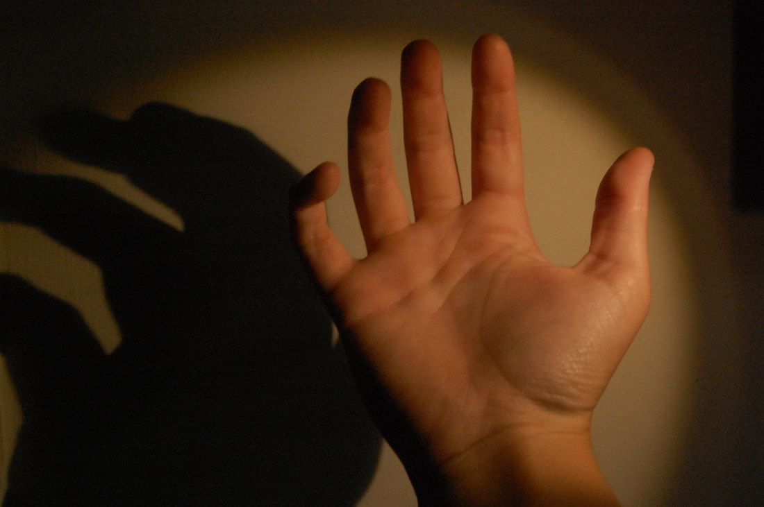
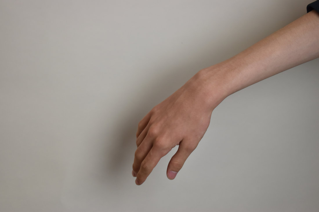
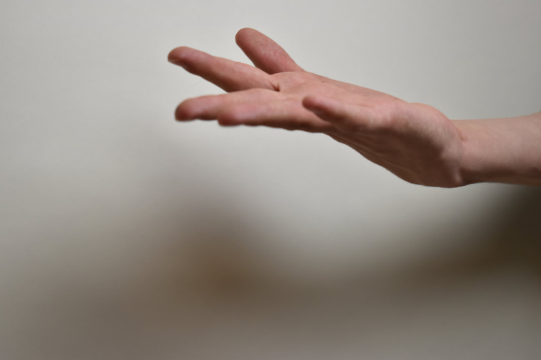
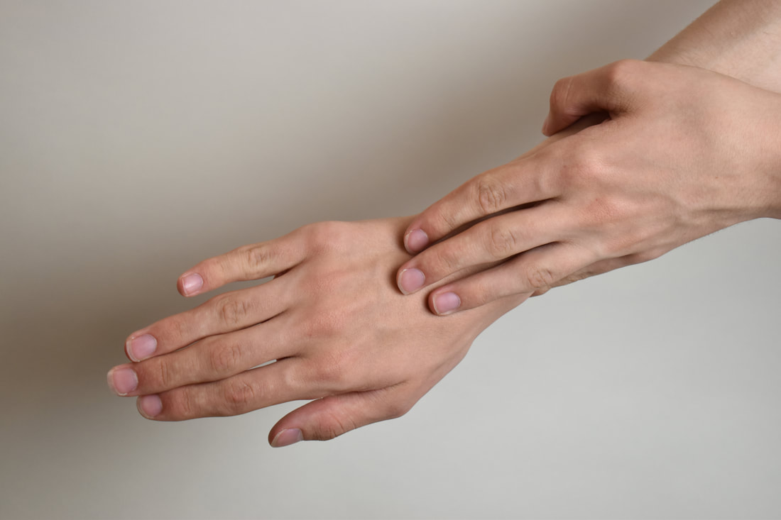
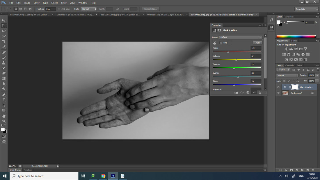
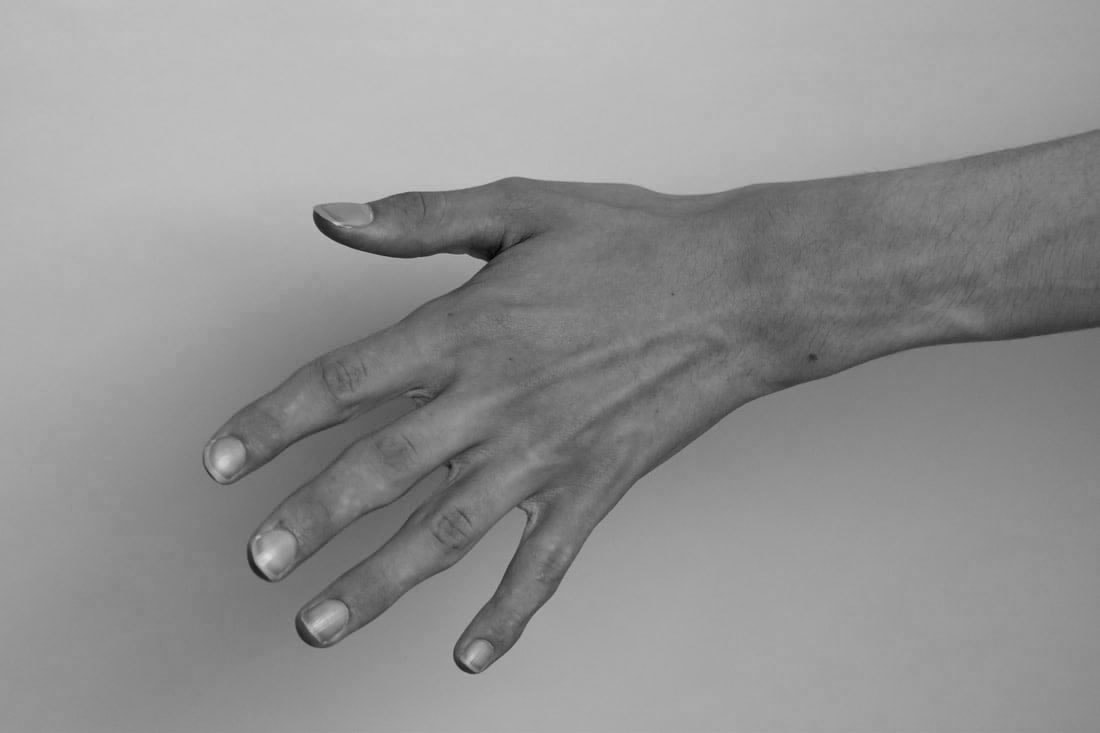
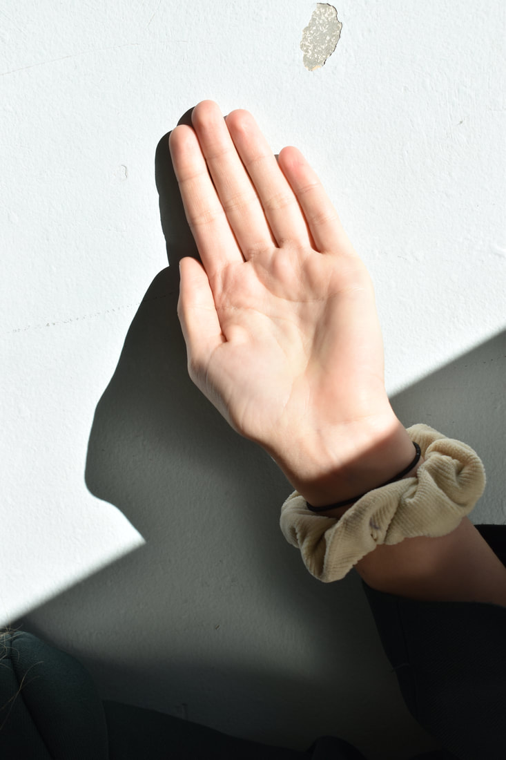
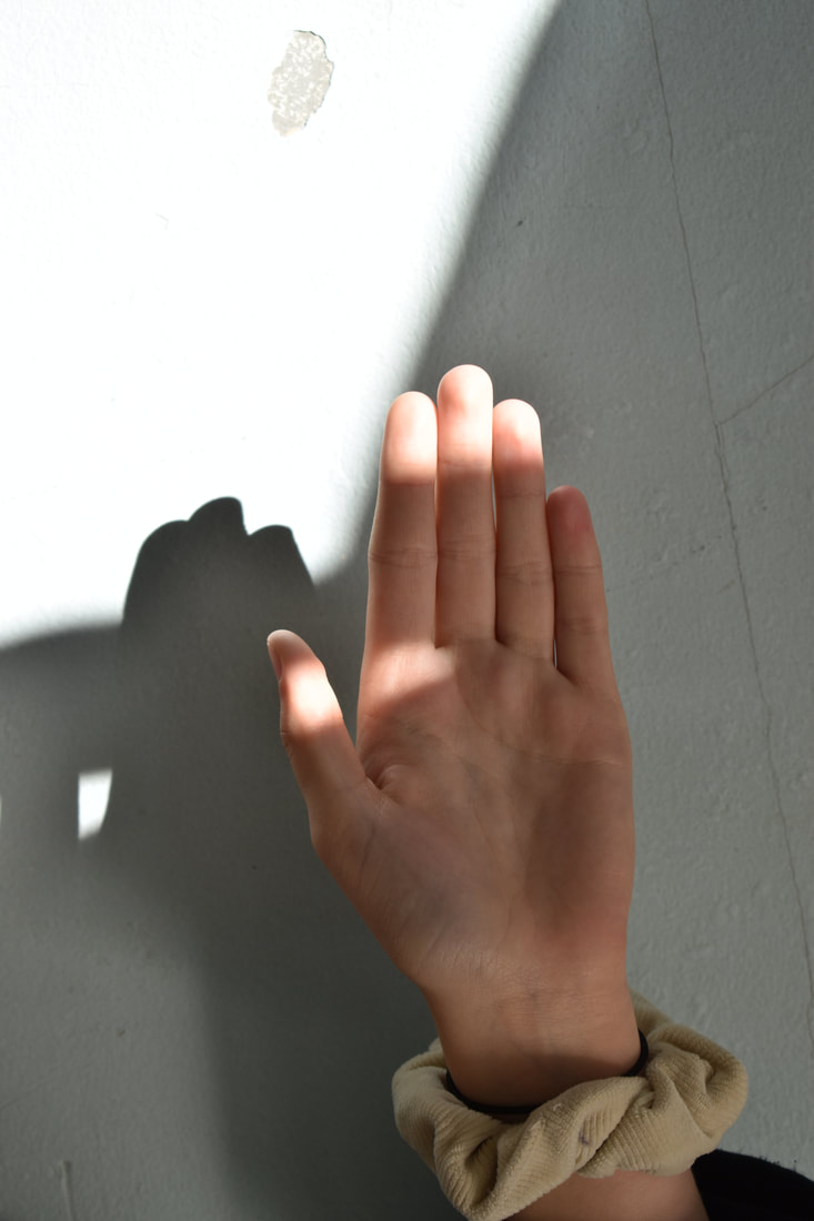
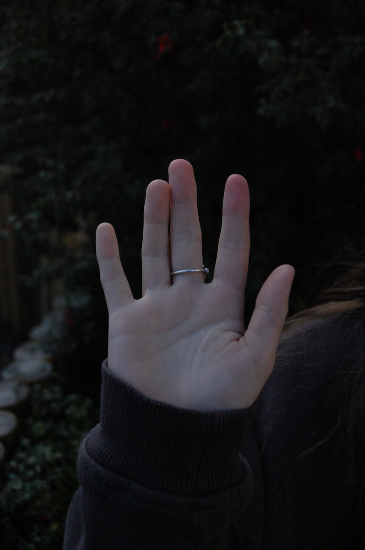
My photos
5
Shoot Review
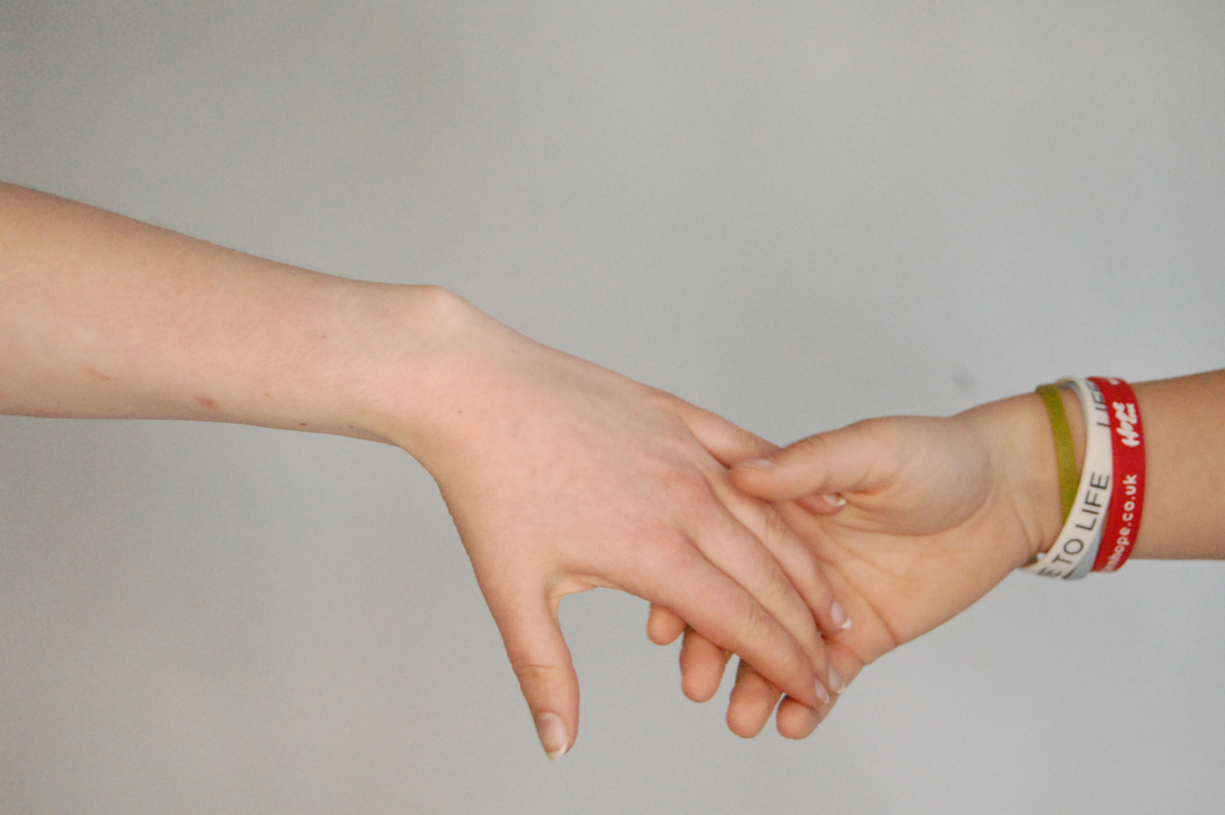
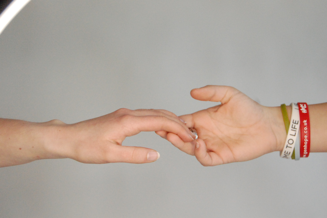
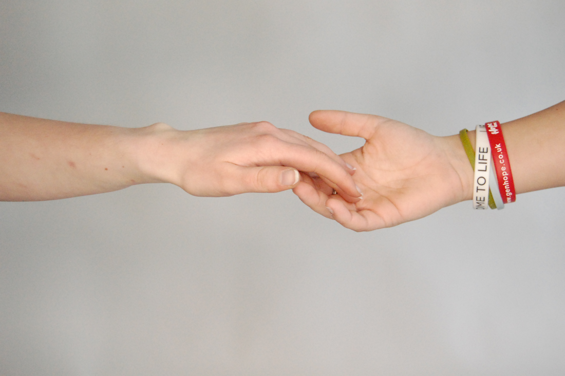
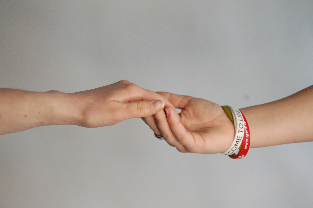
In this shoot I have taken photos of my friend's hands during school. I used a large aperture of around f4-5 to focus on the object and create a blur in the background. I think I achieved a good range of hands with different backgrounds and good natural lighting. However I think my shoot could be even better if I had experimented with different ages and maybe different times of day. I have learnt to use more aperture settings and explore more camera settings. My targets for next shoot will be to not over expose any photos and to use a range of different ages/ people rather than just in school. This piece of work was influenced by Omar Reda and the link between what I have done and what they have done is that I have achieved similar photos to his and looked at the details of the palms.
Photo analysis
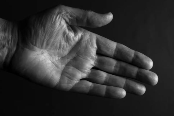
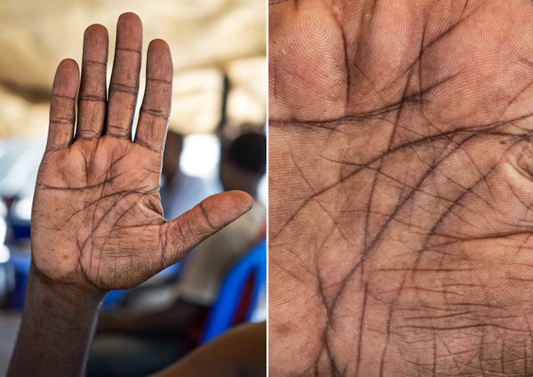
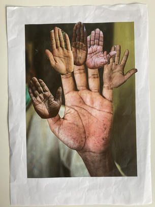
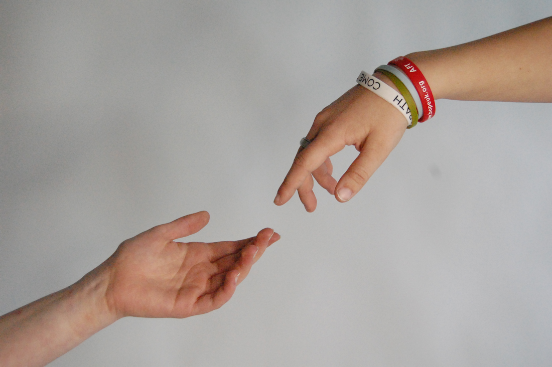
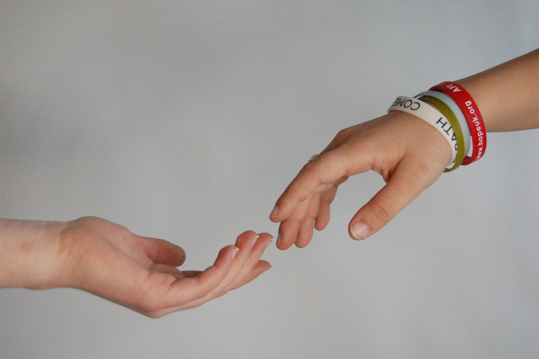
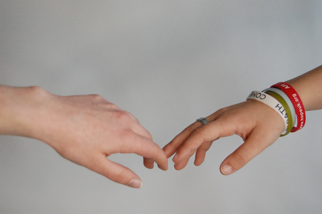
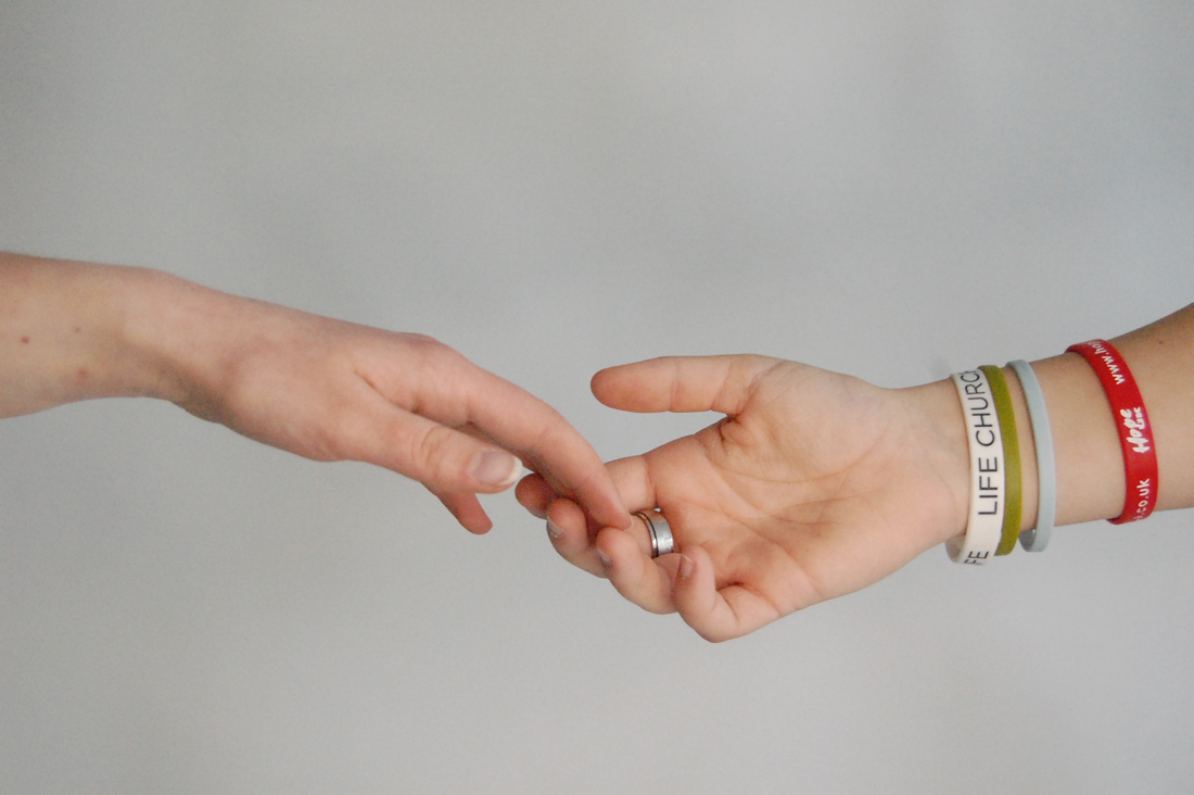
In this photograph is an open hand in black and white where the palm is facing towards the camera and it the focus of the photo. You can recognise clearly that it is a hand, as there appears to be some lighting directly on the subject. The photograph reminds me of someone reaching out their hand to help me off the ground. Texture is the most important in this photo because it focuses on all the lines and creases . The light in the photo makes the photo quite dramatic as lots of the photo is dark. It would've needed a a zoom lens to capture the detail and a large aperture to focus on the near object giving it a shallow depth of field. This photo is different from reality as it's in black and white and the eye may not capture the details of the palm so clearly. This photograph is captivating because I like the black and white effect on the hand, how it makes it sort of mysterious. There is no sense of time passing because the image is calm and still. There is lots of empty space where the hand doesn't fill the whole photo. I would ask the photographer what was the purpose of this photo. It was by Elizabeth Howell during May, 2013 and she was investigating 'Why do humans have palm lines?' This makes me see the photo differently as now it is clear the palm lines are the very focus and purpose of the photo. The title I would give this photo is 'Offering' because I feel like the hand looks like it's offering to help someone or even a peace offering. I think other people would call it 'Reaching Out' because the hand is simply reaching out. To be inside the photograph it would feel cold and dark because no one is touching the hand maybe it's isolated and lonely. it would be quiet and peaceful because there is no movement and no one else in the image. I think they took this photograph to express the story that may be behind the palm lines. Someone else's response to this photograph would be that it's quite boring, maybe because of the black and white, but also because not much is happening, it's not very exciting. To achieve a similar photograph I would ask a friend to be my model and get the black back drop from school and use a dim light to shine on the subjects hand. I think it would also be effective to turn off the main lights and only have the light shining on the subject because it will make the photo more dark and gloomy like the one by Elizabeth Howell.
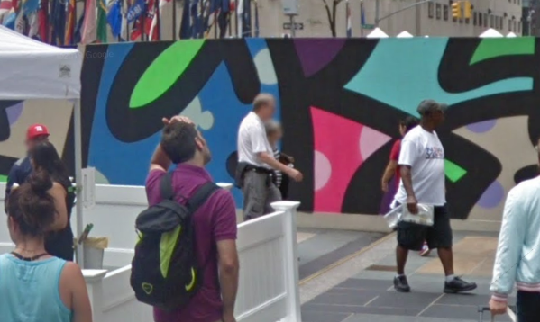
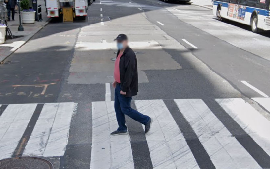
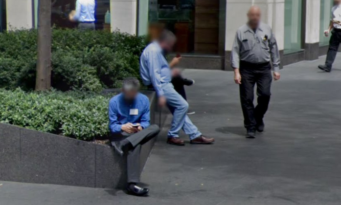
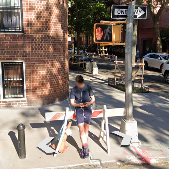
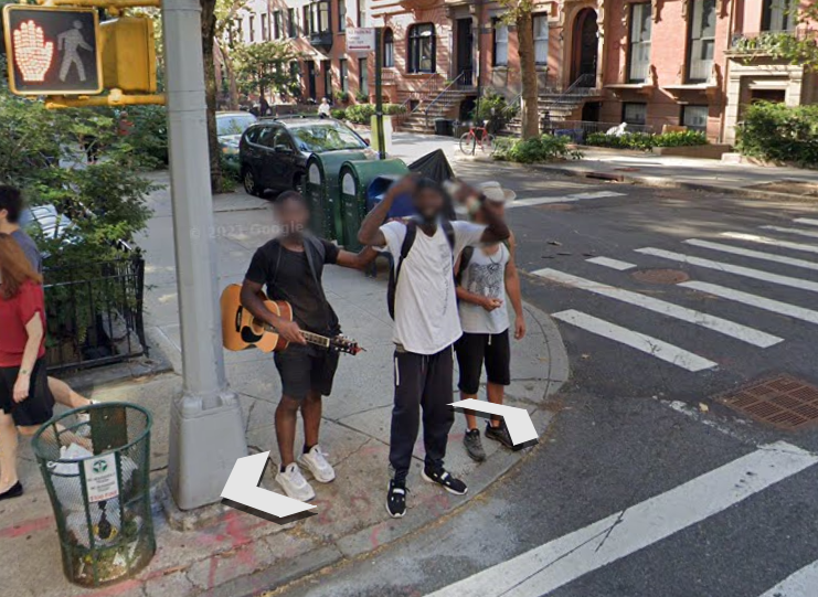
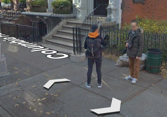
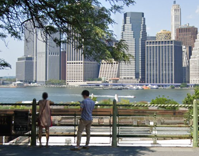
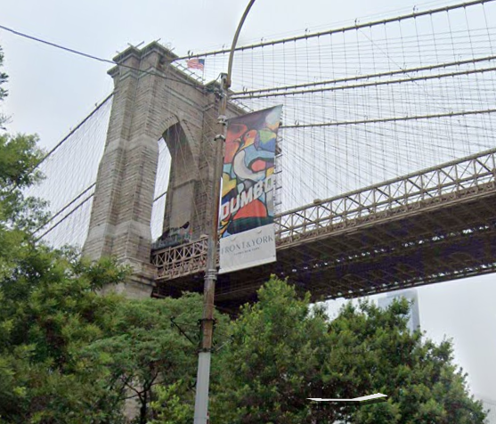
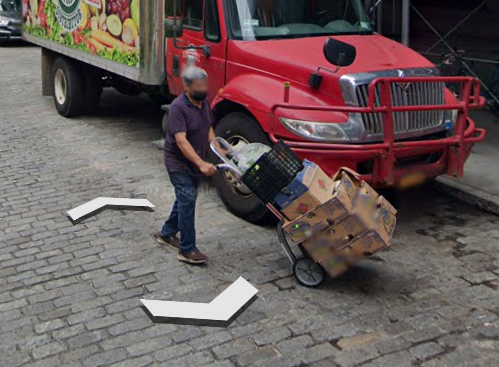
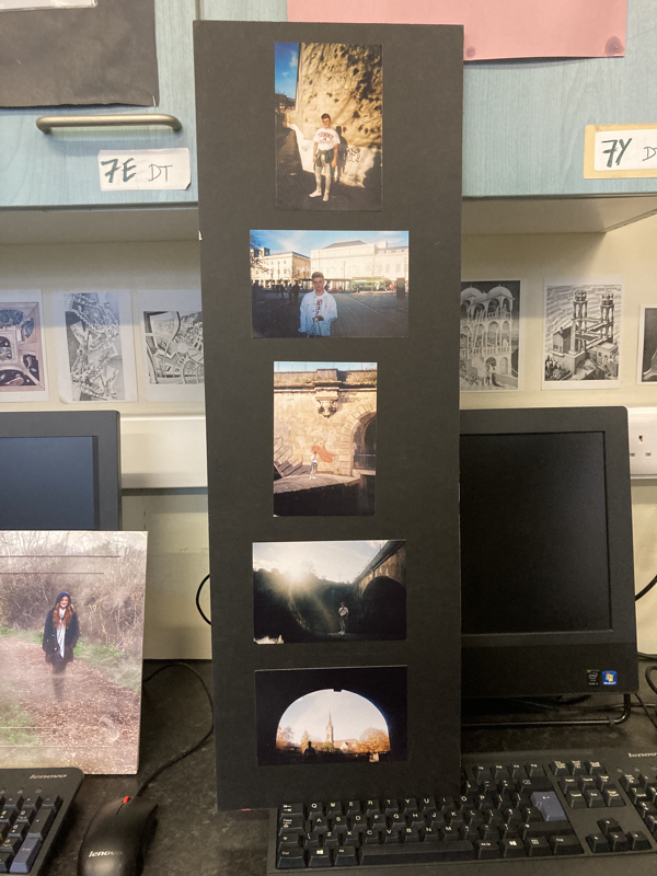
Appropriation and screen shots - New York City
Doug Richard and Michael Wolf
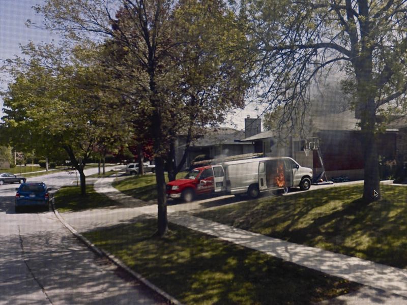
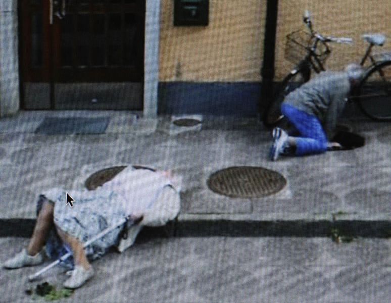
I have looked at the work of Doug Rickard and Michael Wolf and they have both used google earth to produce their own set of images in their own way. They have re-photographed images and cropped them and edited them to make them their own. So I went on google earth and screenshot interesting moments on the streets of New York city and cropped them to how I liked them.
My photos
6
Appropriation - readymades
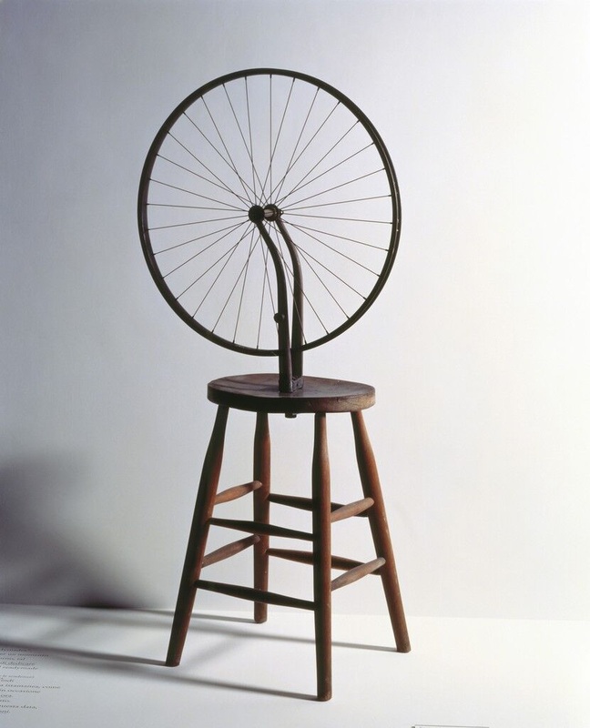
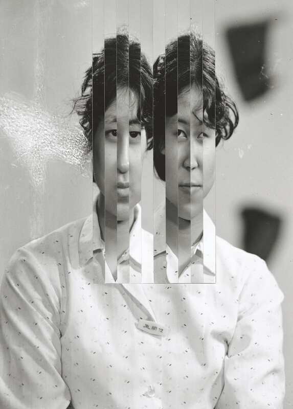
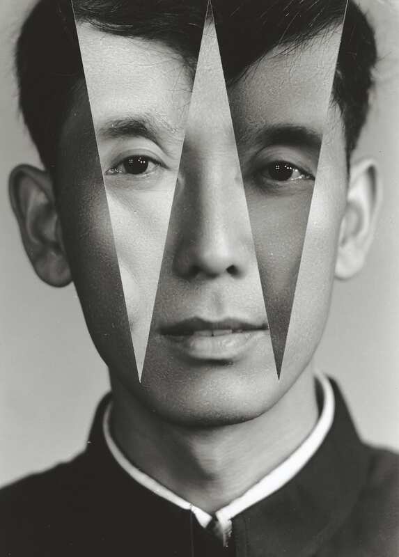
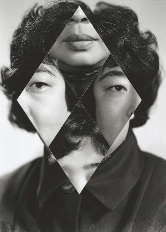
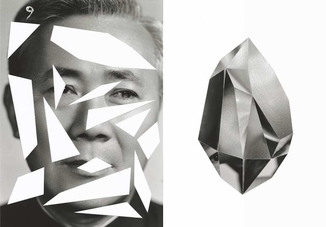
A readymade is a common place artefact selected and shown as your own work of art. The readymade of Marcel Duchamp are ordinary manufactured objects that the artist selected and modified (shown above). By simply choosing the object and repositioning or joining, tilting, signing, the found object became art. Kensuke Koike is a Japanese visual artist currently based in Venice who also creates readymade art, here is his work:
My readymade
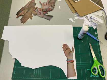
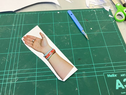
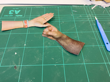
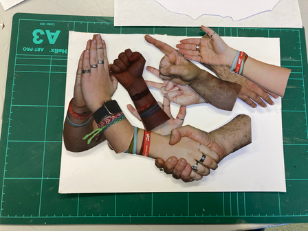
|
For my ready made I used 6 of Omar Reda's photographs of the palms of peoples hands. I printed five small, and one big, to fit on the ends of the finger tips. I stuck them on as a collage and this is how it turned out. I liked how I presented it but I think I should've made the little hands that I stuck on a bit smaller so they don't collide as much.
|
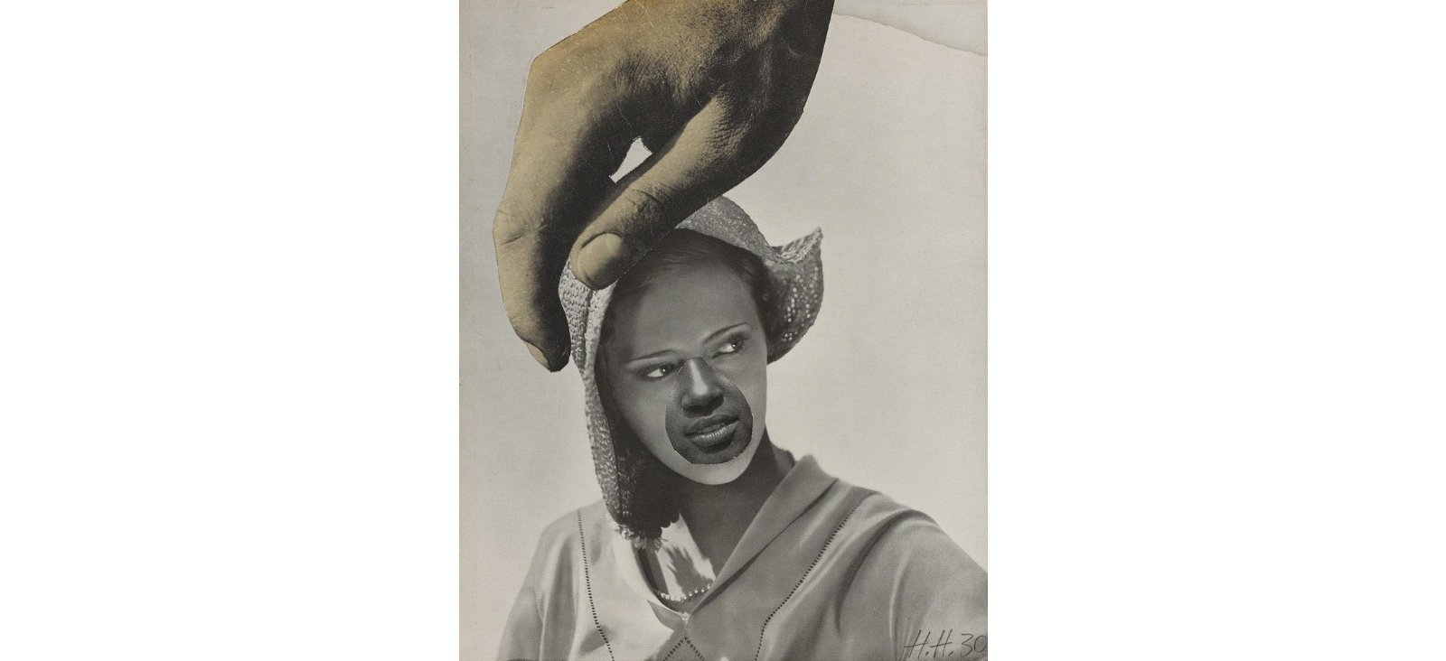
Kensuke Koike
Kensuke Koike is a surreal artist bringing new meaning to archive found photography. He spends his days buying old photographs at flea markets and distorting them in his studio to produce often incomprehensible work that is exhibited around the world. Every image is re-composed and therefore recycled to create a new image with a totally different set of possible interpretations.
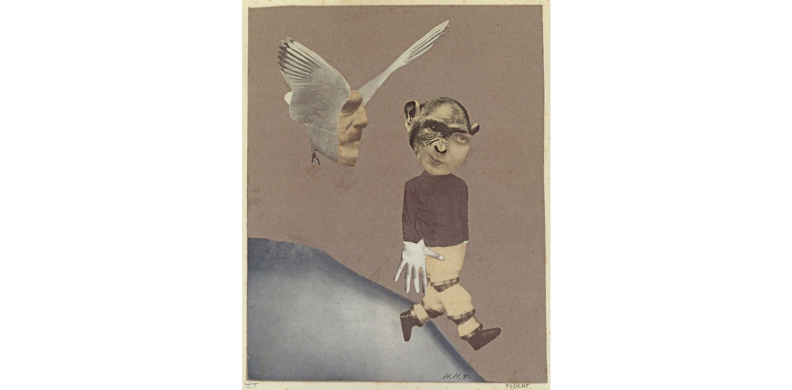
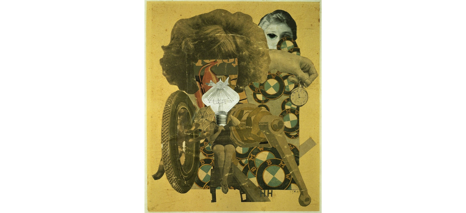
Hannah Hoch
Hannah Hoch was a German Dada artist. She is best known for her work of the Weimer period, when she was one of the originators of photomontage. Dada artists developed in reaction to World War I, and consisted of artist who rejected the logic, reason and aestheticism of modern capitalism society, instead, expressing nonsense, irrationality, and anti-bourgeois (a middle class person) protests in their work. Hoch began to experiment with non-objective art - works that make no reference to the natural world - through painting, but also with collage and photomontage, consisting of fragments of imagery found in newspapers and magazines.
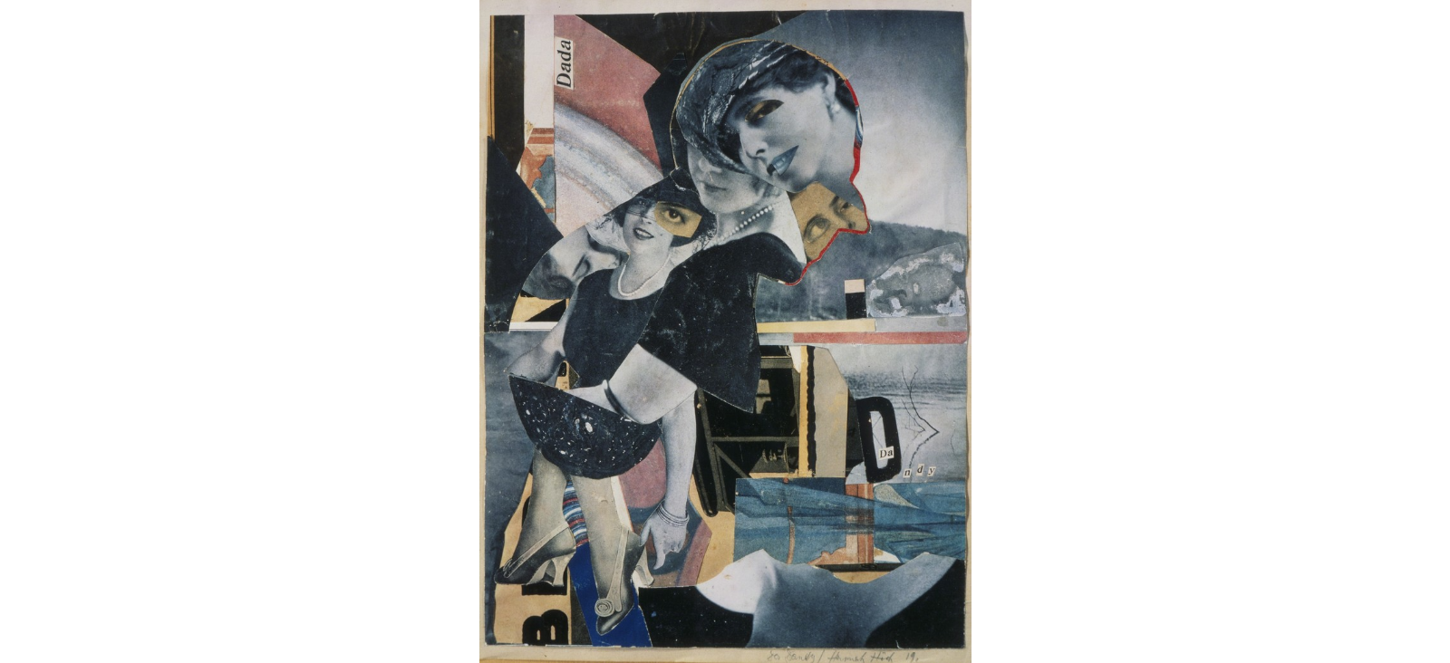
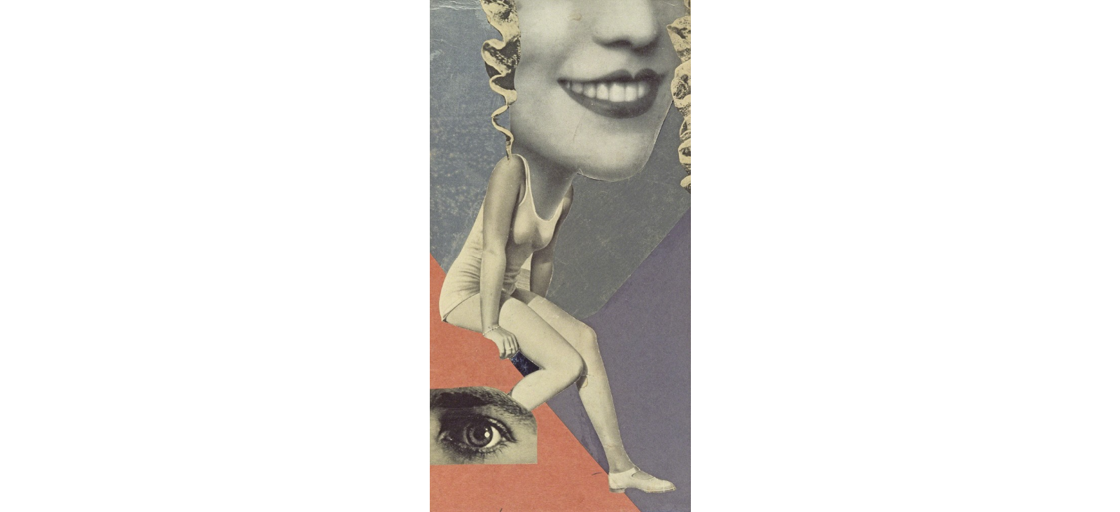
My collage
This is my collage of some of my photos from previous shoots and is inspired by Hannah Hoche.
Experimental shoot
7

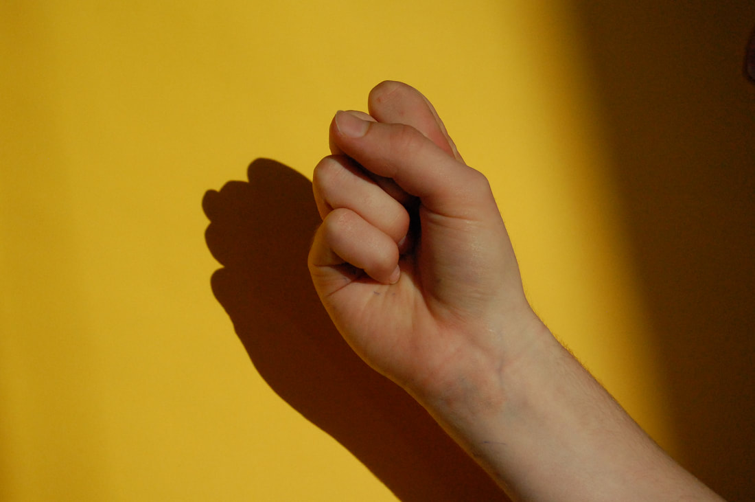
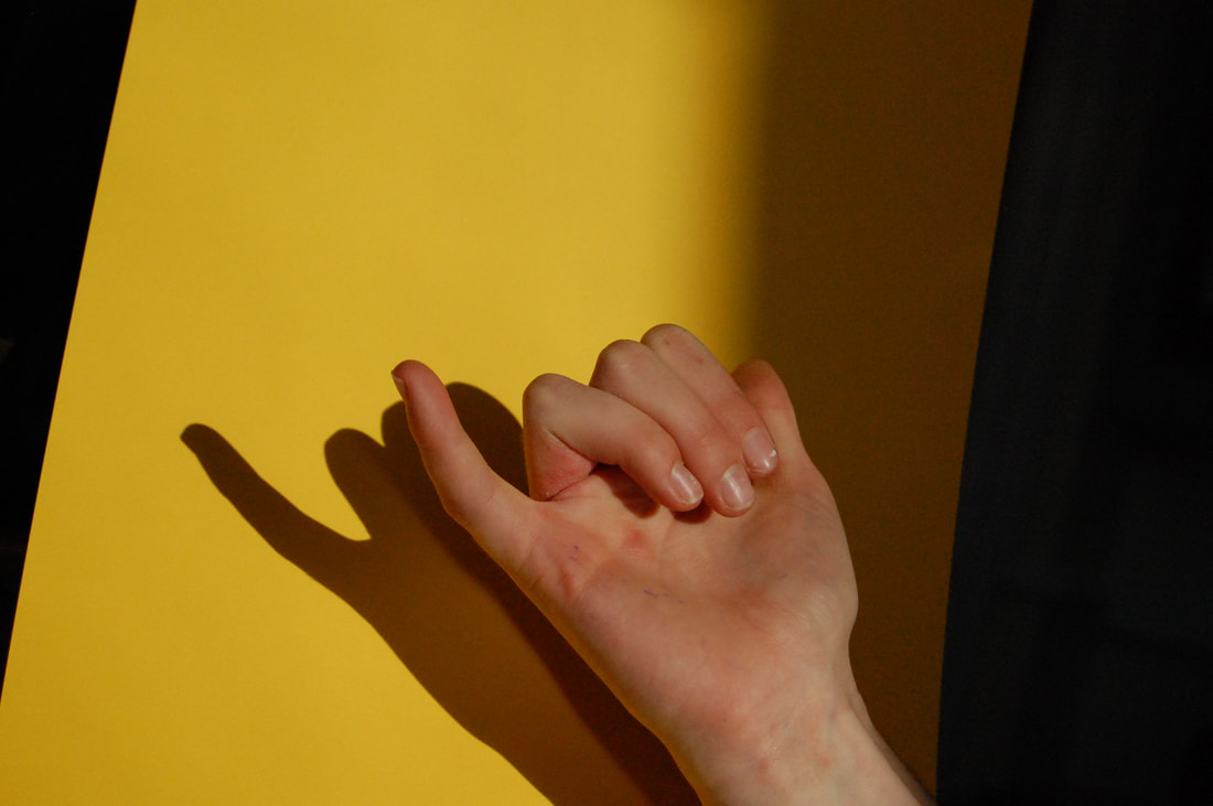
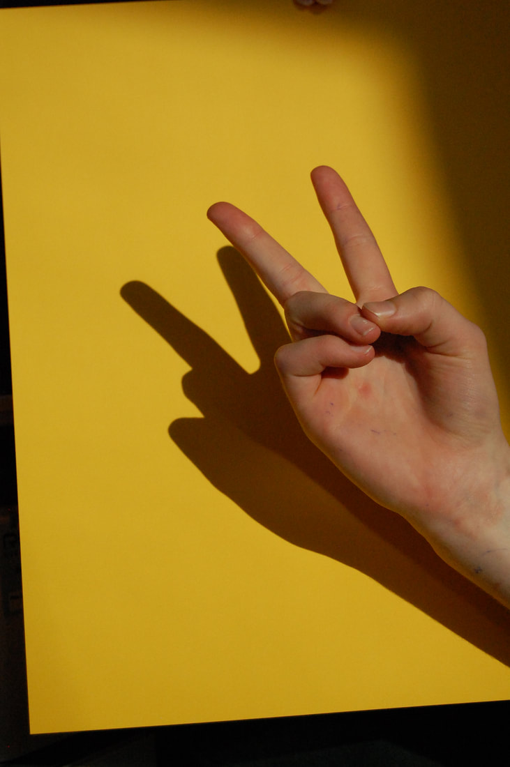
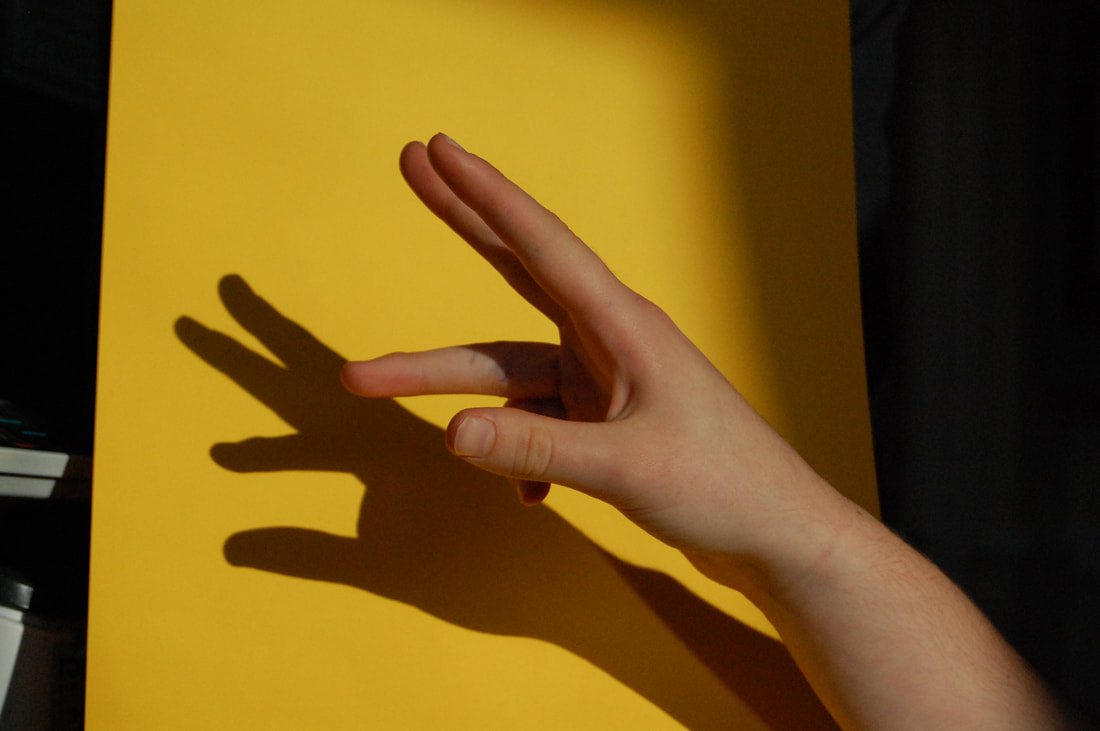
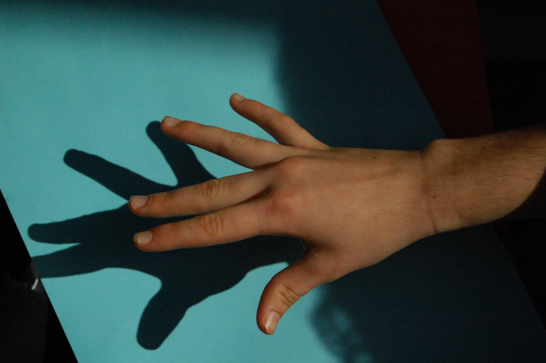
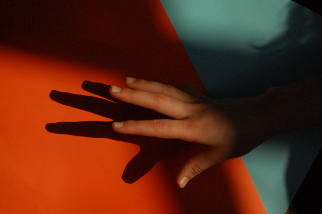
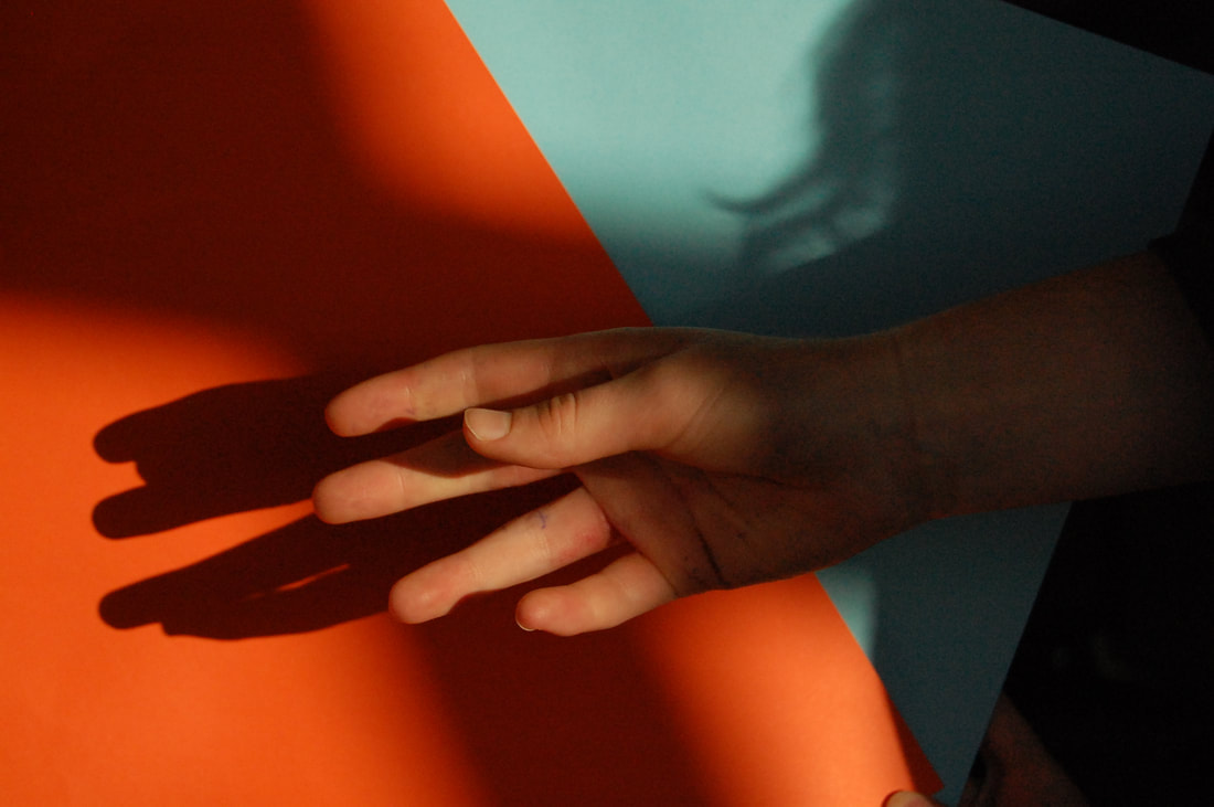
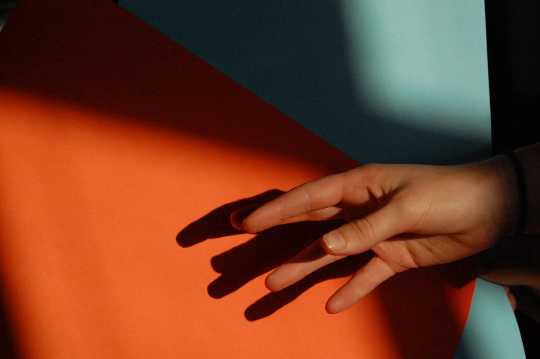
Shoot review: In this shoot I used coloured card as a colourful background and natural light for the lighting. I used my camera with an aperture of about f4 to focus on the subject. I think this shoot went well because it added more colour to my shoots which I haven't experimented with much before. If I were to do this shoot again I would explore different colours and different aged hands.
3D 2D 3D 2D
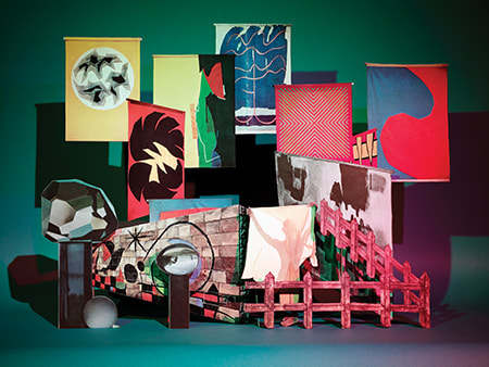
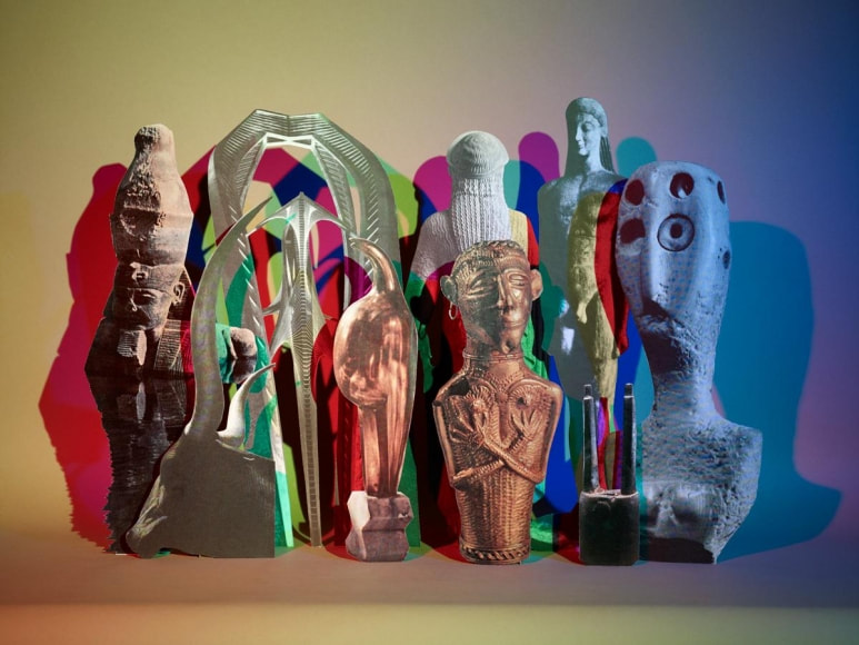
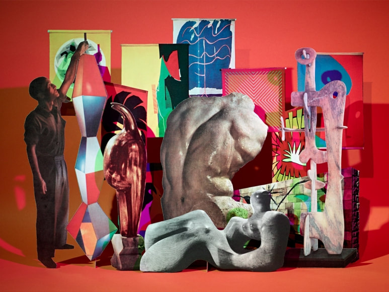
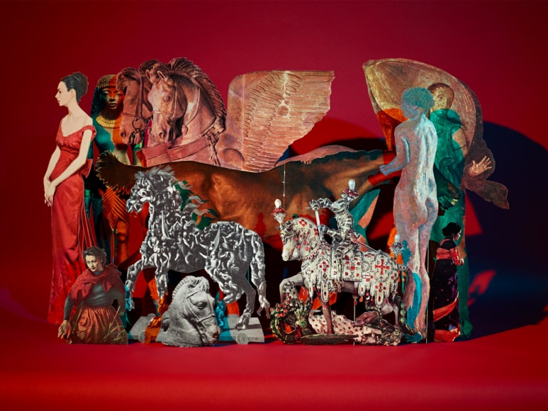
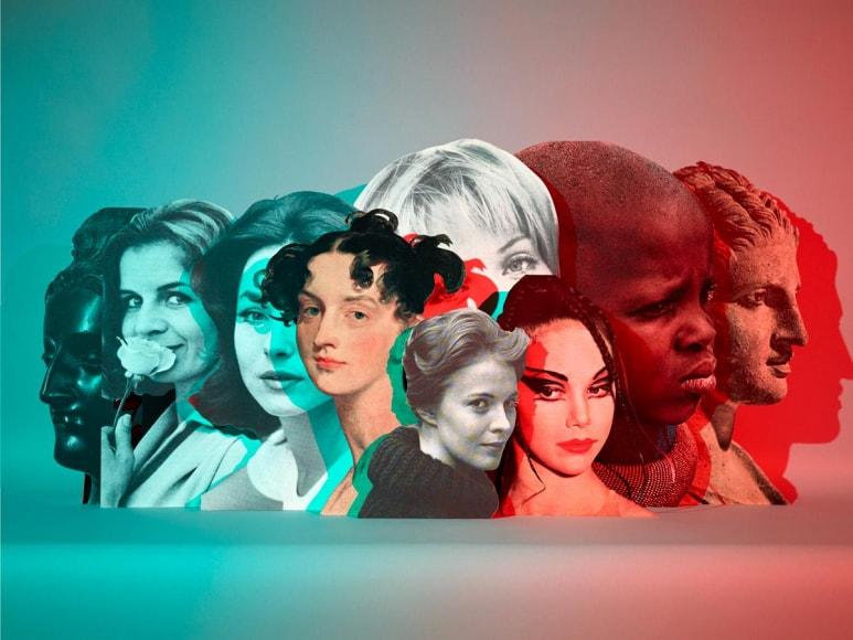
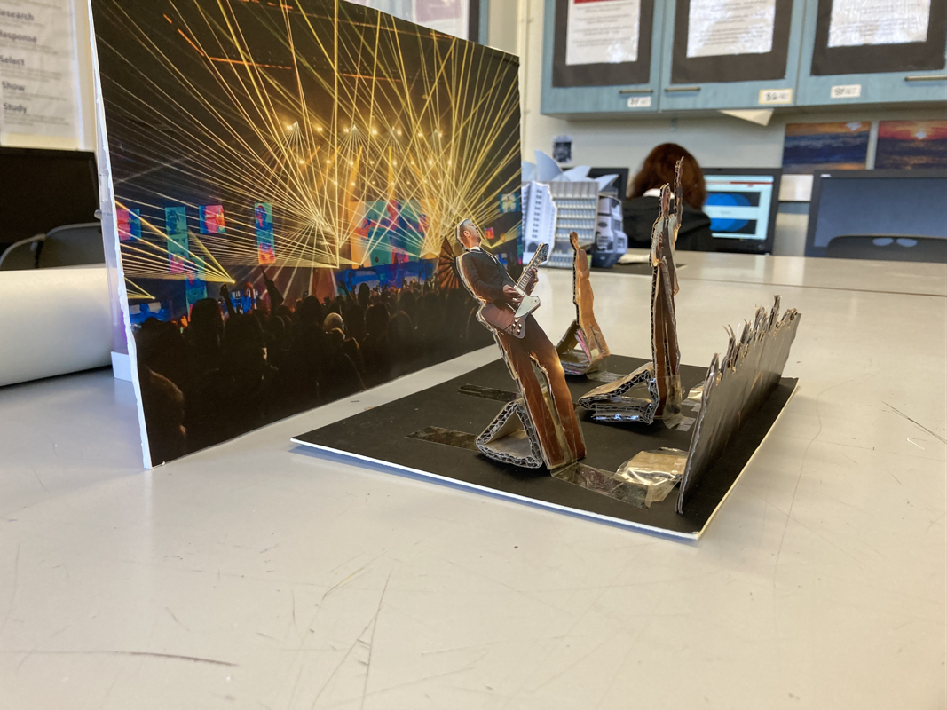
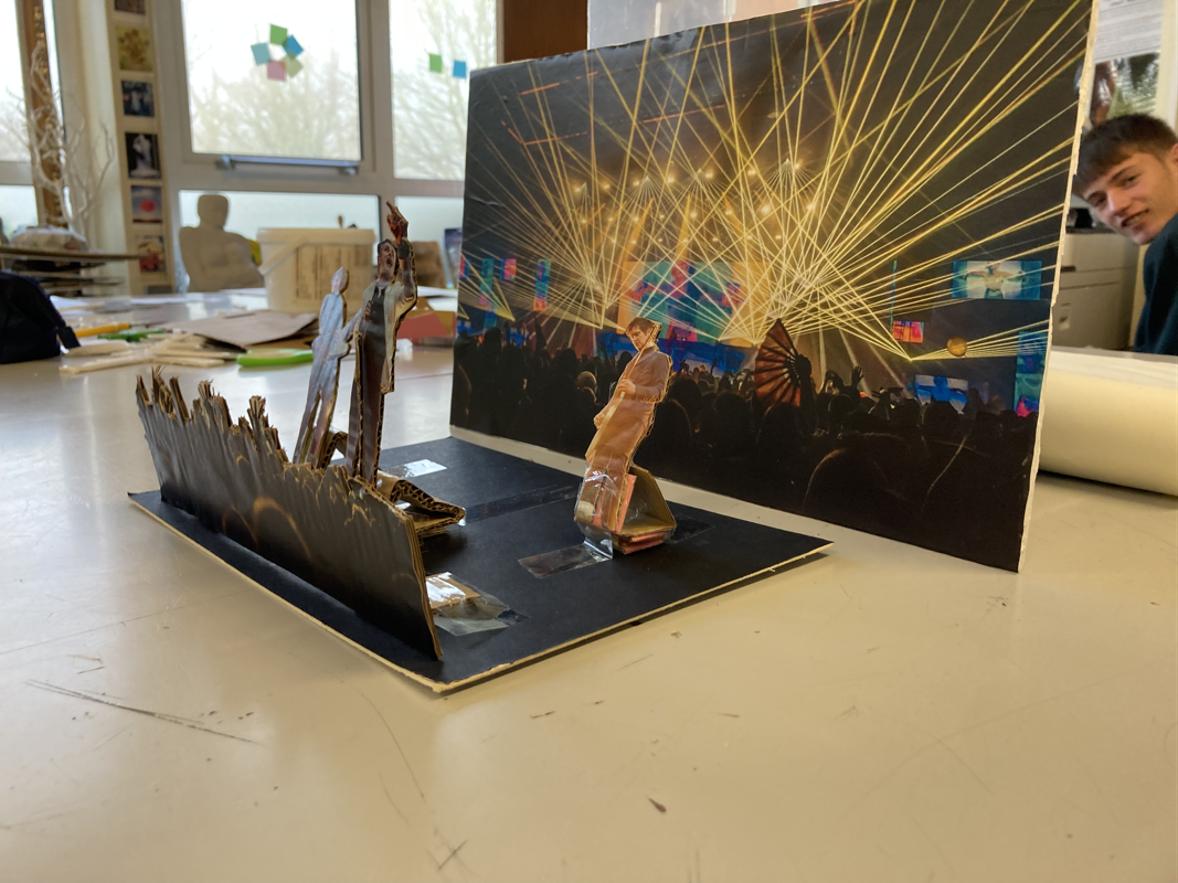
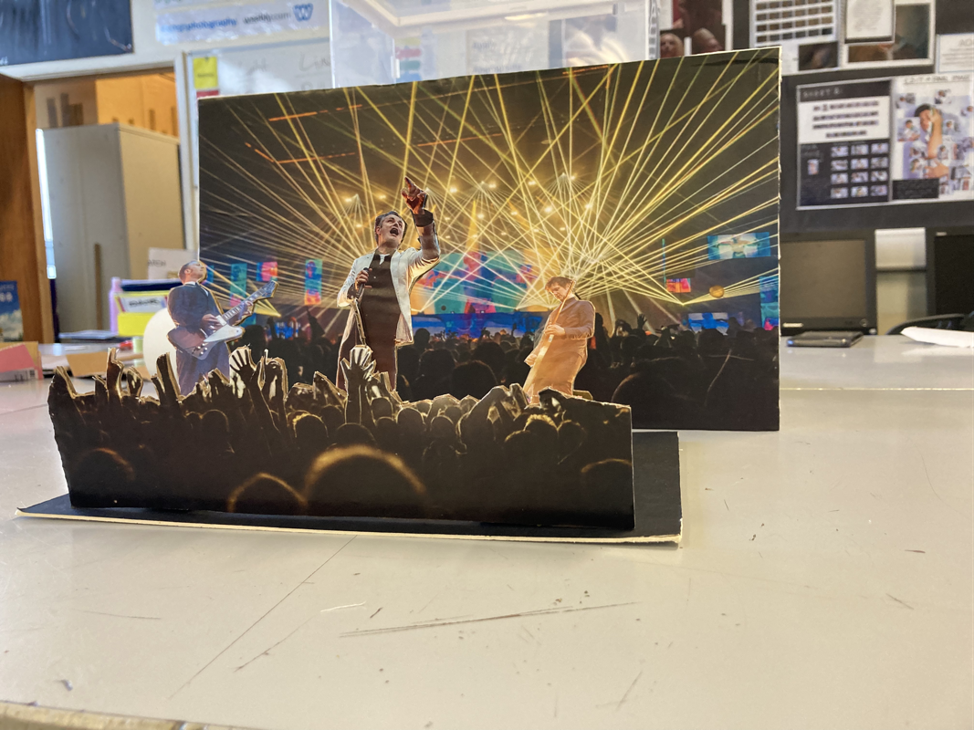
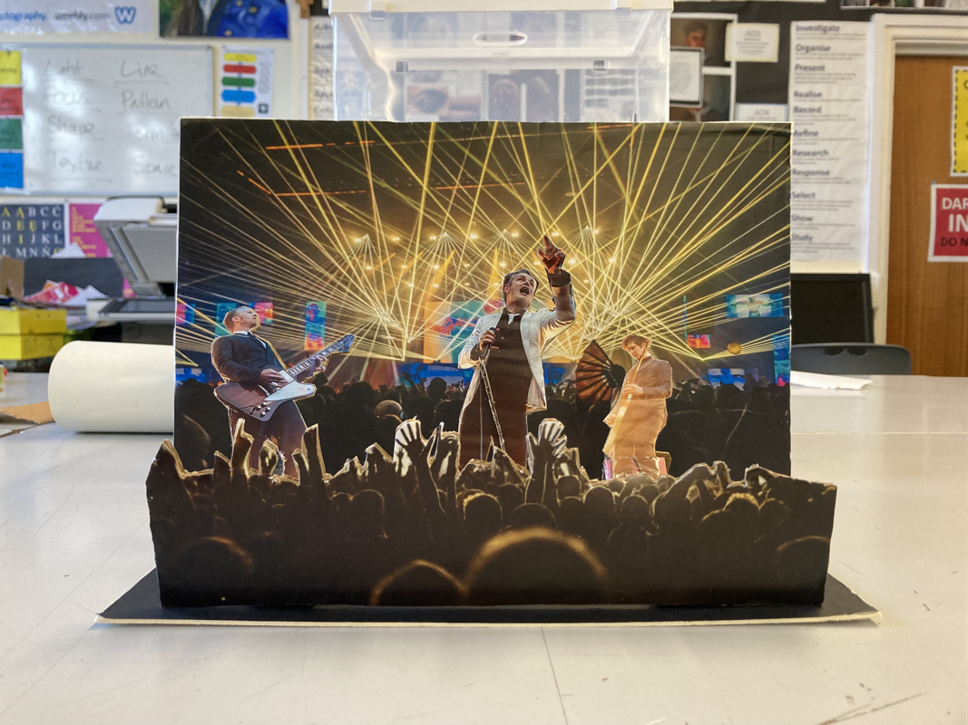
Matt Lipps
Matt Lipps' work involves collage strategies, sculptural tropes and theatre staging. After cutting out pictures from books and magazines and arranging them, freestanding, he re-photographs them and and prints the images into a large scale. By way of dissecting, mounting, reassembling and lighting. Lipps pulled images from Horizon Magazine, and a arts journal first published in 1958 with the intention of teaching the American public about "high art and culture". He photographs these including different types of lighting and creating numerous shadows behind his arrangements of photographs.
"We live in a photographic mind-set, creating memories for the future," - Matt Lipps.
"We live in a photographic mind-set, creating memories for the future," - Matt Lipps.

|
This image is called Untitled (Women's heads) and was created in 2010. The composition shows several cut outs of women's heads arranged in a certain way with different coloured lighting of red and blue. The focal point of the image is the woman in the centre of all the people and she is actually looking towards the camera. The techniques used are probably a small aperture letting more light into the camera to focus on the subjects of the image which would be the women's heads. The colours in the image are light blue and red LEDS but the photos that were being re-photographed are both in colour and black and white. This could be because they are older photographs or because they were edited like this. The texture in this image looks polished and simple because of how well the two colours meet in the middle and how smooth the back ground Lipps used. I would presume he has used a digital dslr camera to create these 3D pieces of art.
|
My photos
8
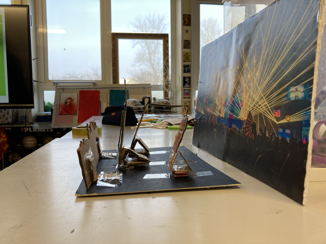
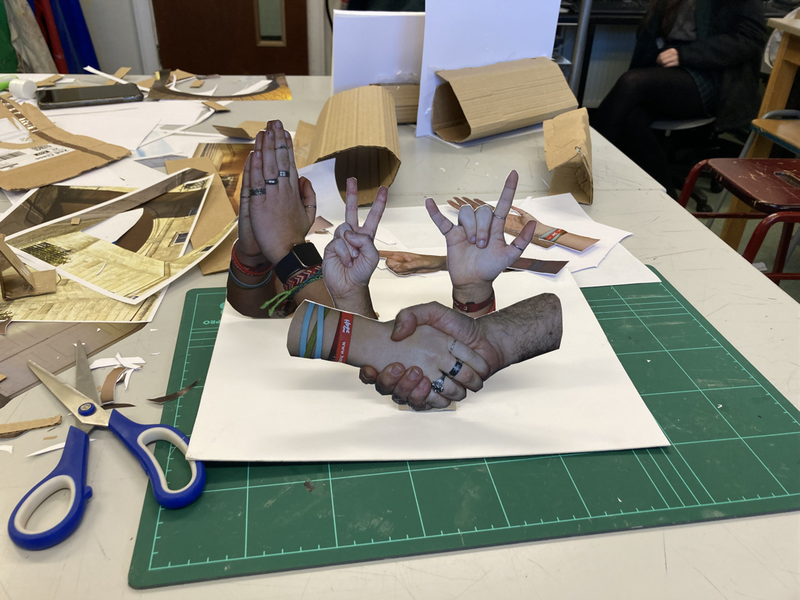
My final 3D-2D-3D-2D (practice)
Making day photo selection
For my final piece I did a shoot and these were the final photos and I had to chose which ones I was going to use for my 3D-2D-3D-2D final project.
9
The photos I chose:
Making Day
The process:
|
Firstly, I stuck my printed photos onto the card that was going to be used to make the photos stand up.
|
|
Trimming the edges
|
|
I used a scalpel here to be more precise and have a clean cut
|
|
These are all the photos I cut out and it took me most of 4 periods
|
|
Assembling my final piece ready to take photos
|
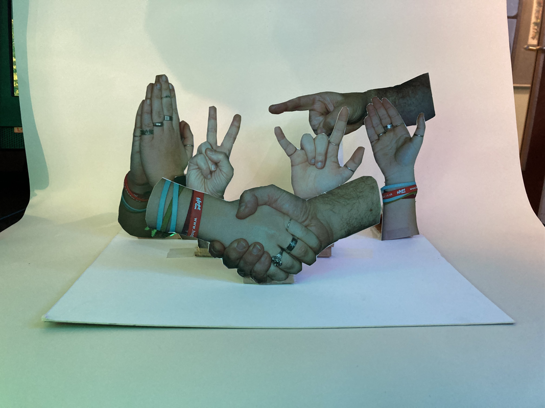
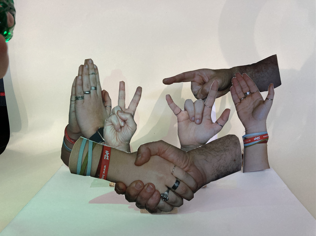
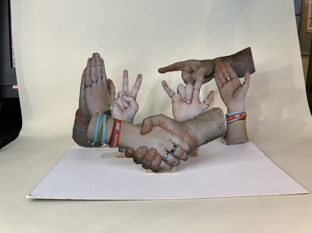
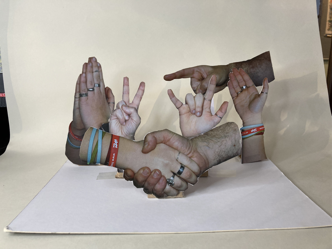
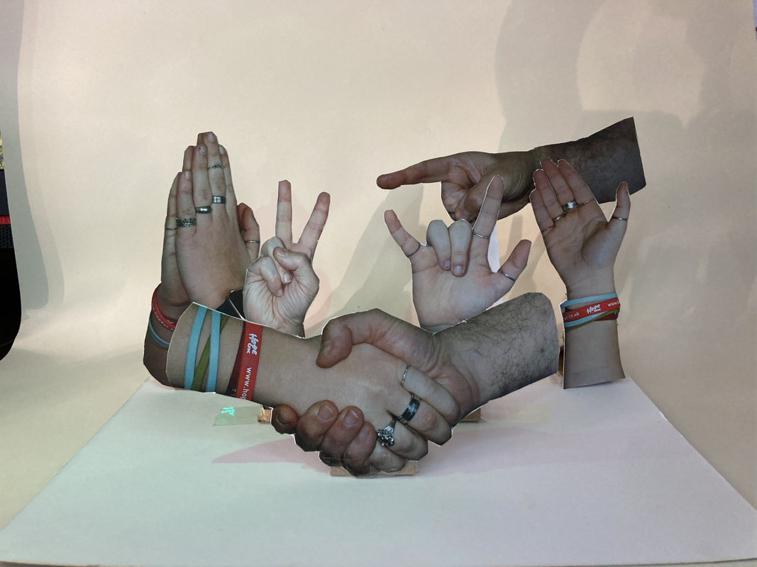
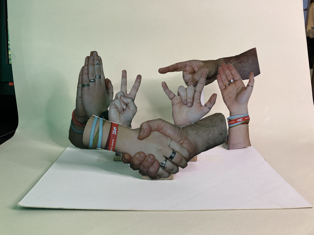
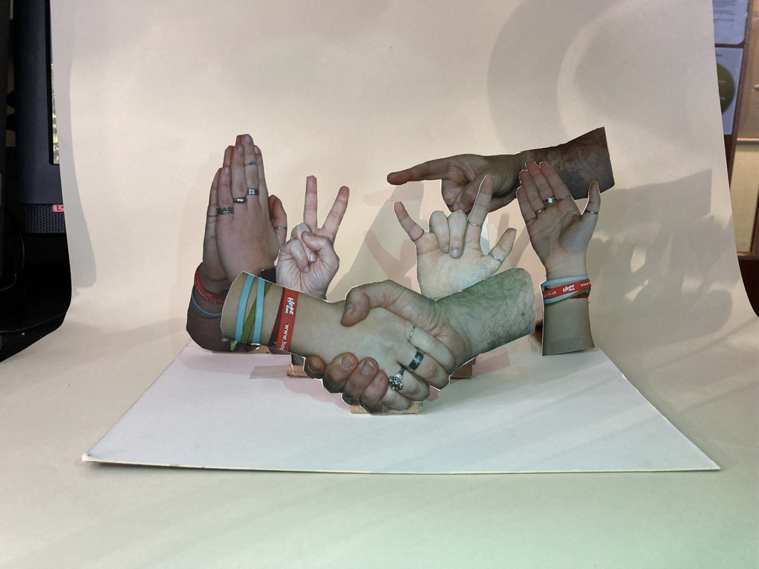
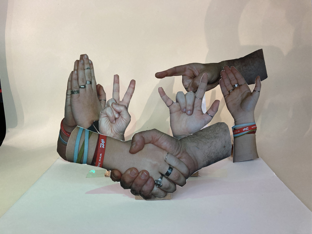
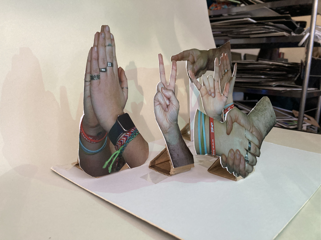
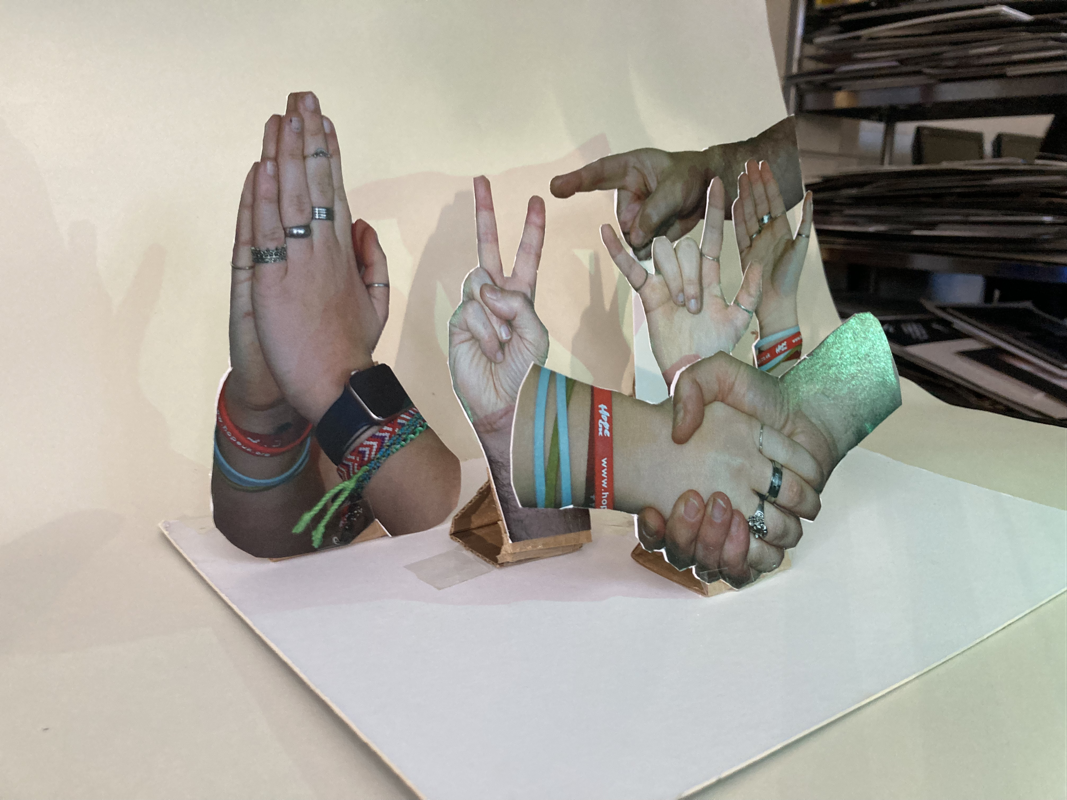
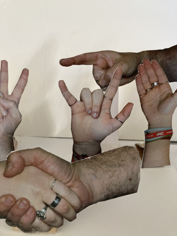
The final product
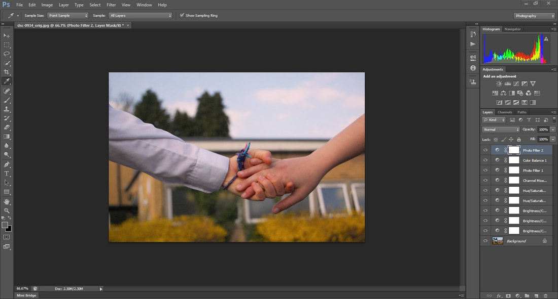
10
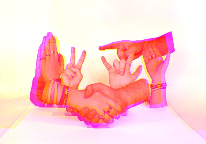
Edited versions
Project analysis
During this project I have researched several artists such as John Copeland, Tim Booth, Omar Reda, Kensuke Koike, Hannah Hoche and Matt Lipps. I discovered them from researching photographers, who have done similar work to my theme, to emulate their styles and create my own piece of work. My sub theme was the human form and I specifically looked into hands, and my ideas developed as I took more shoots to appreciate the detail and story of hands and what different gestures signify. In my final piece I considered the rule of thirds which is a composition guideline that places your subject in the left or right third of an image, leaving the other two thirds open. This rule often leads to more compelling and well-composed shots.
I have experimented with a range of different shoots and techniques in this project including aperture and depth of field. This focussed my images and concentrated on the objects in the shot bringing out the detail in them. I was going to refine my experimental shoots, but we were told to make a final piece of a 3D project. I still did a couple of experimental shoots which I think turned out good as I explored different age models, different coloured back grounds and changing the objects they would hold. I found getting the right lighting at home when I was taking photographs a bit challenging as I don't have any lighting equipment at home. However when I was taking photos for my final piece I made sure I had the correct lighting, aperture and depth of field to get high detail images ready to be printed.
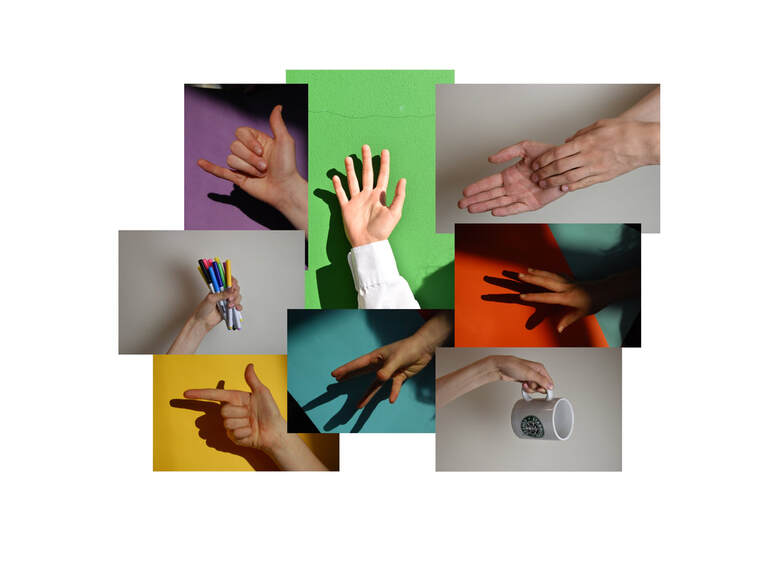
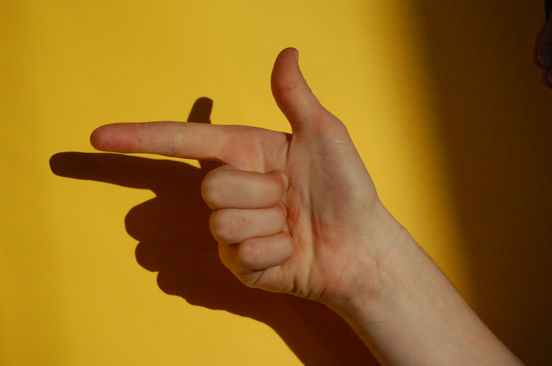
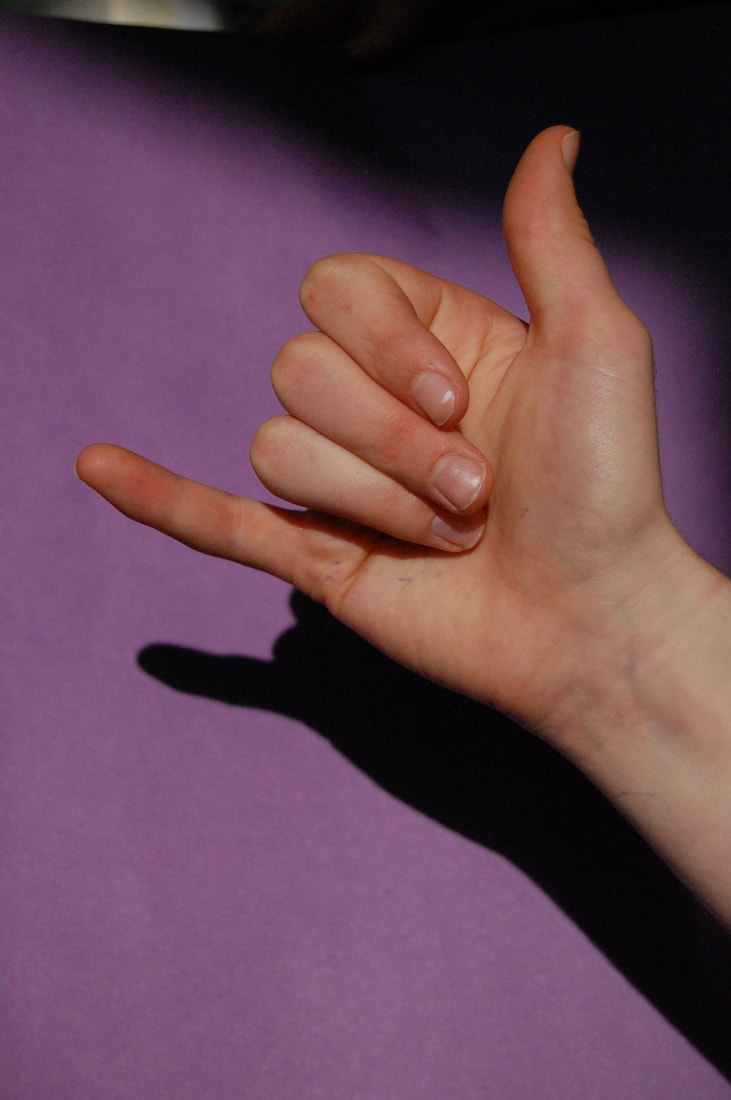
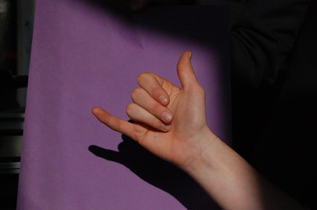
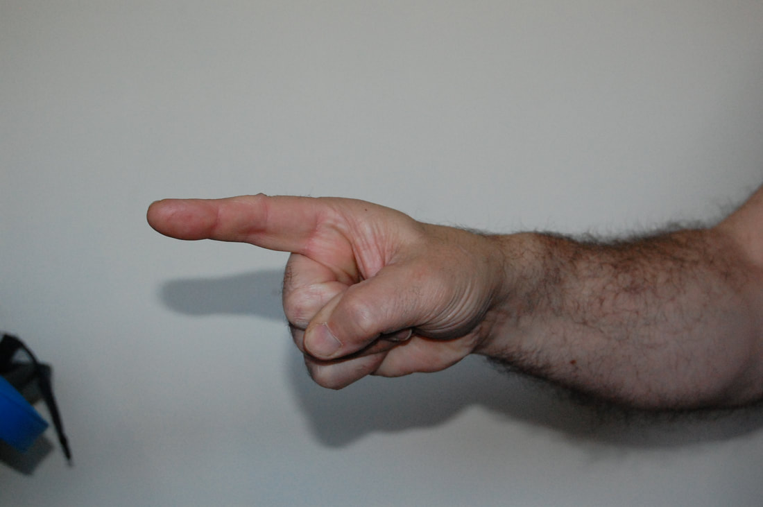
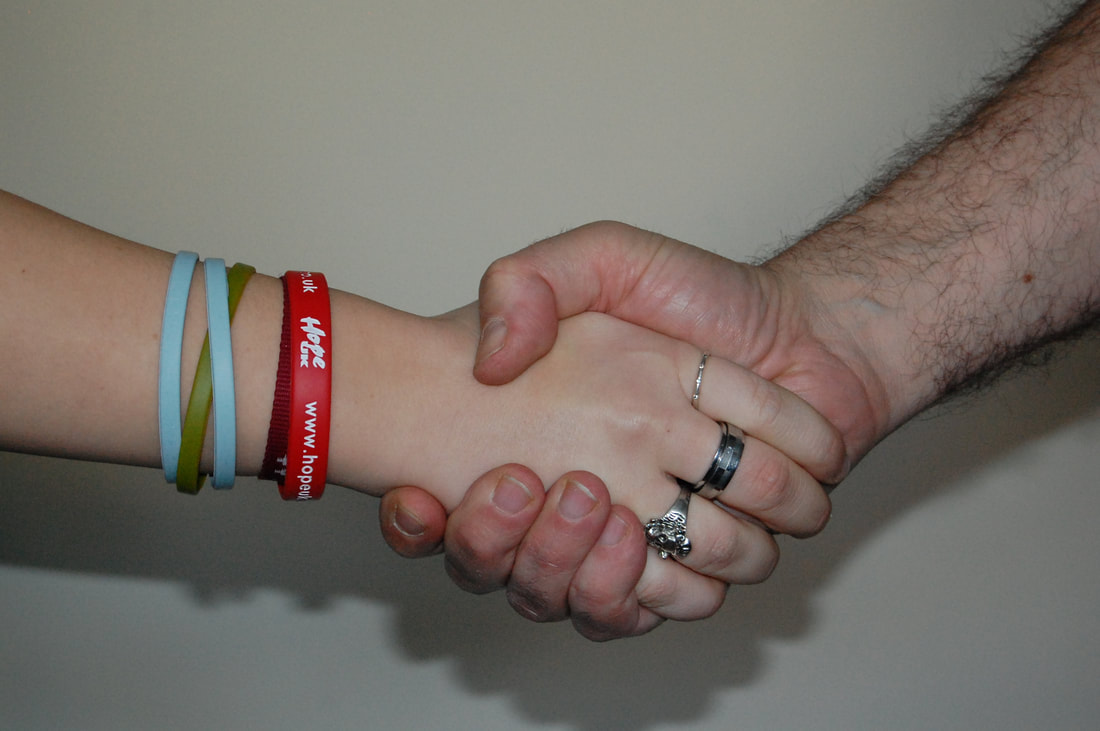
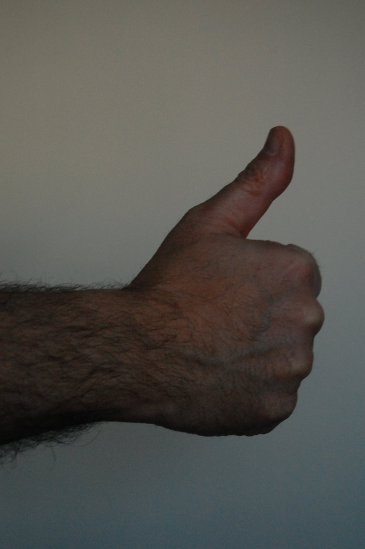
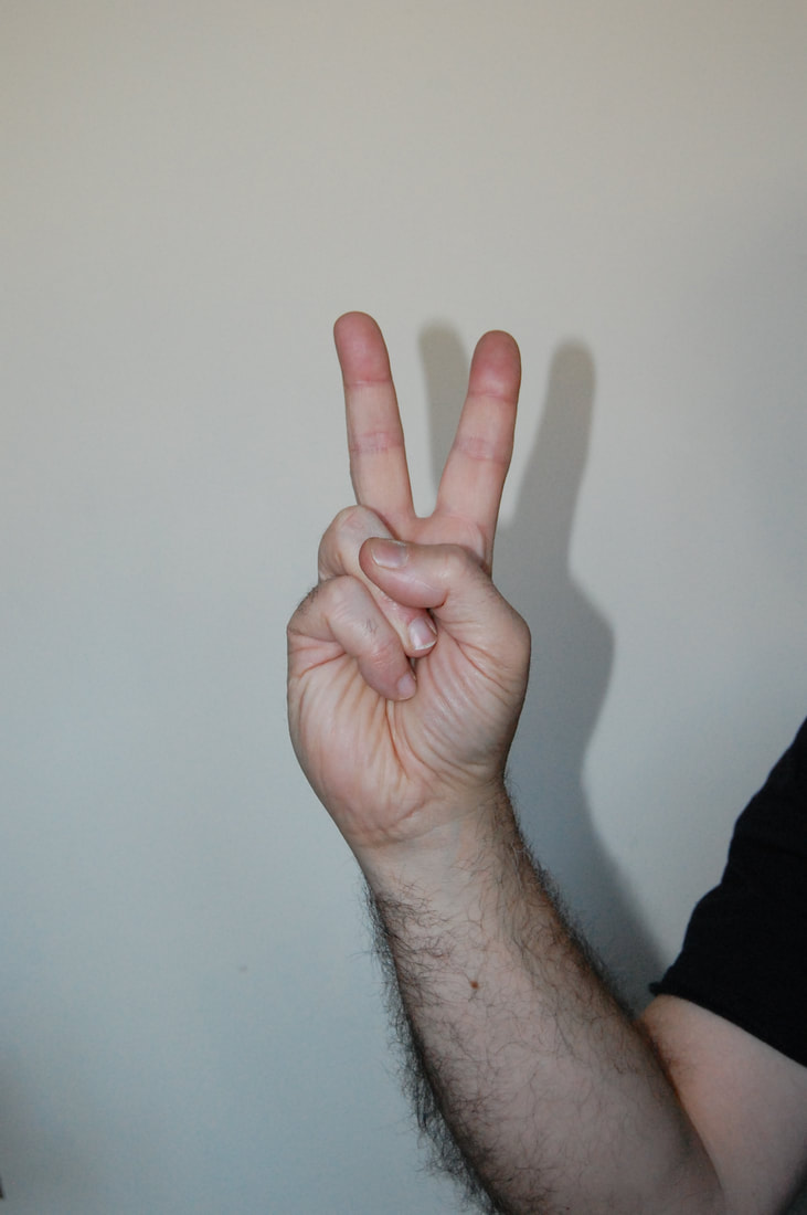
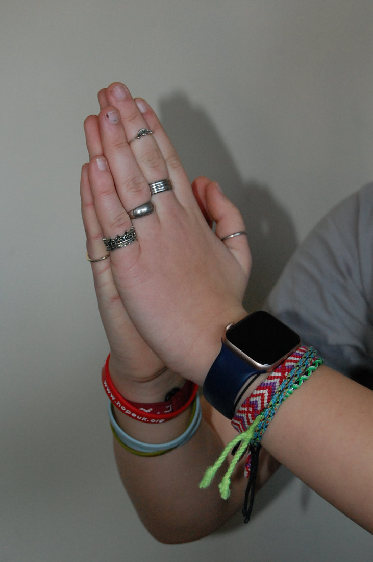
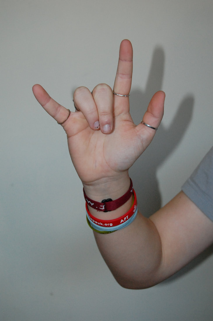
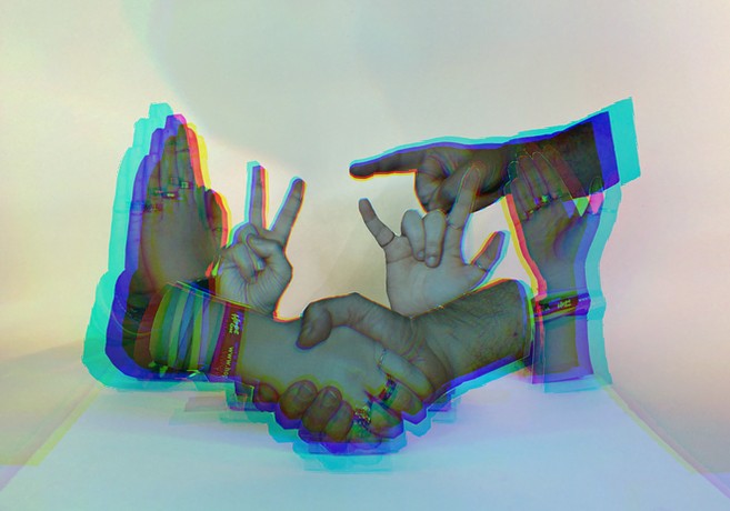
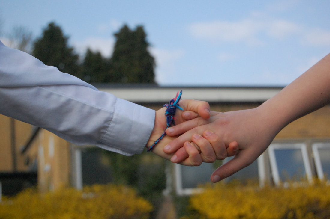
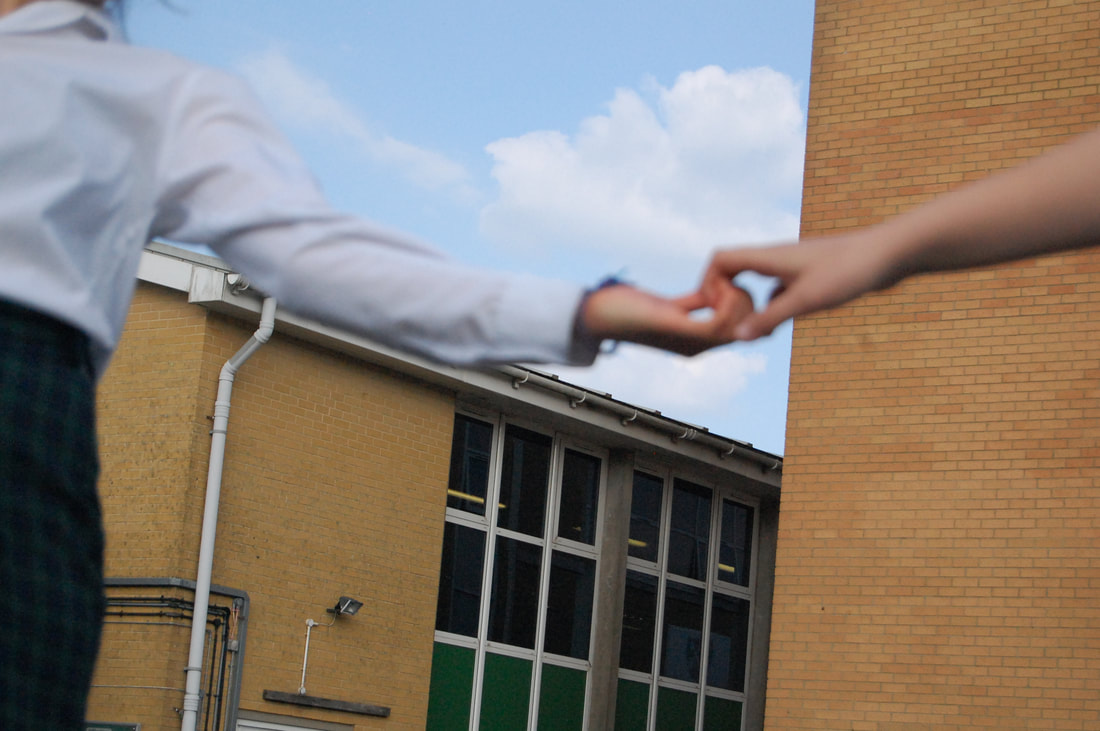
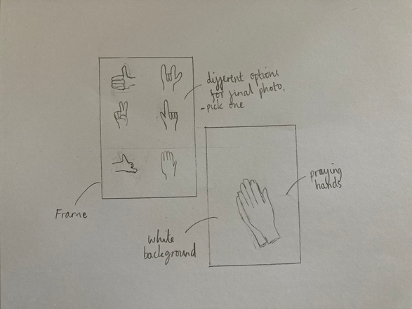
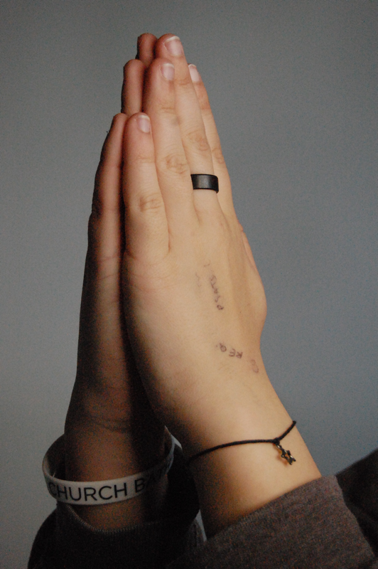
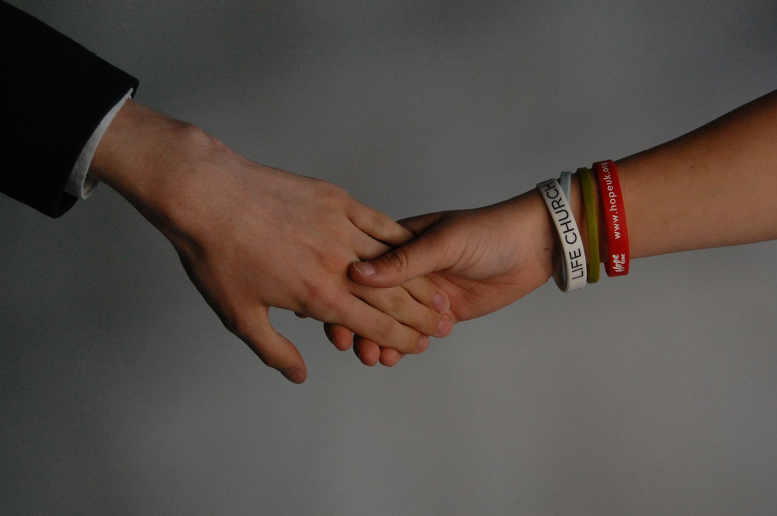
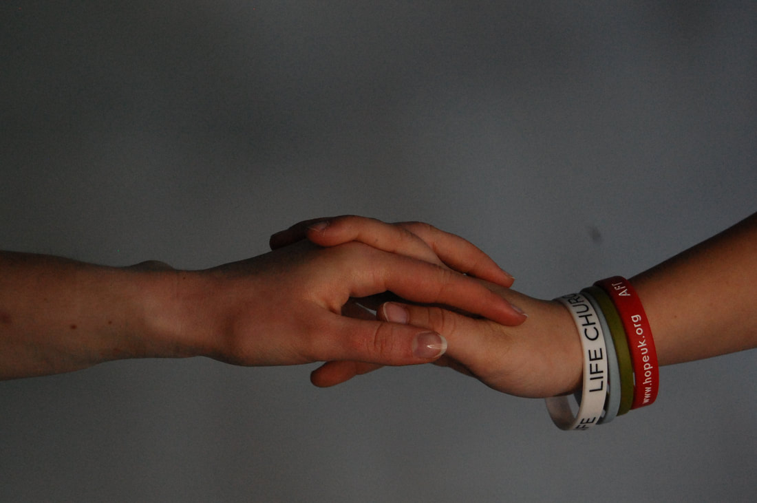
I am pleased with my final outcome of my 3D-2D-3D-2D project that I spent the whole day working on. I printed of my photos, that I took for this final piece, and cut them out then stuck them on cardboard that would then be mounted on white card to be displayed. I used a white back ground and two ring lights either side that my friends helped by holding over two different coloured translucent sheets. This work was meaningful for me as I used my dad and sister as models for the hands and the shaking of the hands in the centre of the image signifies friendship and connection. The images around it are a variety of hand gestures and signs which all mean something different. One was the hands together, normally done while in prayer, prayer is an important part of my life so this reflects my beliefs. The others aren't as meaningful but they all have different things they signify eg the peace sign and and 'I love you' in sign language. I hope the audience of my work will understand what it means to me, and why I used the photos I did. I think I successfully explored my theme of the human form well because I tried to take my shoots in as many different ways as I could. However, I think I could've explored different ages as models.
I have experimented with a range of different shoots and techniques in this project including aperture and depth of field. This focussed my images and concentrated on the objects in the shot bringing out the detail in them. I was going to refine my experimental shoots, but we were told to make a final piece of a 3D project. I still did a couple of experimental shoots which I think turned out good as I explored different age models, different coloured back grounds and changing the objects they would hold. I found getting the right lighting at home when I was taking photographs a bit challenging as I don't have any lighting equipment at home. However when I was taking photos for my final piece I made sure I had the correct lighting, aperture and depth of field to get high detail images ready to be printed.
I am pleased with my final outcome of my 3D-2D-3D-2D project that I spent the whole day working on. I printed of my photos, that I took for this final piece, and cut them out then stuck them on cardboard that would then be mounted on white card to be displayed. I used a white back ground and two ring lights either side that my friends helped by holding over two different coloured translucent sheets. This work was meaningful for me as I used my dad and sister as models for the hands and the shaking of the hands in the centre of the image signifies friendship and connection. The images around it are a variety of hand gestures and signs which all mean something different. One was the hands together, normally done while in prayer, prayer is an important part of my life so this reflects my beliefs. The others aren't as meaningful but they all have different things they signify eg the peace sign and and 'I love you' in sign language. I hope the audience of my work will understand what it means to me, and why I used the photos I did. I think I successfully explored my theme of the human form well because I tried to take my shoots in as many different ways as I could. However, I think I could've explored different ages as models.
The Human Condition Extended
Pinterest board of my sub-theme
Threshold Concept
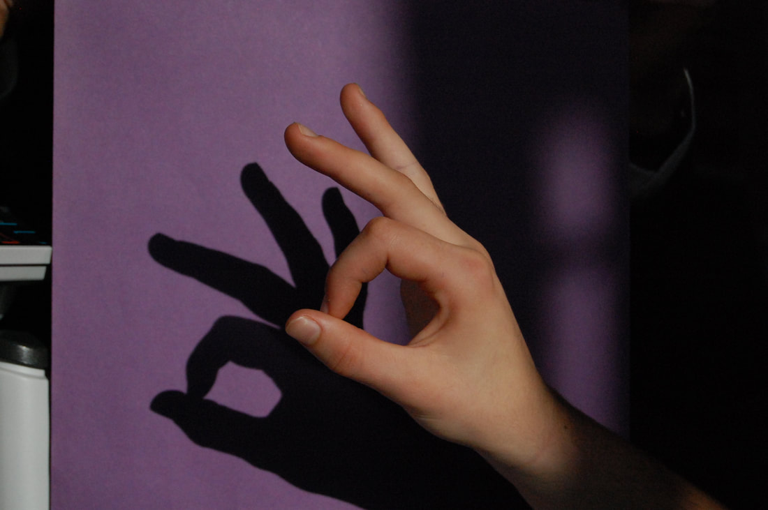
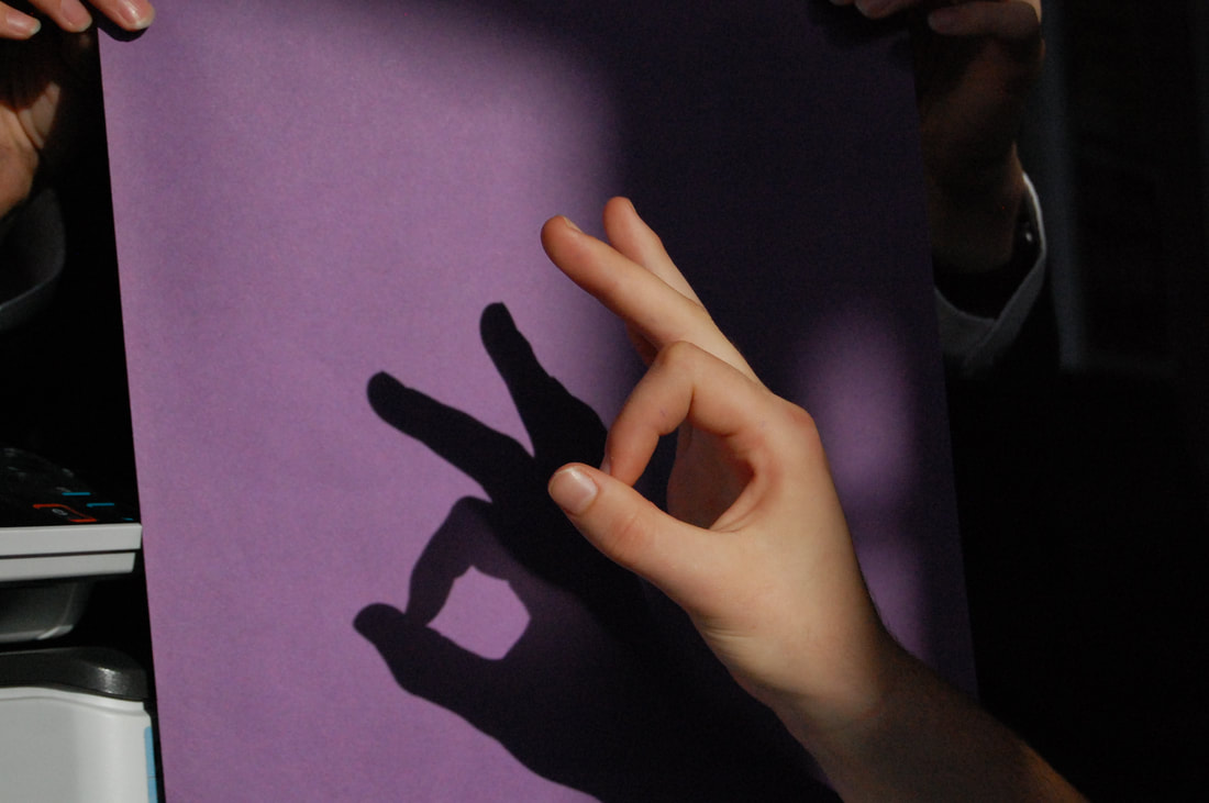
|
Threshold concept #4: Photography is the art of selection rather than invention. Photography is unlike other visual arts in that it begins with a world full of things rather than a blank slate. However, photography is also an art of production, not just reflection. It does things to the subjects it represents.
"Photography is a system of visual editing. At bottom, it is a matter of surrounding with a frame a portion of one's cone of vision, while standing in the right place at the right time. Like chess, or writing, it is a matter of choosing from among given possibilities, but in the case of photography the number of possibilities is not finite but infinite." - John Szarkowski |
|
|
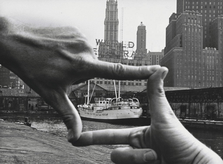
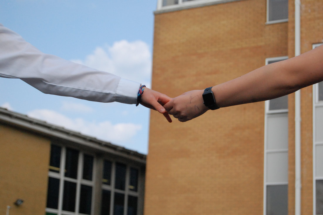
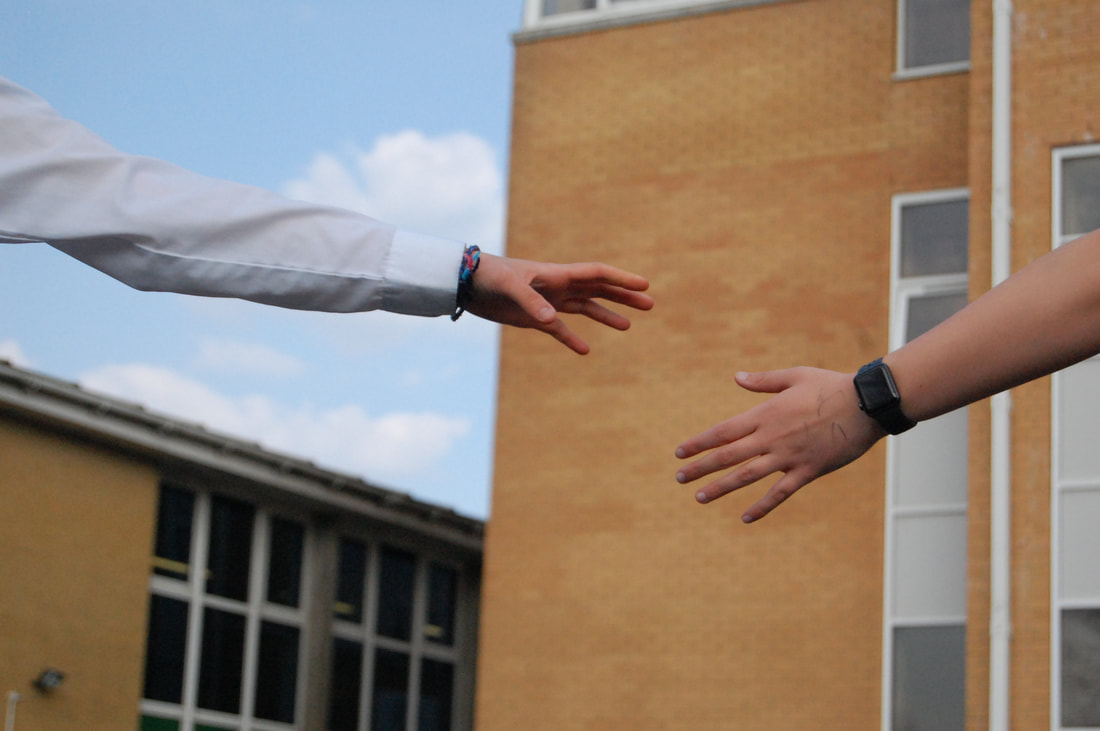
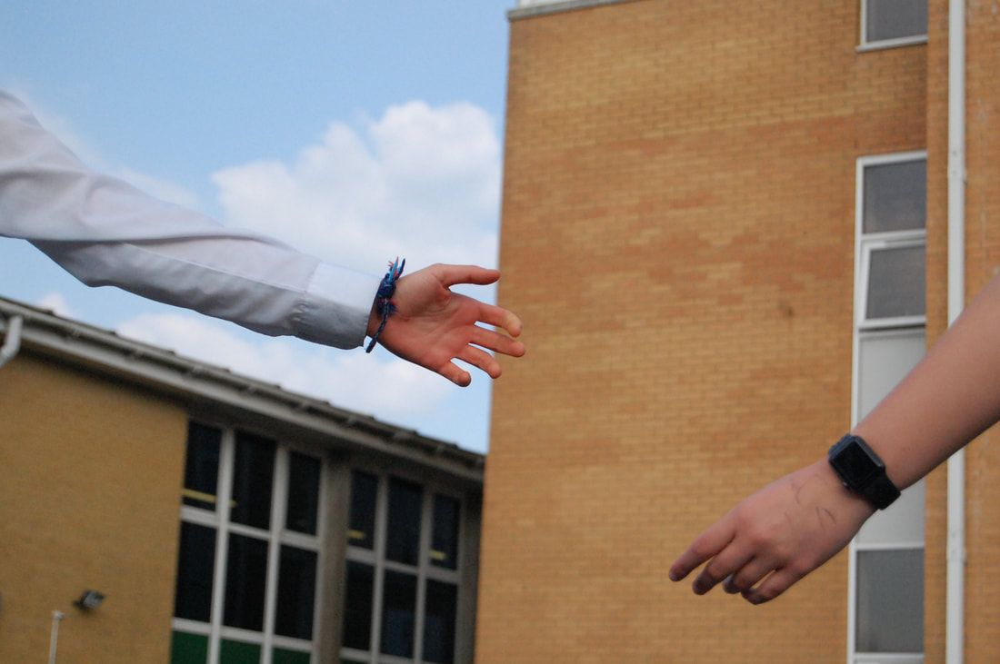
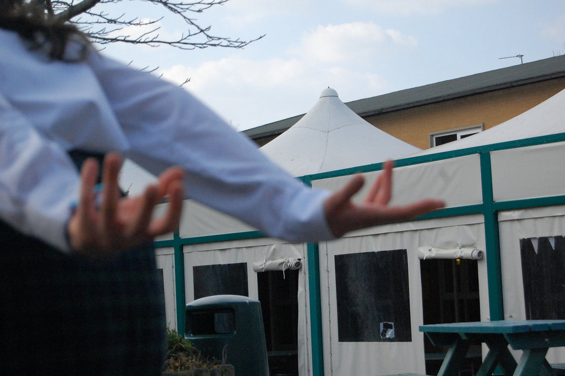
John Baldessari (photo by Sunk-Kender) - hands framing New York Harbour, 1971. Baldessari used his hands to mimic the view of their camera, emphasising the framing choices made by the photographers.
This photograph presents a frame within a frame. If Baldessari had moved his hands a few centimetres in any direction, the intended framing of the boat could be totally different. He could've framed the architecture or the sign. Photographers have to make choices and in these phots below the photographers had to chose where to place the edges and what to include or exclude from the frame. |

|
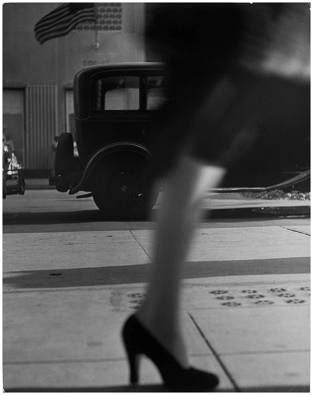
The title of this piece is Lisette model - running legs, New York in 1941. It is an example of the threshold concept #4 'Photography is the art of selection rather than selection'. The composition shows a woman's leg moving past the frame quickly, she is wearing black high heels and a skirt/dress down to her knees. She is walking along a pavement and in the background there is a car and an American flag. The focal point of the image is the woman's leg because she is the subject and is placed in the centre of the photo. Due to the blurring of the photo the techniques used would be a slightly slow shutter speed of about 1/8th of a second. The colour of the image is black and white and the lines in the image are on the pavement, buildings, car and the subject. Lisette Model was best known to take her photographs with a 35mm camera.
|
Table Top sculpture
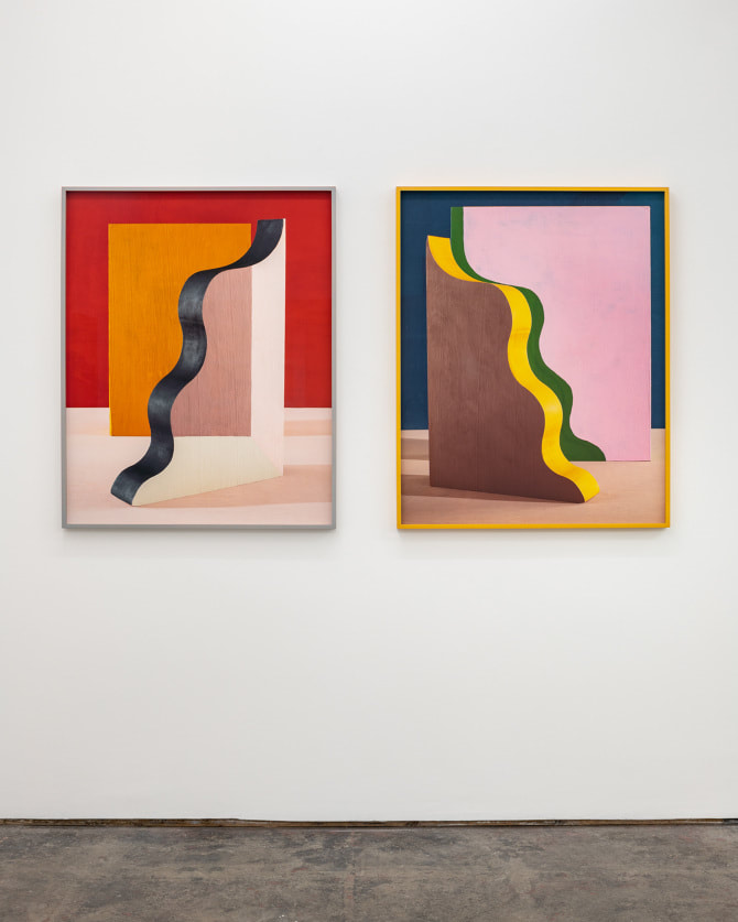
Erin O'Keefe
Erin O'Keefe's oblique geometric photographs are staged to look like abstract paintings of still life, she received her BFA from Cornell university and earned a masters degree in architecture from Columbia. Combining elements of photography, painting and sculpture, O'Keefe constructs formal still life arrangements using hand painted cardboard, plexiglass and wood blocks and photographs them under precise lighting conditions, seemingly flattering three dimensional objects to appear as if they exist on a single plane.
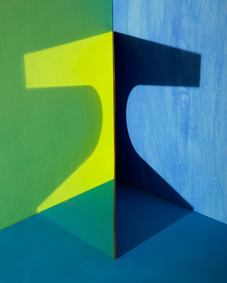
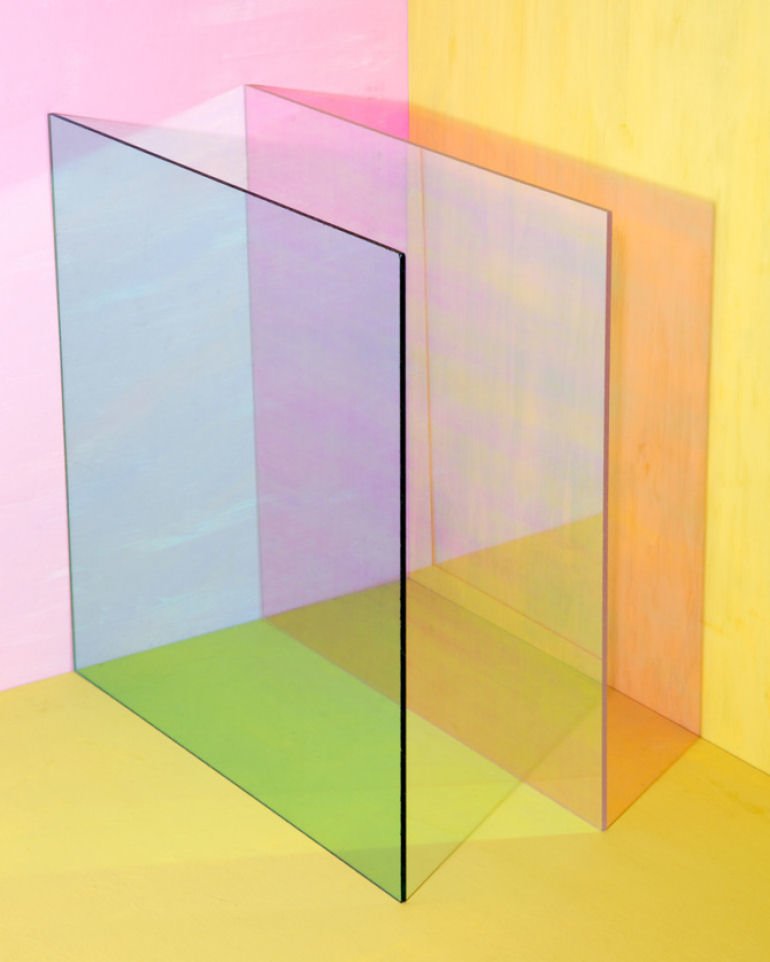
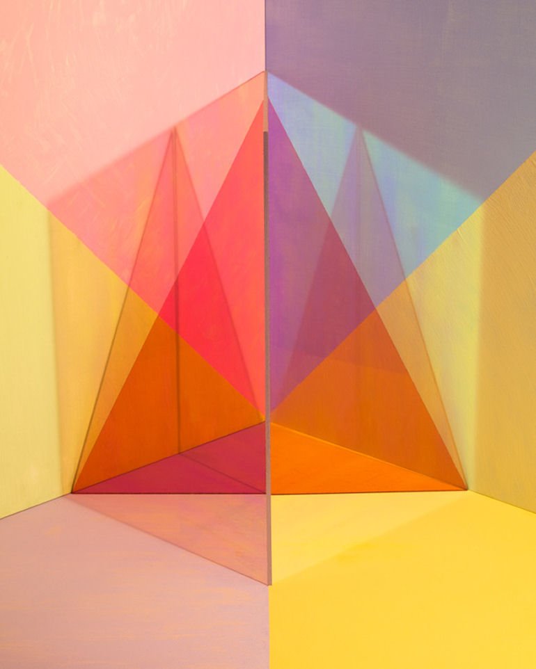
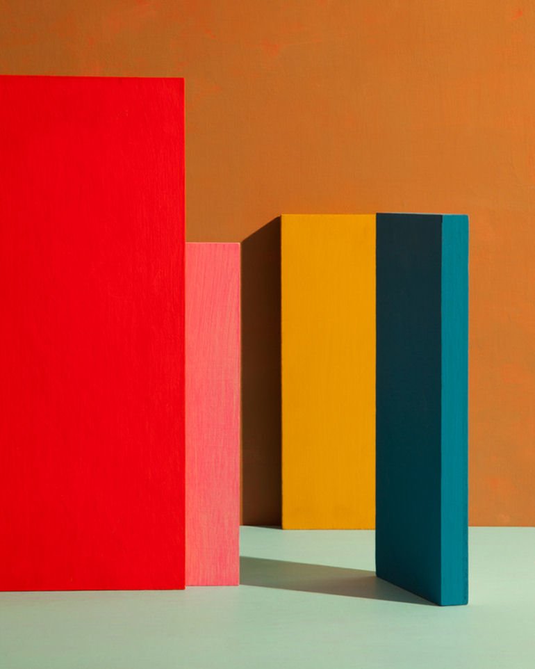
My photos using my sub theme
11
Edits
Photographs of photographs
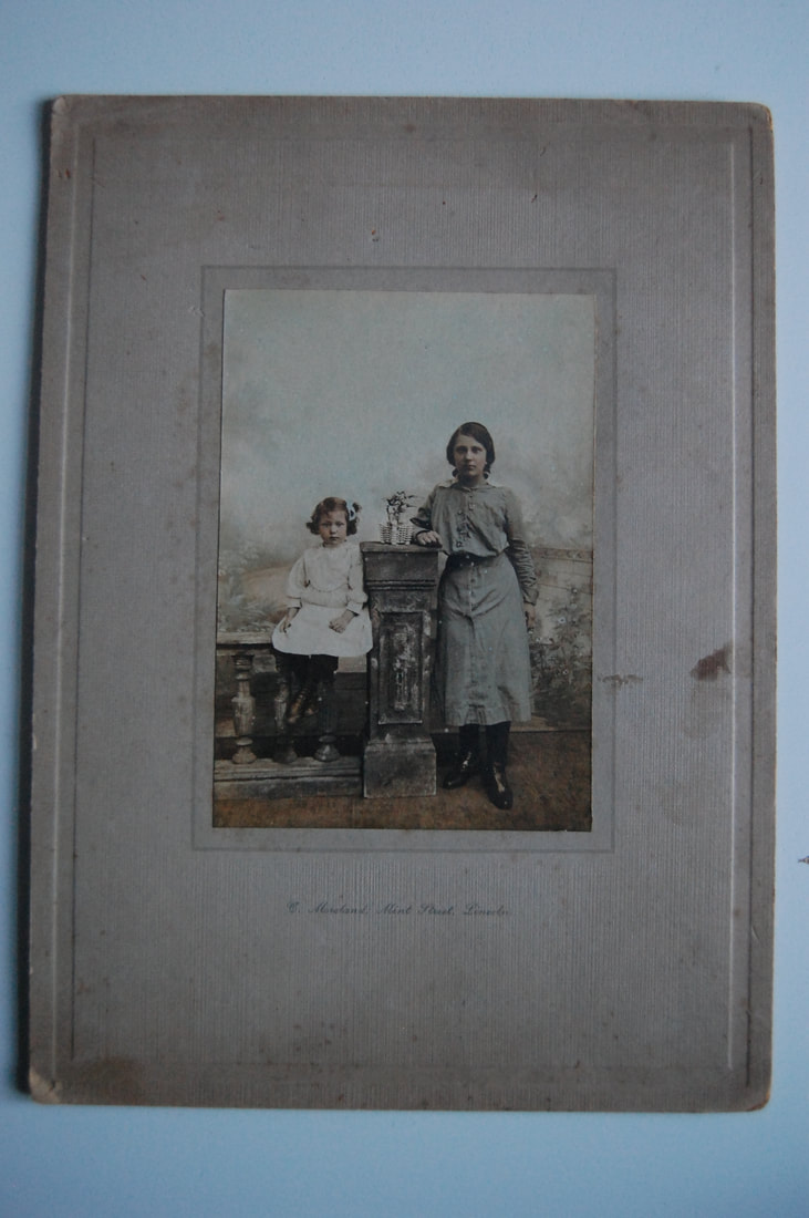
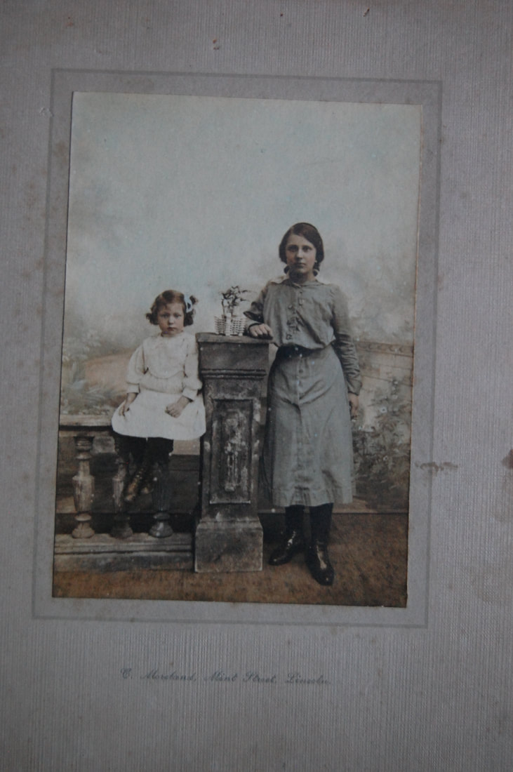
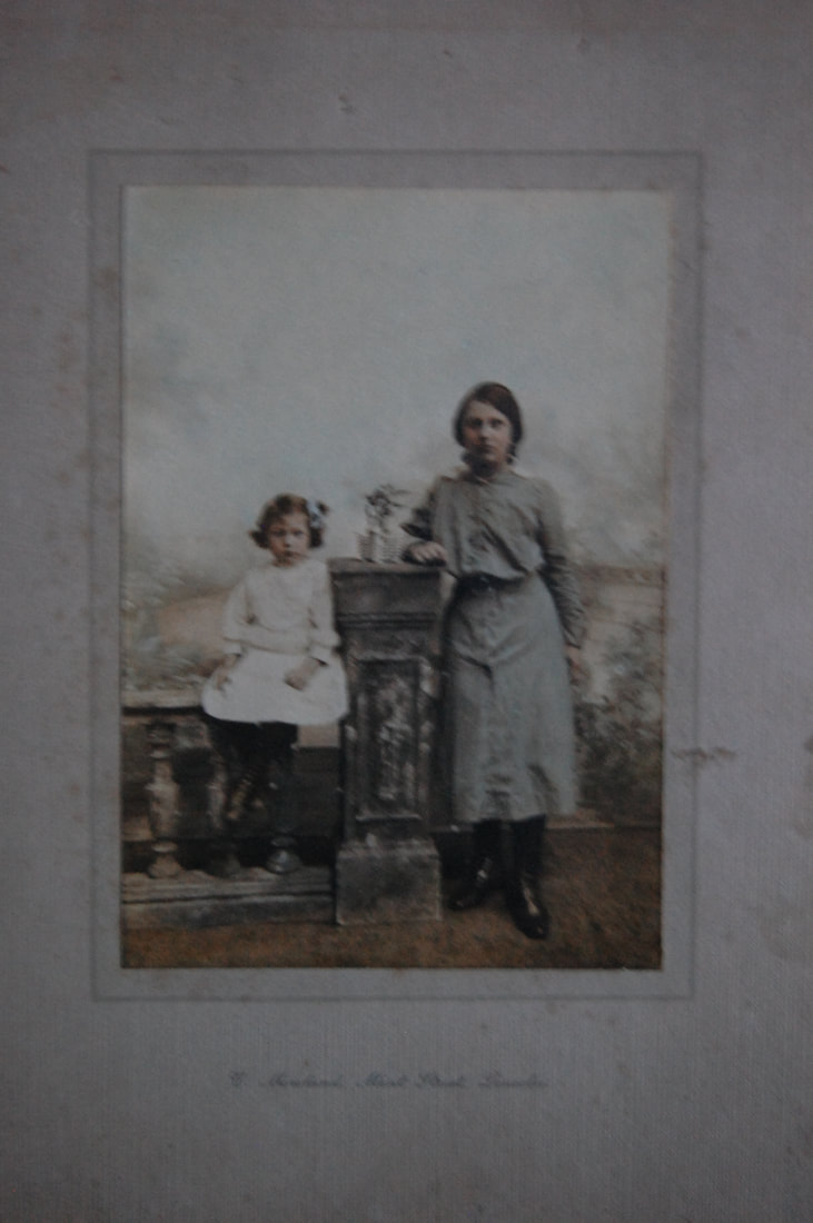
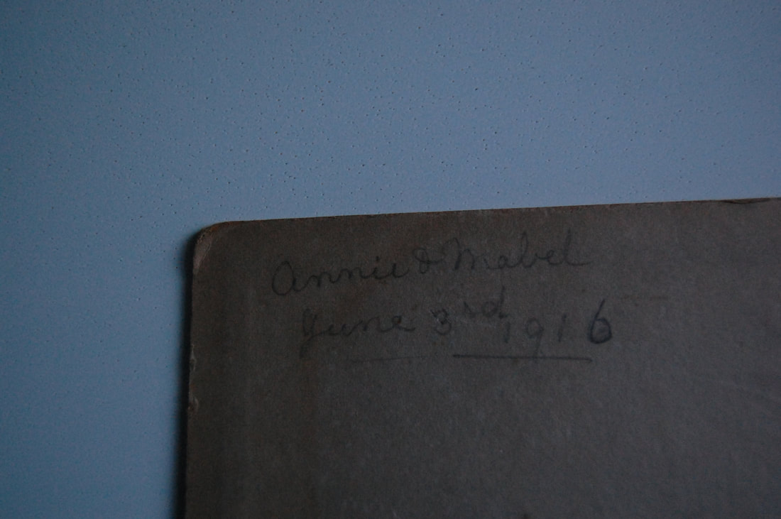
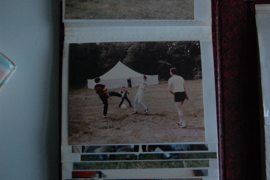
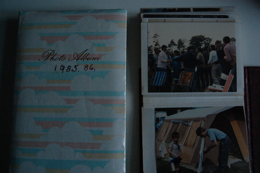
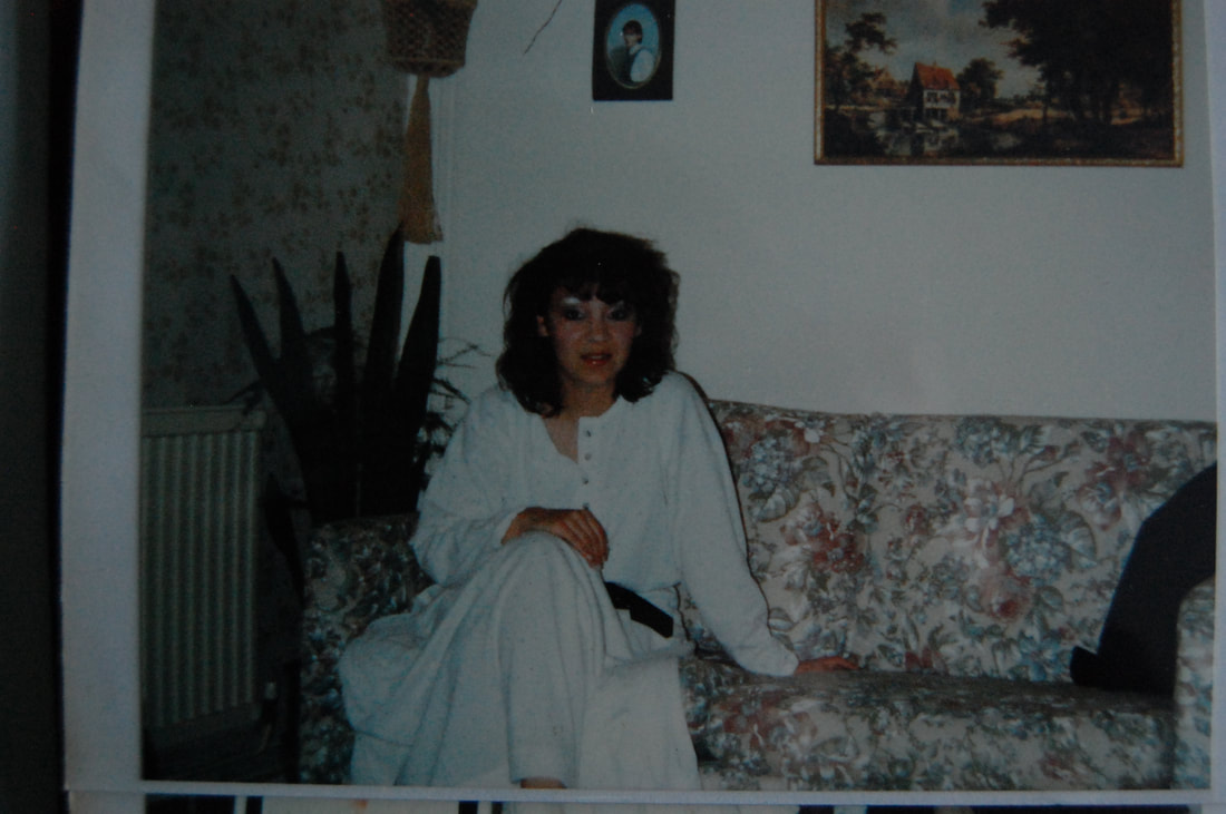
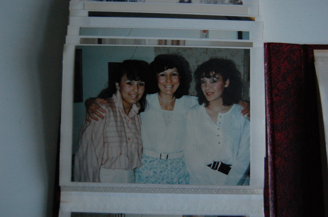
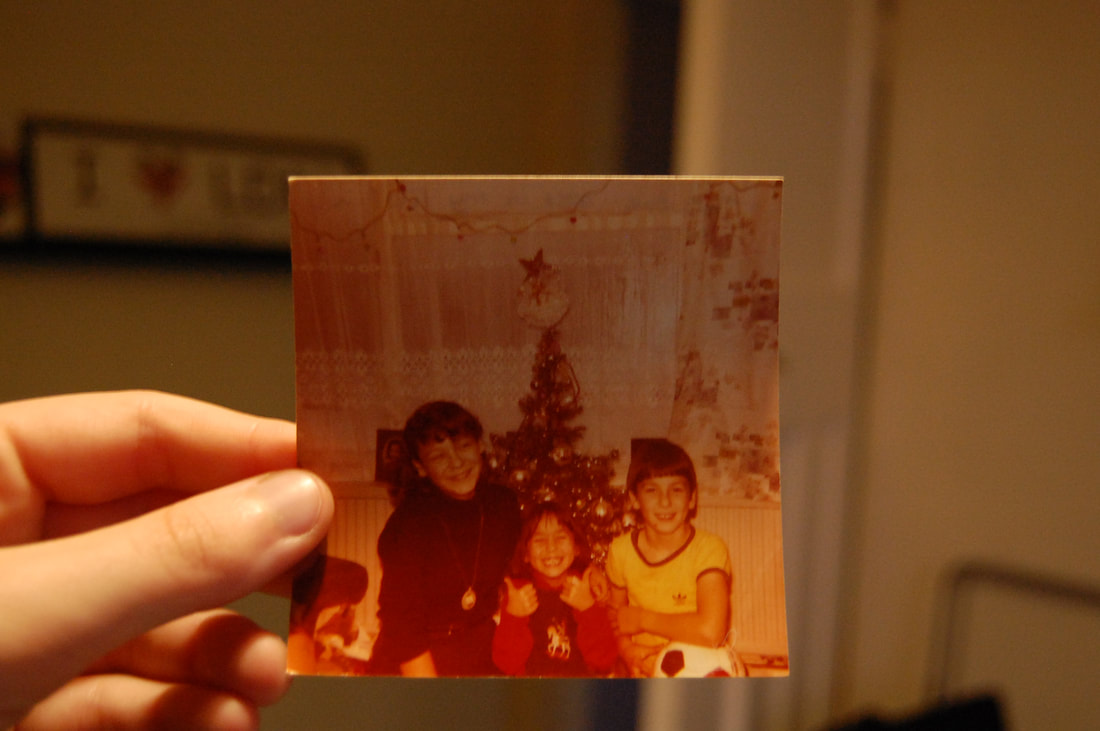
Julian Germain
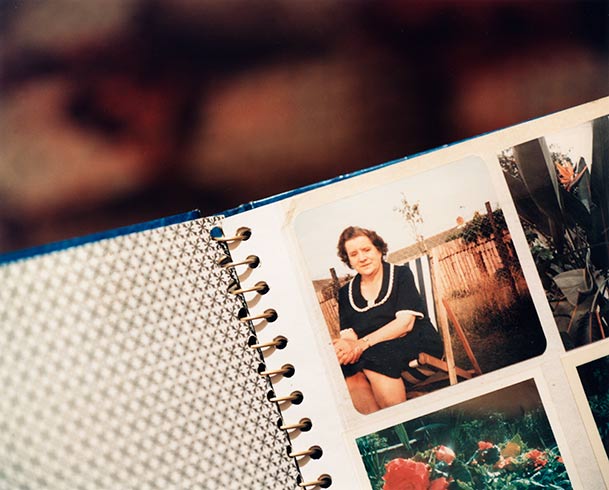
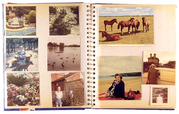
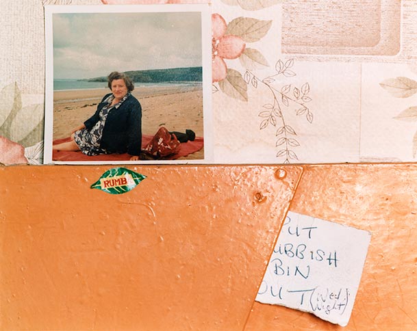
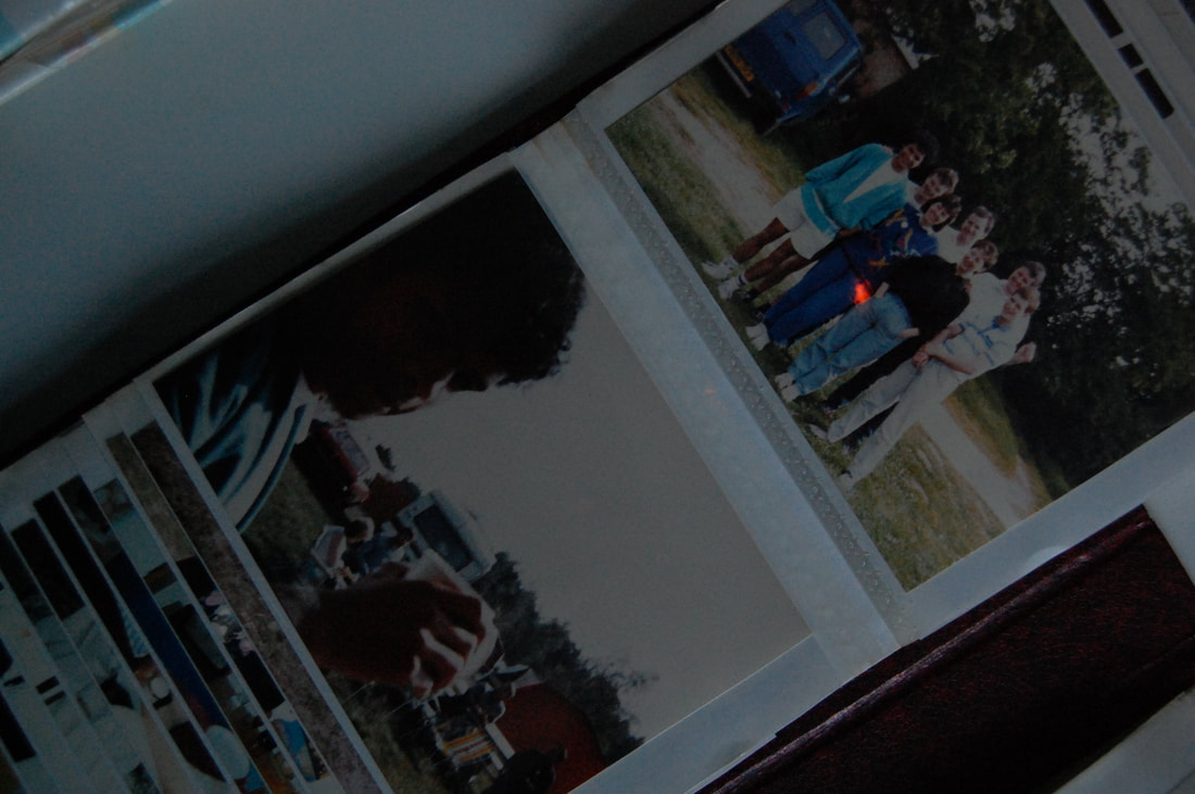
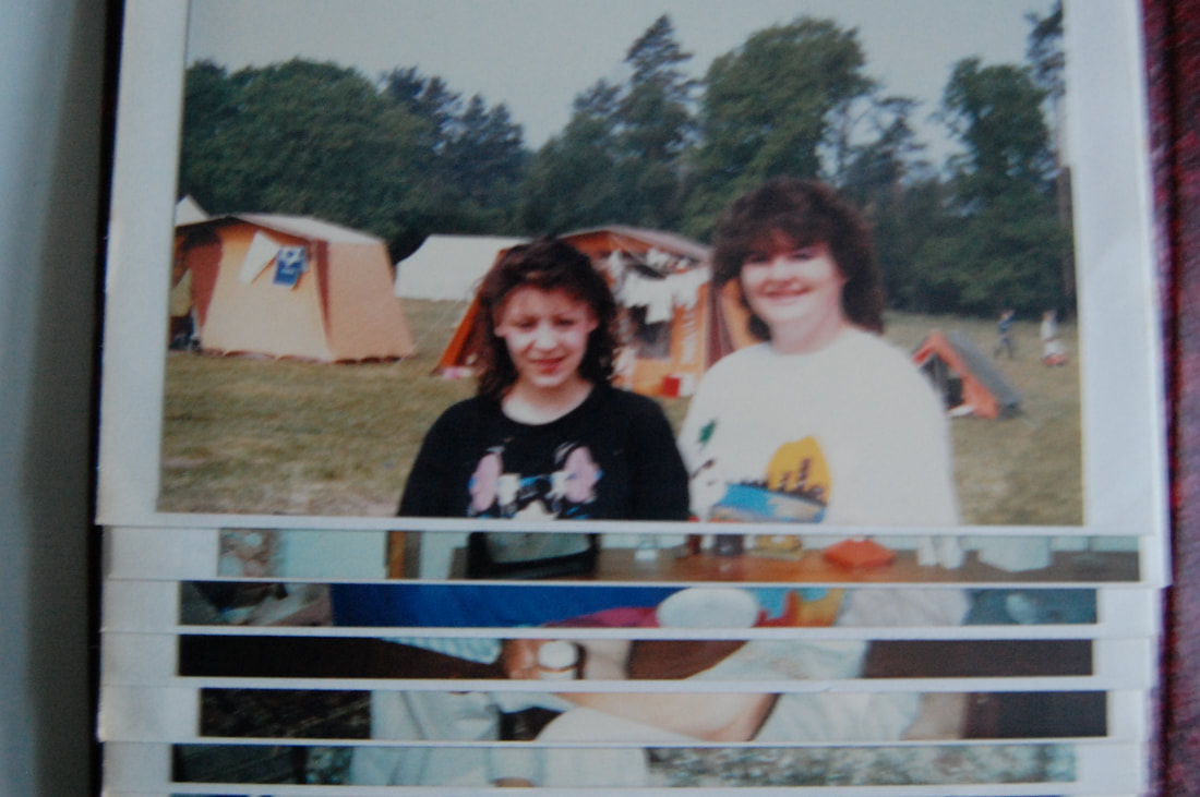
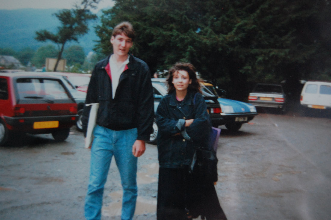
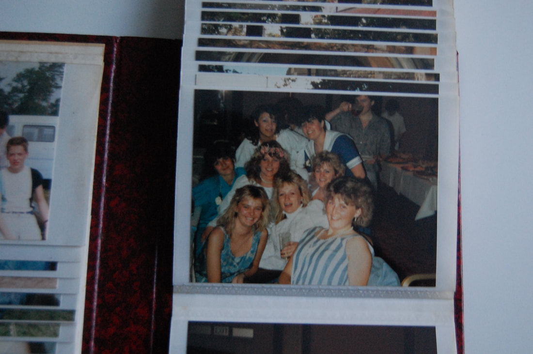
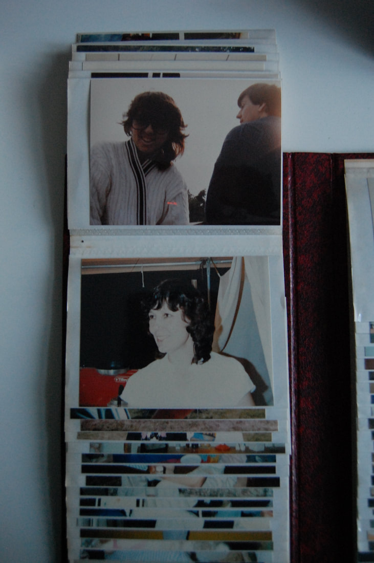
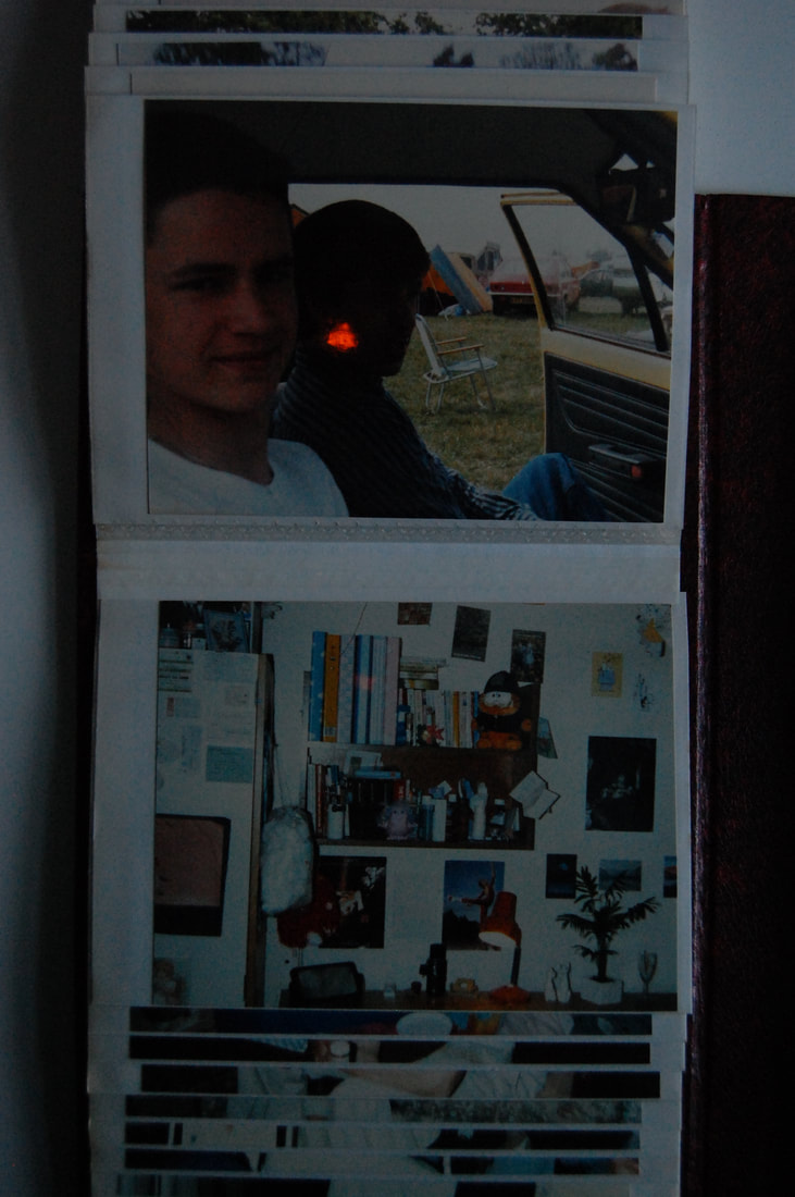
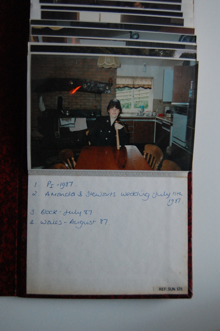
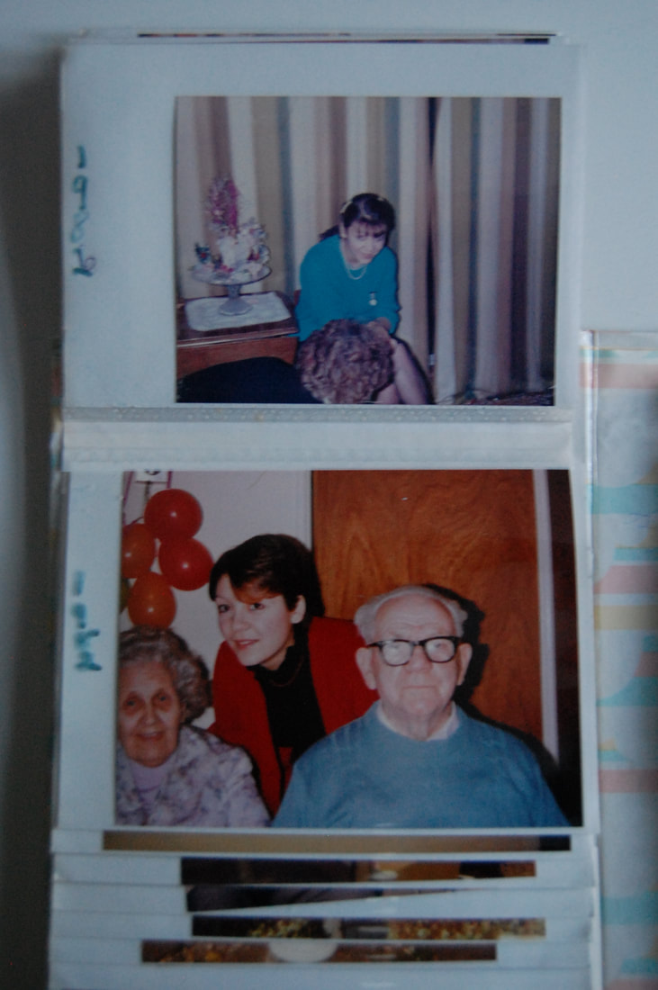
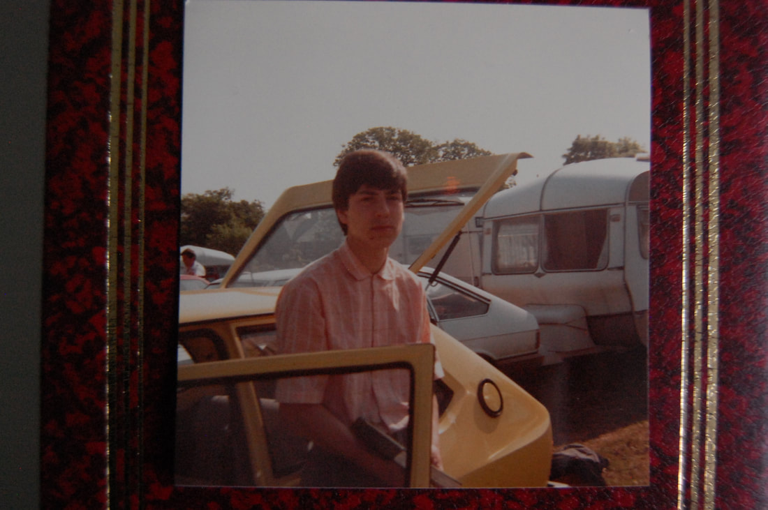
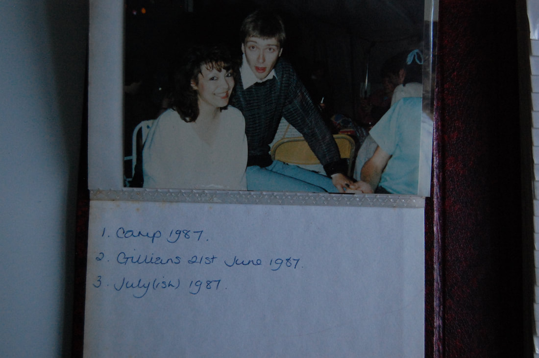
This shoot by Julian Germain and is called 'For every minute you are angry you lose sixty seconds of happiness' in 2005. It photographs his friendship with Charles Snelling, an elderly man living alone in a small house in Portsmouth, who's portraits appear alongside Snelling's own photo album with his wife that passed. He took photographs of his photo albums
My photos
12
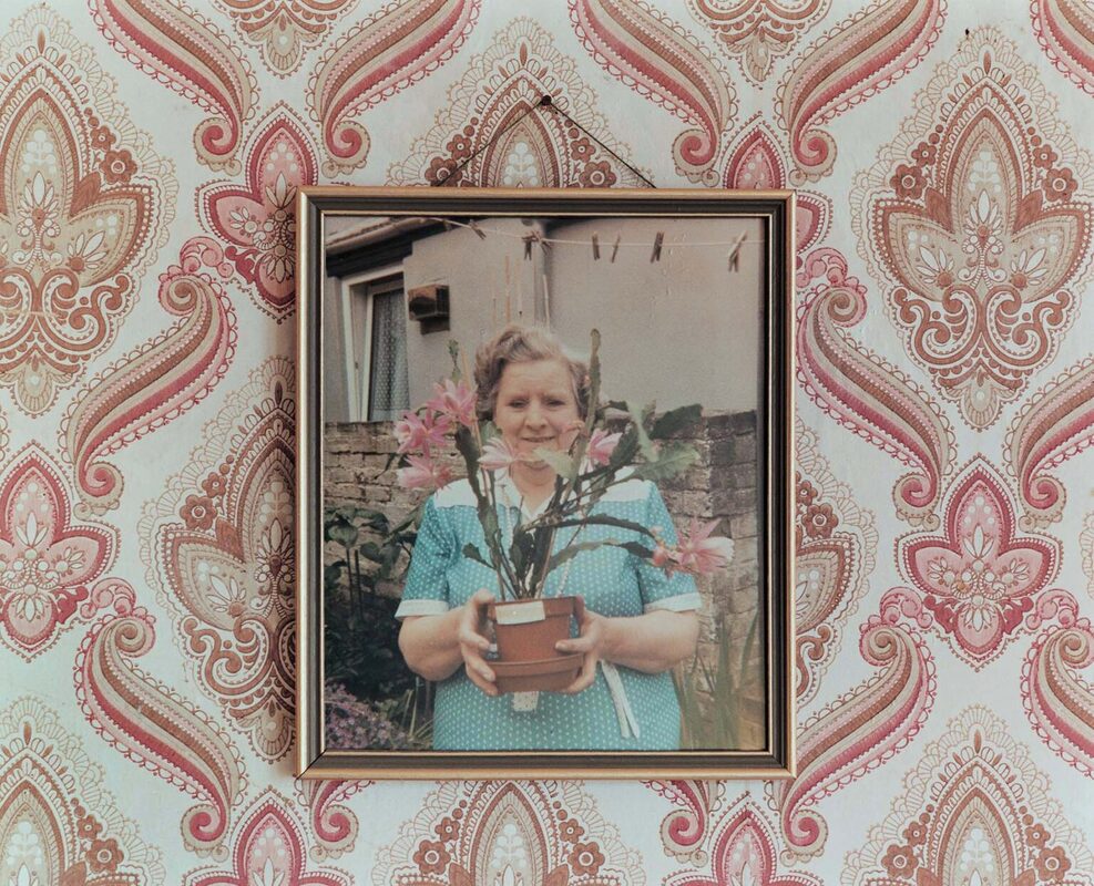
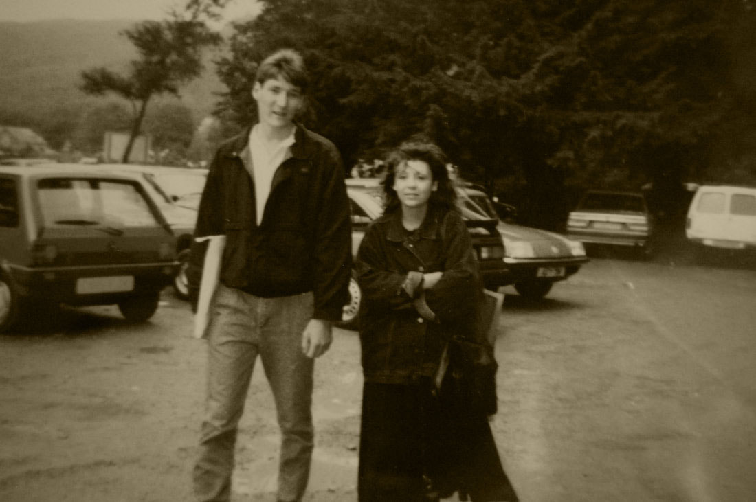
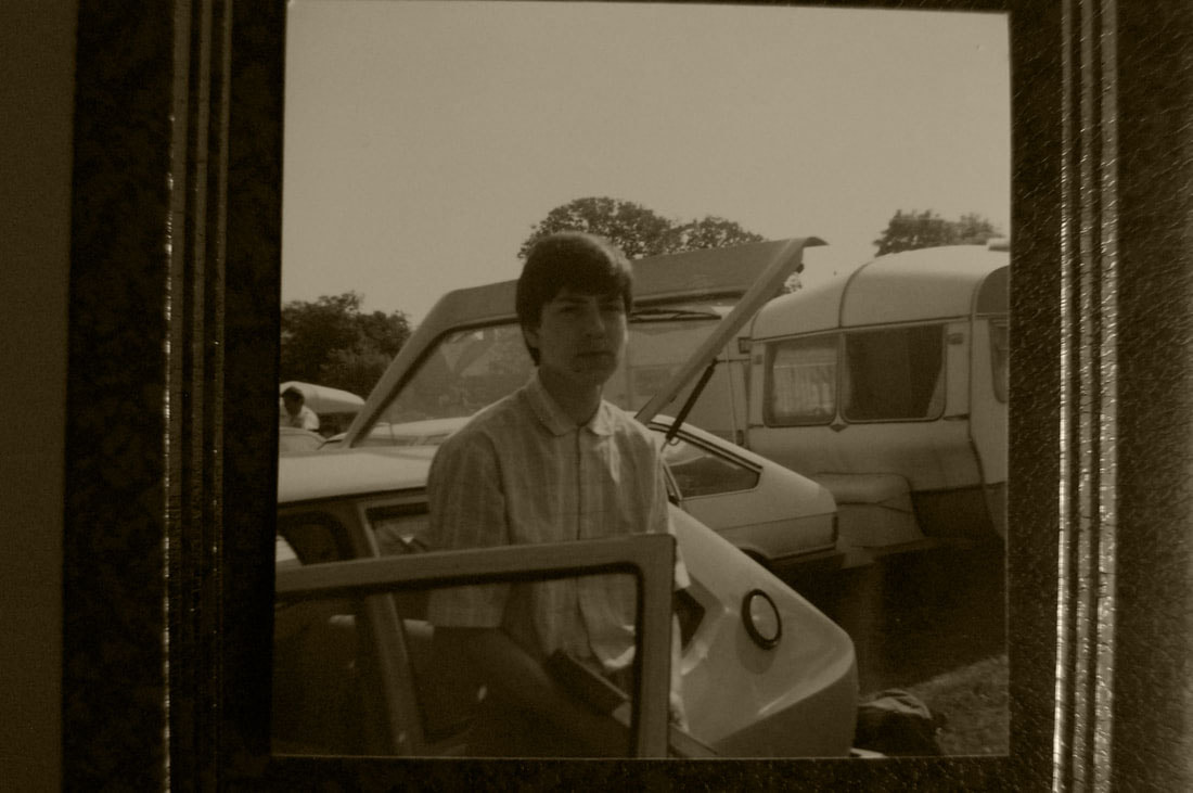
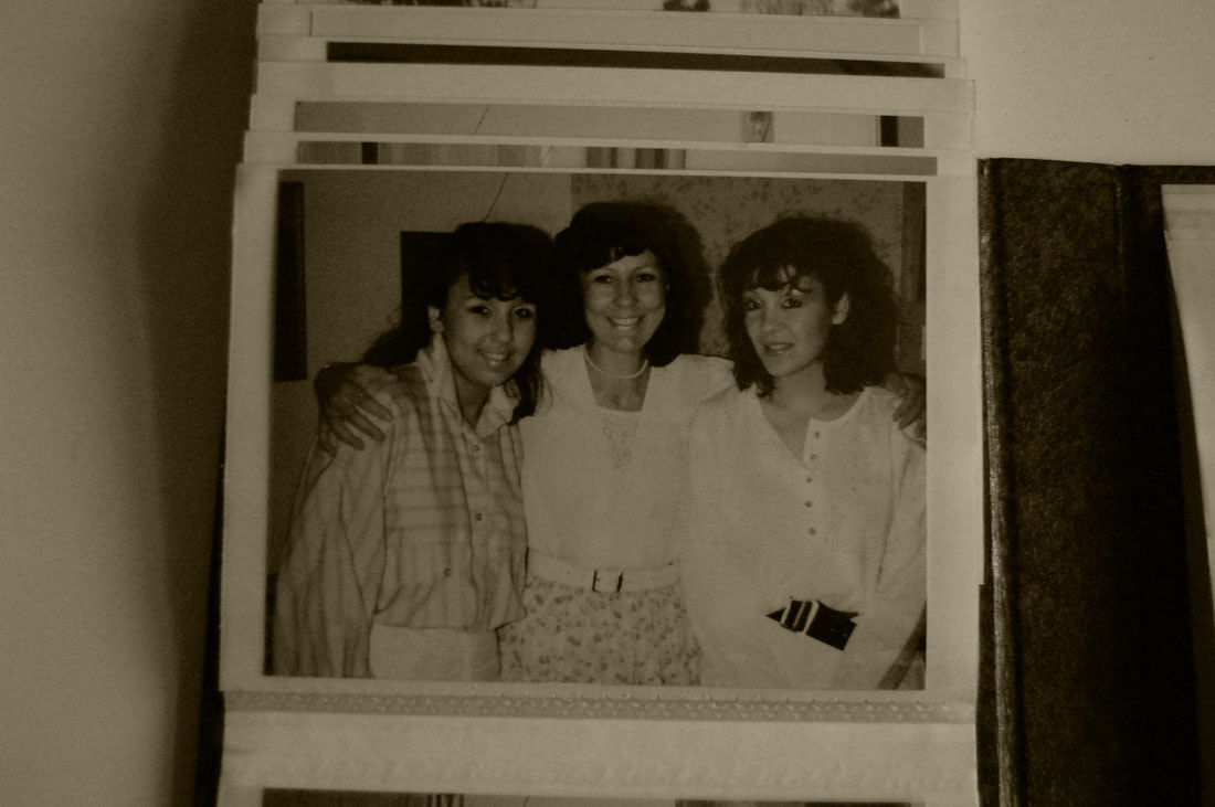
I took photographs of my mum's old photo albums that include her and her family and friends that date back to 1916.
Edits
Shoot review: I think this shoot went well as the edits came out how I wanted them, however the lighting in my main photos wasn't great so to improve I could've used better lighting so they weren't so dark. I used my camera to take these so if I used the flash it would've been reflected. This could've given a nice effect so next time I could play about with the reflective surface of the images and flash/lighting.
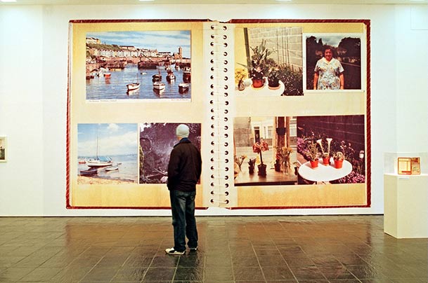
Final piece planning
Developing ideas of how I am going to present my work, looking at previous students' final pieces. I'm thinking about resenting mine in simple frames or doing some sort of typology. The reason I photographed these are I like how they were displayed in simple ways but they still look neat and have good quality photographs.
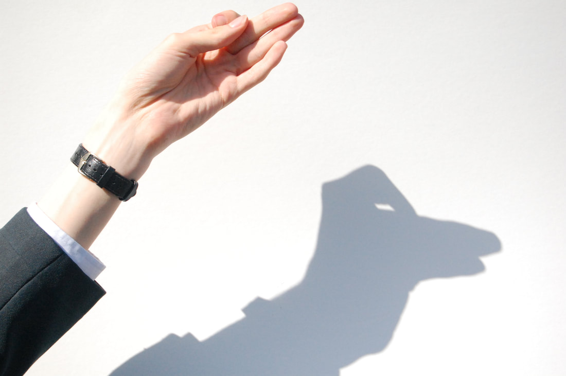
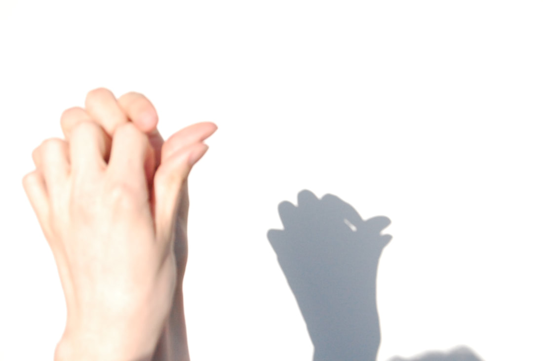
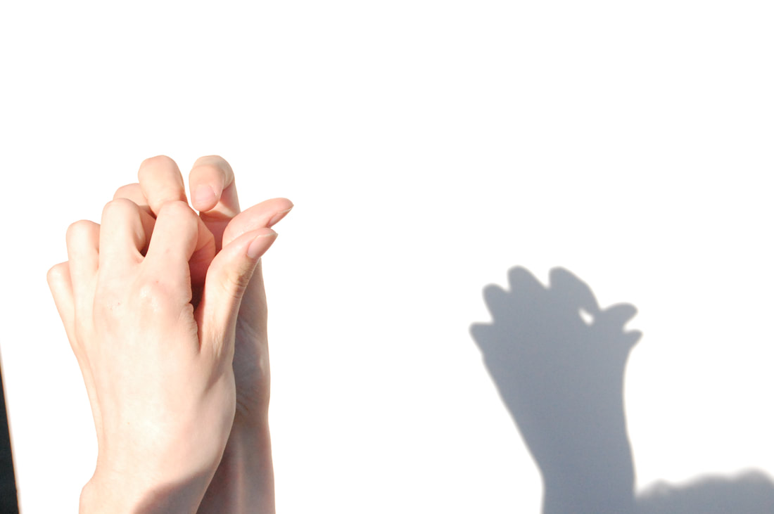
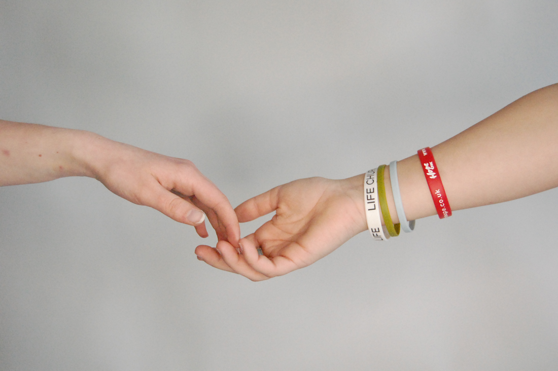
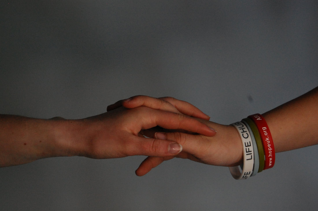
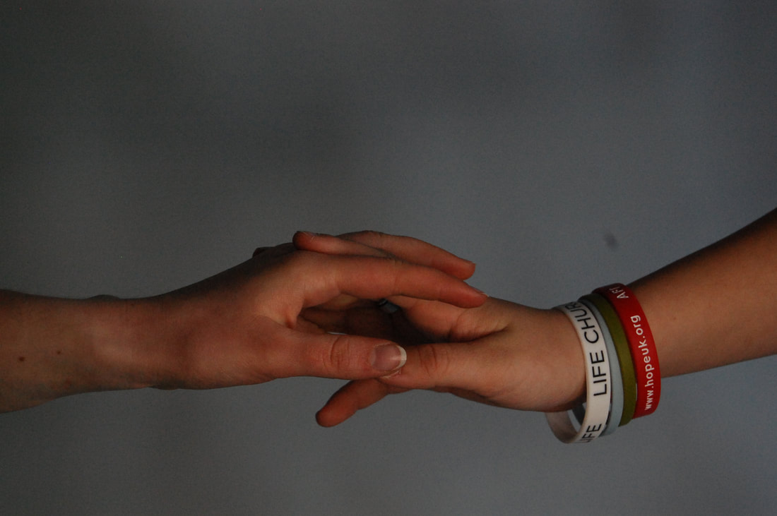
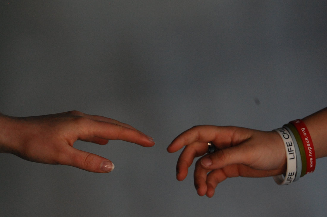
Initial ideasMy first idea was to have 3 frames going from about A5 to A4 to A3, or 2 bigger frames and 1 smaller one. I would take a photo of a younger hand for the frame on the left and an older one for the right. This would be showing how hands age over time.
Another idea is to have one picture across the same three different frames from small to large. I will take a series of images and chose the best one to use across the three frames. I am going to experiment with shadow, using different hand gestures and then full shadows of my friends on the ground. I also would like to just display my photographs normally in two frames of the same size (A2) and just picking the best two from my shoots and edit them for them to be printed out. |
|
Shoot
13
Edits
My developed idea
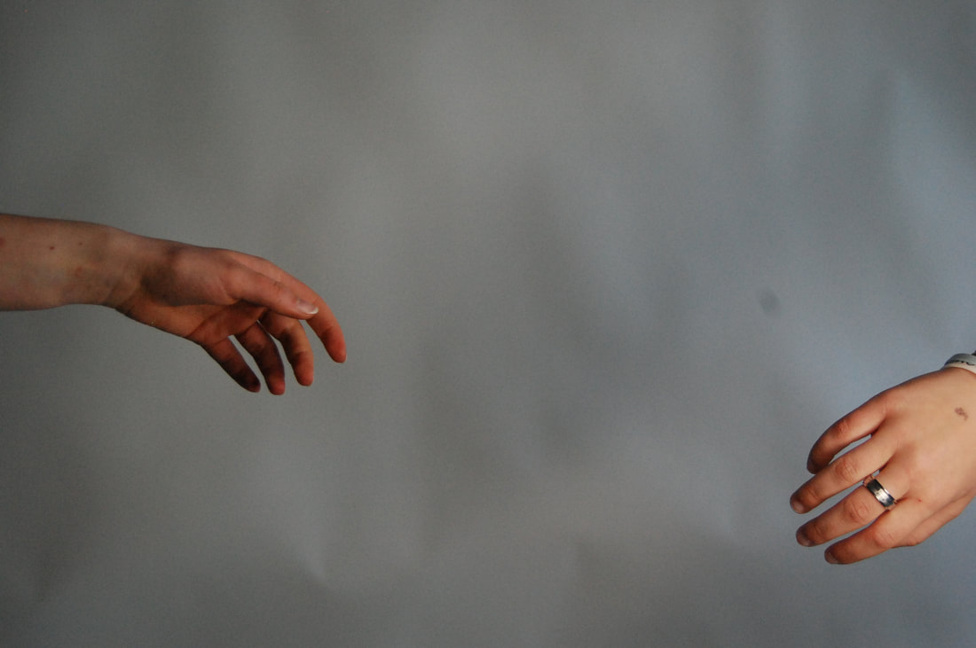
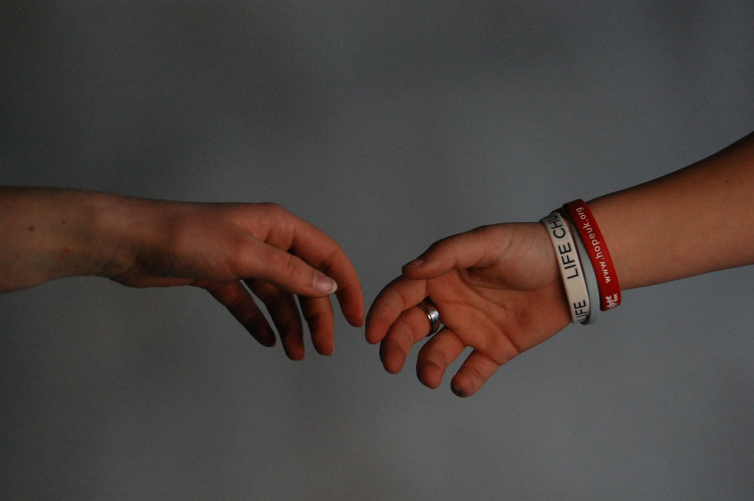
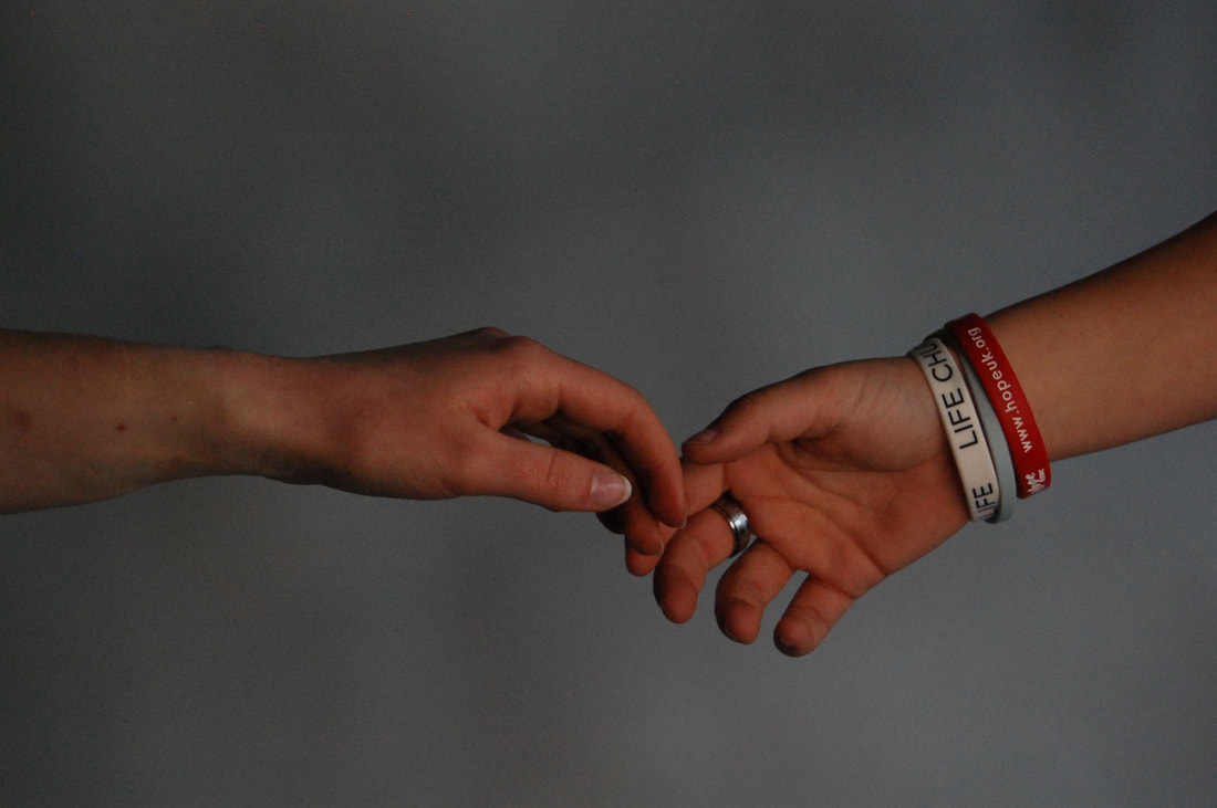
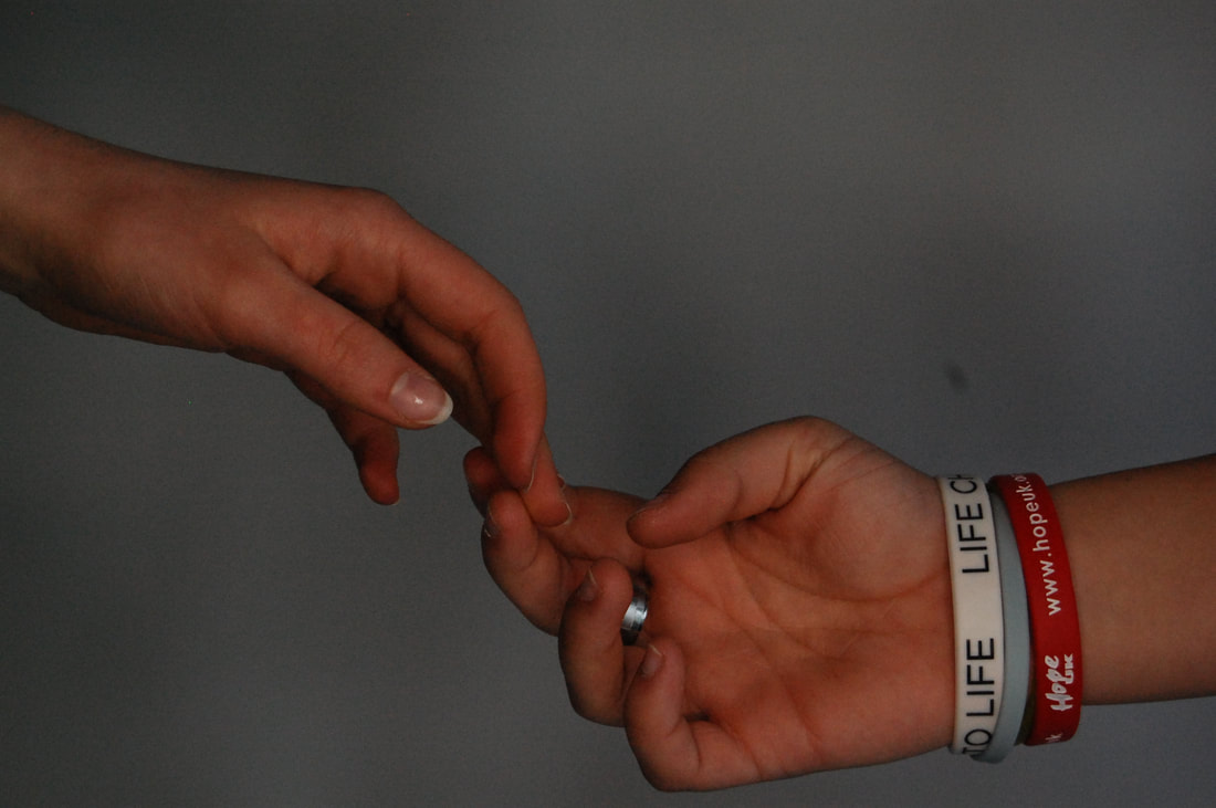
I have decided to go for two good quality images in either two frames or displayed on a mount board. I'm going for a simplistic look as I will be using a bright white background with the main focus being the hands. I drew what I want it to look like; however, the image that will go on the left could be switched to landscape.
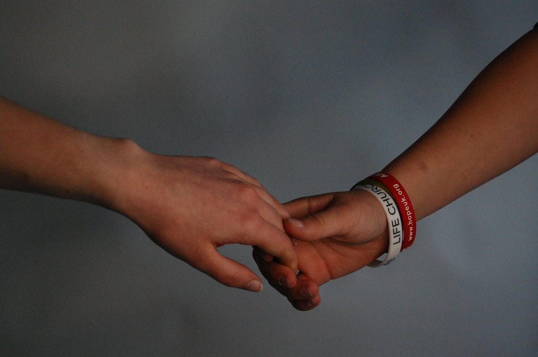
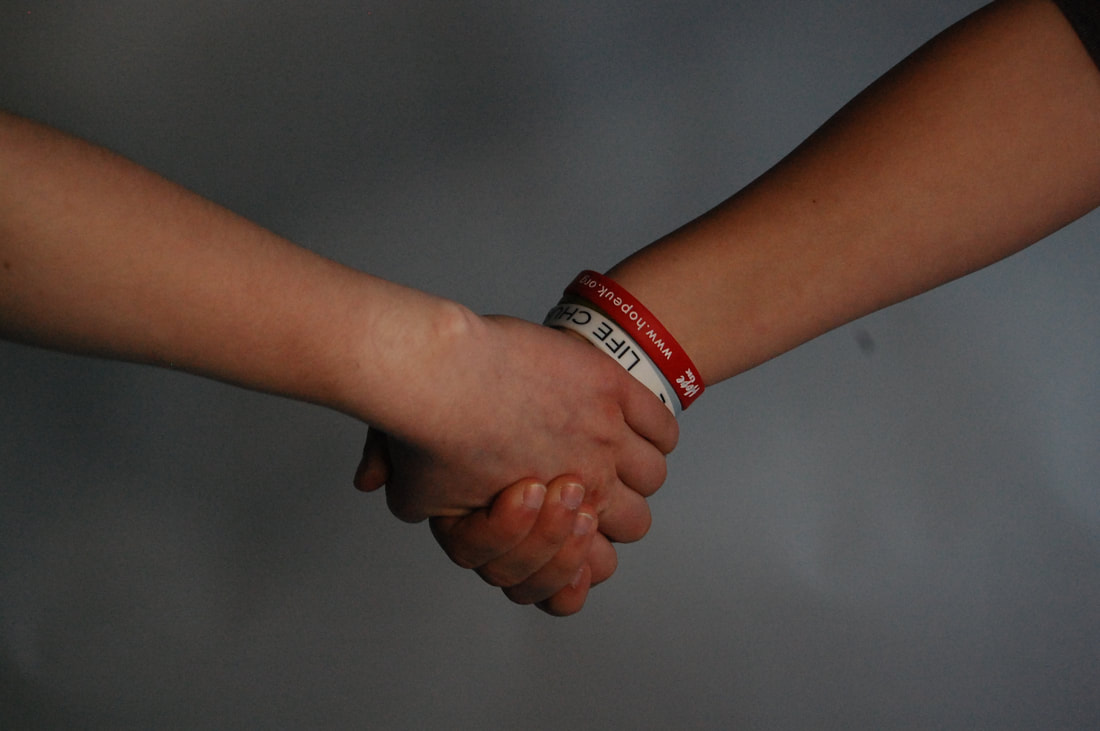
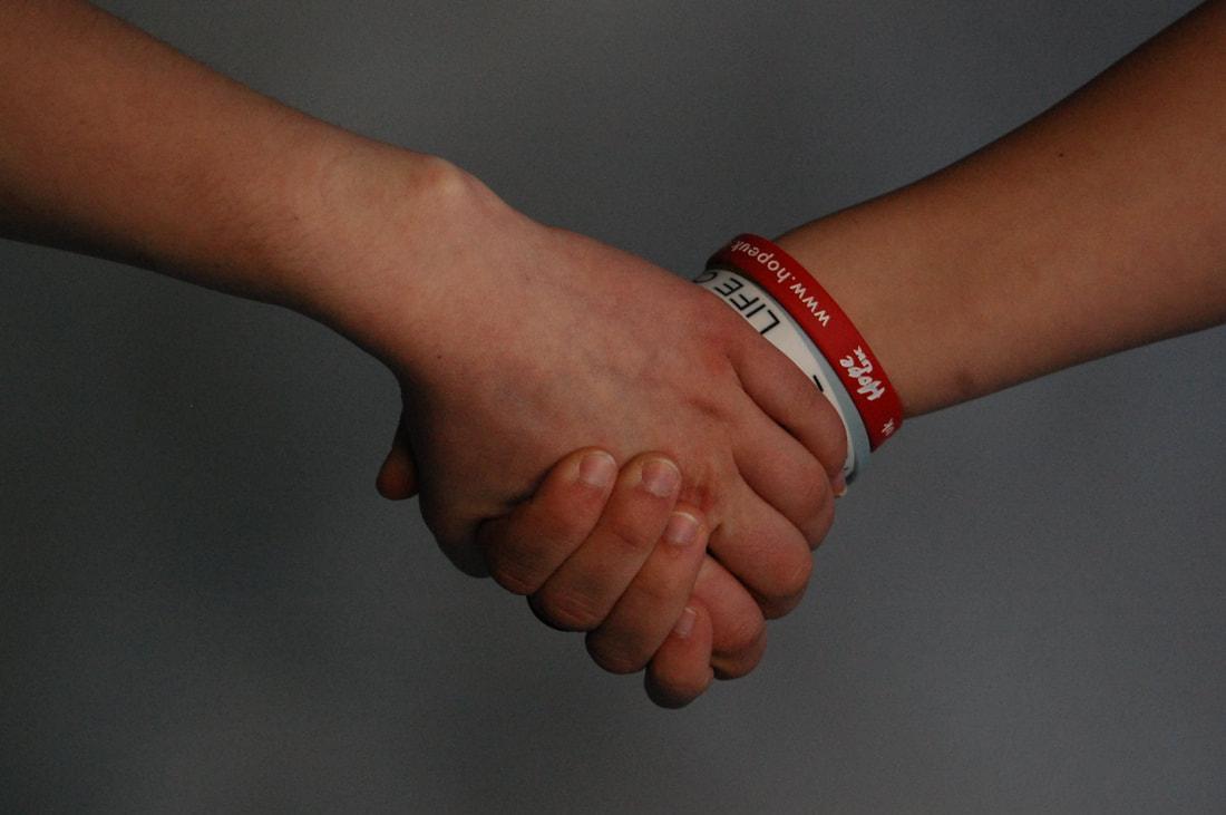
My final piece shoot
14


Edits
Shoot review
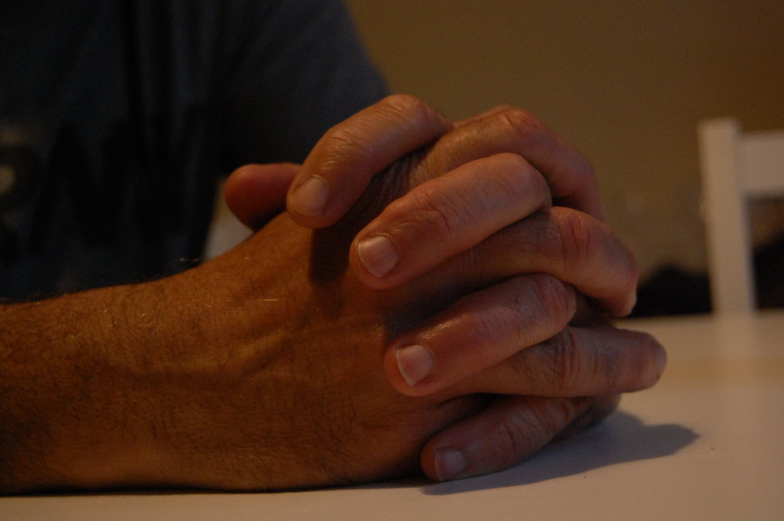
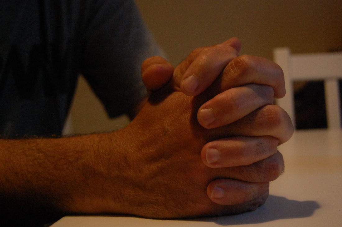
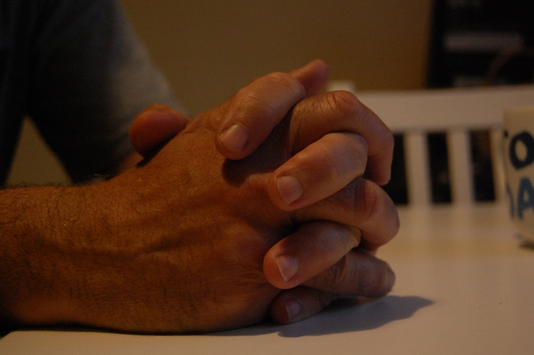
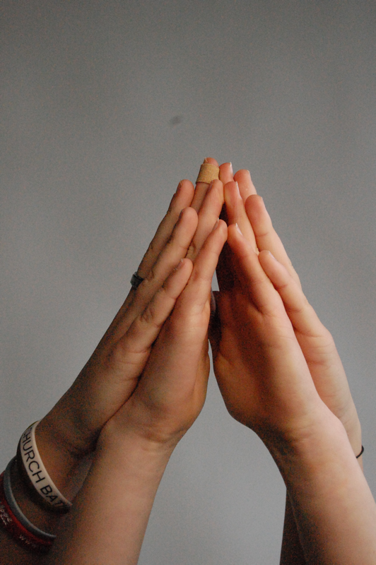
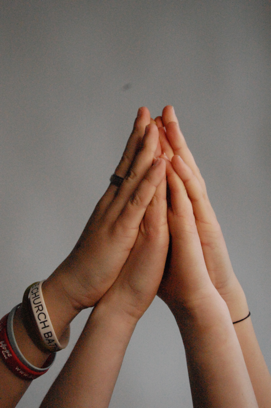
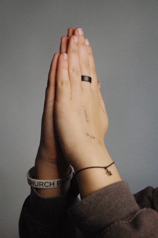
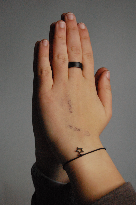
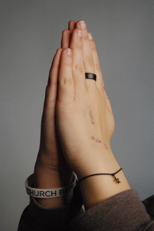
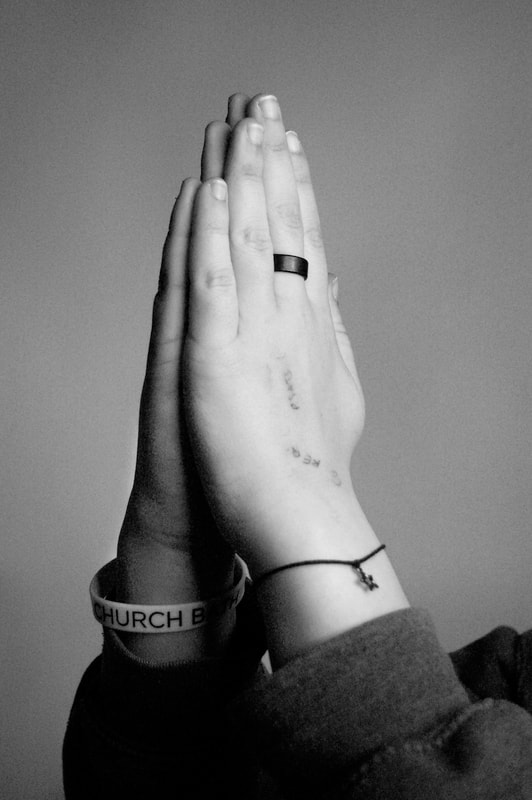
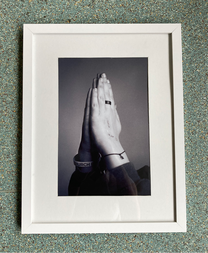
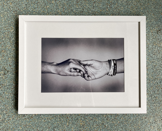
For this shoot I am finalising my ideas for the making day and the end of the photography course and in this shoot I am narrowing down my favourite ways to photograph hands. I used my Nikon camera and a white backdrop for a clean background. I really like the outcome of this shoot and most of them came out how I wanted; however, some of the photographs with hands praying came out with a darker background which look grey.
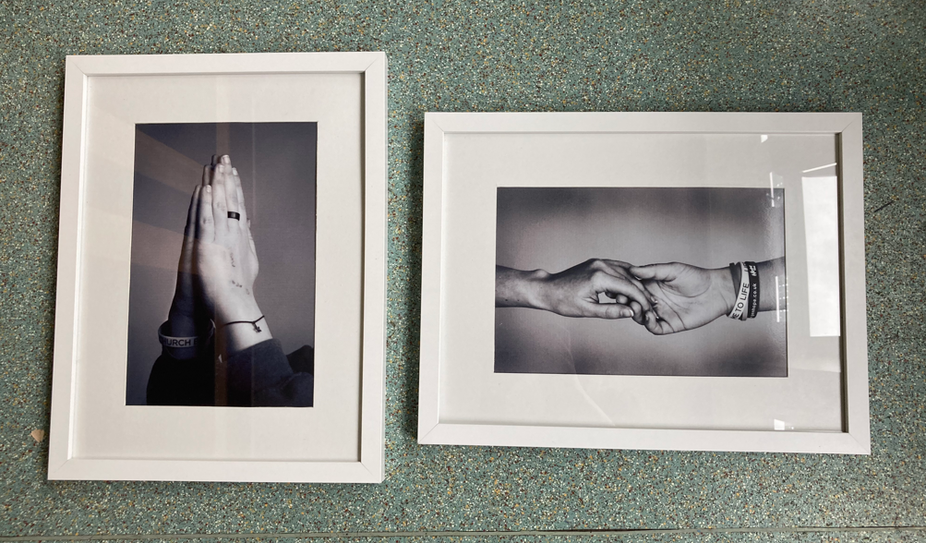
Final Piece
The process
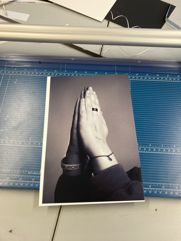
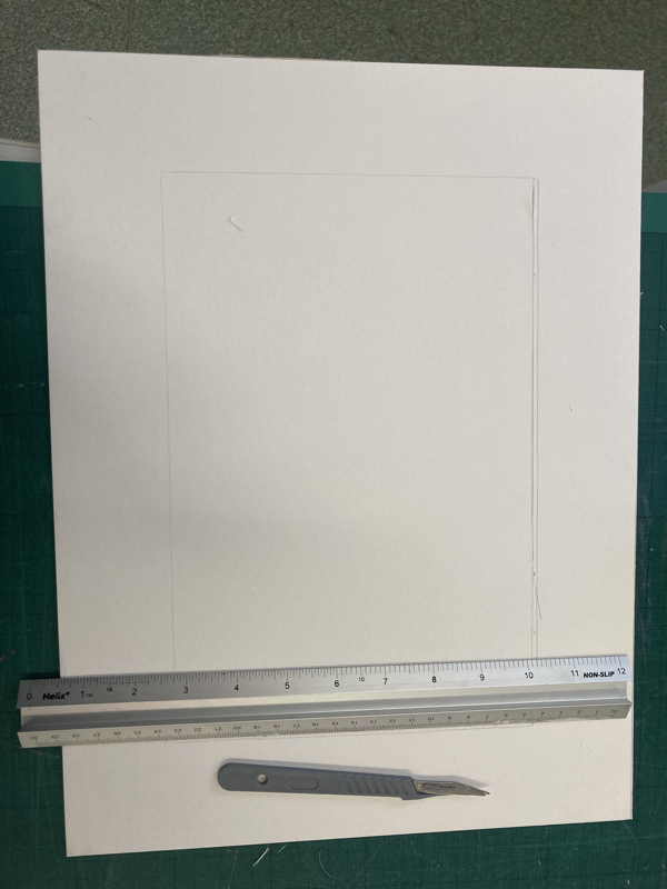
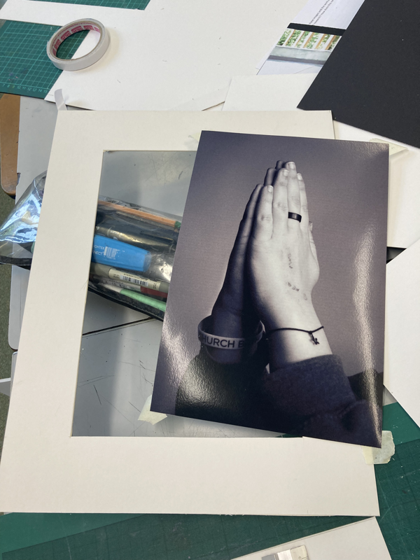
During our making day we assembled our final pieces. I trimmed the edges of my photographs and they were slightly smaller than a4, so I ran into a problem. My photographs were too small for the boarders of my frames so I had to use two large pieces of mount board to cut out and resize them. I put them in the frame to take photos and this is how they turned out:
Project analysis
For my Human Condition project I am exploring the sub theme of the human form and specifically hands. I've continued to research photographers that explore the theme of human form and I particularly liked the work of Julian Germain. He took photographs of photographs and, I learned from studying his work, that you can use the texture/surface of the image to reflect light as it has a glossy finish to add to the photograph. His work said a lot about his friendship with Charles Snelling and how they took spent 8 years making a photographic documentation of his life. "For every minute you are angry you lose 60 seconds of happiness" - Julian Germain. I also researched the threshold concept #4 that 'photography is an art of selection rather than invention', which links to Julian Germain's work of selecting parts he will photograph and not taking an entirely new image. I've also looked at a variety of photographers such as Martha Cooper, Bruce Gilden, John Copeland, Tim Booth, Omar Reda, Doug Richard, Michael Wolf, Kensuke Koike and Hannah Hoche. I appreciated John Copeland's images a lot because his photographs are natural and represent my sub theme of the human form well. I also enjoyed looking at Doug Richard's work as he took photographs of google earth which I thought was also a good portrayal of the human form because google earth captures people in every day life.
I have explored a range of media, processes, techniques and experimented with collage, 3D 2D constructions and other creative ways to display my work and have made several final pieces for each theme we covered. I demonstrated these processes and would refine my work to the processes I was most pleased with, to create my final piece. I explored different lighting techniques (natural and artificial), a range of back drops which are used behind the subject to capture them in the best possible way, and - with my Nikon camera - I played about with the techniques aperture and depth of field. Throughout this project my work developed in a number of ways as I changed things over shoots to explore various ways to photograph my sub theme. For example I used a larger aperture to allow more light into the lenses which focuses on the object and less on the background. I've learned how to edit my photographs to a better standard and create a more interesting image to look at, especially in my 3D 2D final piece where I edited my work similar to a photographer I had looked at (Matt Lipps).
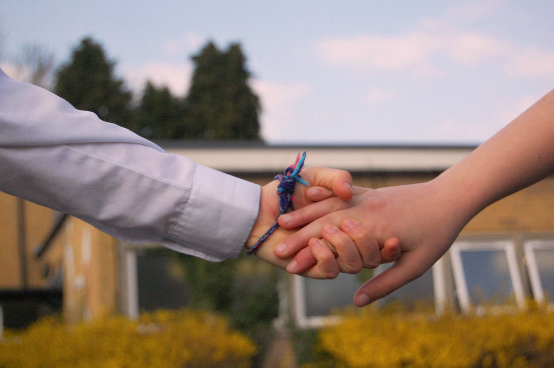
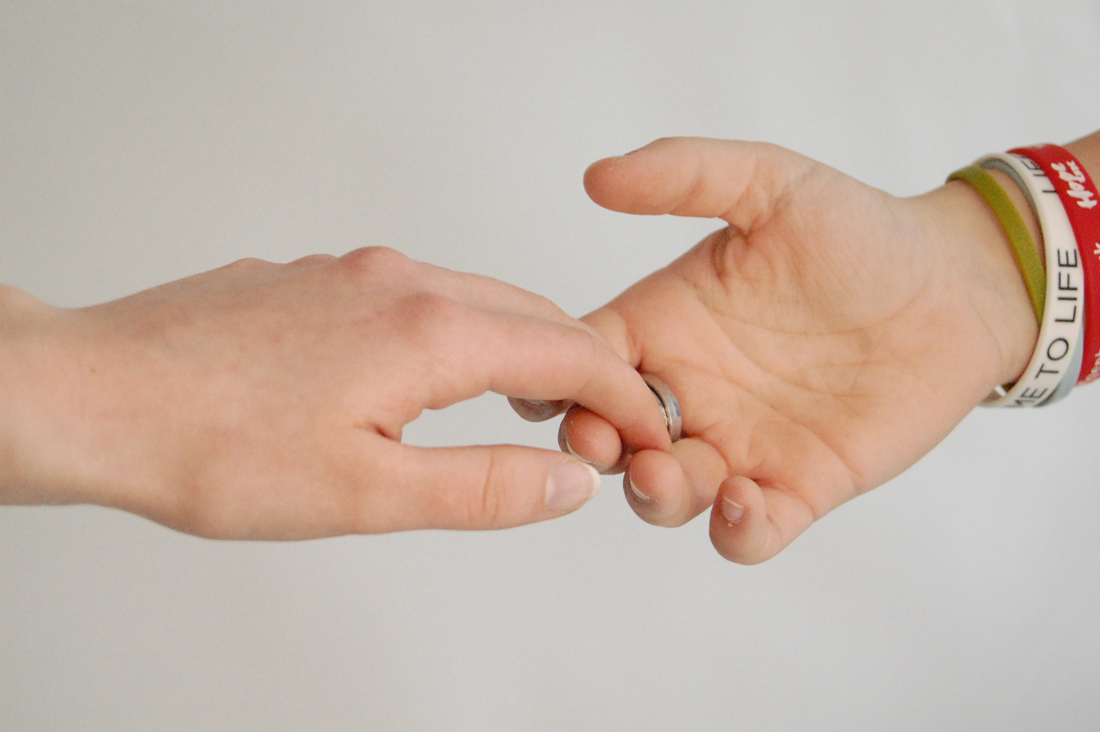
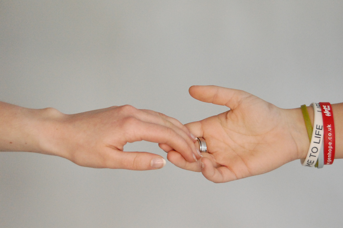
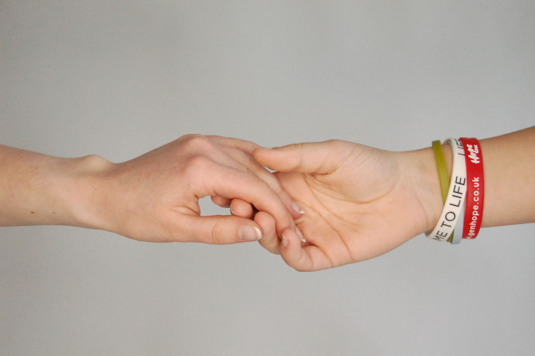
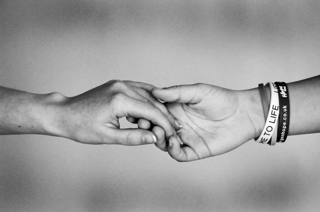
In my final outcomes I had two photographs displayed in frames. The images were in black and white and the frames where white so the contrast of the image and frame worked really well and gave the images a nice finished look. I was hoping to create two good high quality photographs and I think it worked well. I also think I have successfully explored the theme of hands in the human form but I do think if I branched out to other parts of the human form I would've gone into the human form a bit more. So if I had more time I would've done a few shoots exploring other parts of the human form. My work is personal to me because I really liked Tim Booth's idea that hands tell a more honest story about what a person has been through than a face. In my final piece my images including praying hands and two people holding hands. This showed connection and friendship as I asked my close friends to be a part of my final piece. The praying hands are significant because this is an important part of my life with my religion and is a form of communication. My photographs are also capture the depth of friendship tenderness and closeness as friendships develop through growth. It can be interpreted in different ways as the hands look like they could be coming together or drifting apart. I hope the viewers of my final piece will feel peace, hope and encouragement and that they would feel a sense of connection (whether its physical or mental) with someone through prayer or friendship.
I have explored a range of media, processes, techniques and experimented with collage, 3D 2D constructions and other creative ways to display my work and have made several final pieces for each theme we covered. I demonstrated these processes and would refine my work to the processes I was most pleased with, to create my final piece. I explored different lighting techniques (natural and artificial), a range of back drops which are used behind the subject to capture them in the best possible way, and - with my Nikon camera - I played about with the techniques aperture and depth of field. Throughout this project my work developed in a number of ways as I changed things over shoots to explore various ways to photograph my sub theme. For example I used a larger aperture to allow more light into the lenses which focuses on the object and less on the background. I've learned how to edit my photographs to a better standard and create a more interesting image to look at, especially in my 3D 2D final piece where I edited my work similar to a photographer I had looked at (Matt Lipps).
In my final outcomes I had two photographs displayed in frames. The images were in black and white and the frames where white so the contrast of the image and frame worked really well and gave the images a nice finished look. I was hoping to create two good high quality photographs and I think it worked well. I also think I have successfully explored the theme of hands in the human form but I do think if I branched out to other parts of the human form I would've gone into the human form a bit more. So if I had more time I would've done a few shoots exploring other parts of the human form. My work is personal to me because I really liked Tim Booth's idea that hands tell a more honest story about what a person has been through than a face. In my final piece my images including praying hands and two people holding hands. This showed connection and friendship as I asked my close friends to be a part of my final piece. The praying hands are significant because this is an important part of my life with my religion and is a form of communication. My photographs are also capture the depth of friendship tenderness and closeness as friendships develop through growth. It can be interpreted in different ways as the hands look like they could be coming together or drifting apart. I hope the viewers of my final piece will feel peace, hope and encouragement and that they would feel a sense of connection (whether its physical or mental) with someone through prayer or friendship.
